UNITED AIRLINES PILOT’S QUALITY
OF LIFE SCHEDULING WEB APPLICATION
Client: United Airlines
Role: UX Designer • Interaction Design
Tools:




OVERVIEW
SCOPE:
The scope for this project was the complete overhaul of the Crew Communication System for Pilots and the design of a brand new quality of life/scheduling website from scratch. The Pilots use the CCS for everything from picking up trips they want to fly, looking at their schedule, look at their pay, etc. The new contract/website meant that the current functionality of the Crew Communication System would be revisited and a lot of the features would become obsolete therefore making room for new features and new functionality based on the new contract.
The outcome would be a website designed using the principles of User Experience Design and it’s best practices which entailed taking into consideration the needs, expectations, motivations, pain points and an understanding of what the flight attendants needed. The CCS had been in production since 1998 without any updates to the interface.
Problem Statement: “United Pilots perform schedule modification tasks on multiple screens and applications. We need to consolidate trading features and improve the display and interactivity of the content, so that information is easily accessible and users are empowered to work more efficiently “
CHALLENGES:
• Understand new business and technical requirements.
• Implement United branding guidelines.
• Re-design how Pilots utilize certain pages and functionality on the CCS
• Work closely and extensively with the Pilot union and the Flight Operations among other stakeholders to ensure compliance with regulations and other requirements.
ORIGINAL WEBSITE:
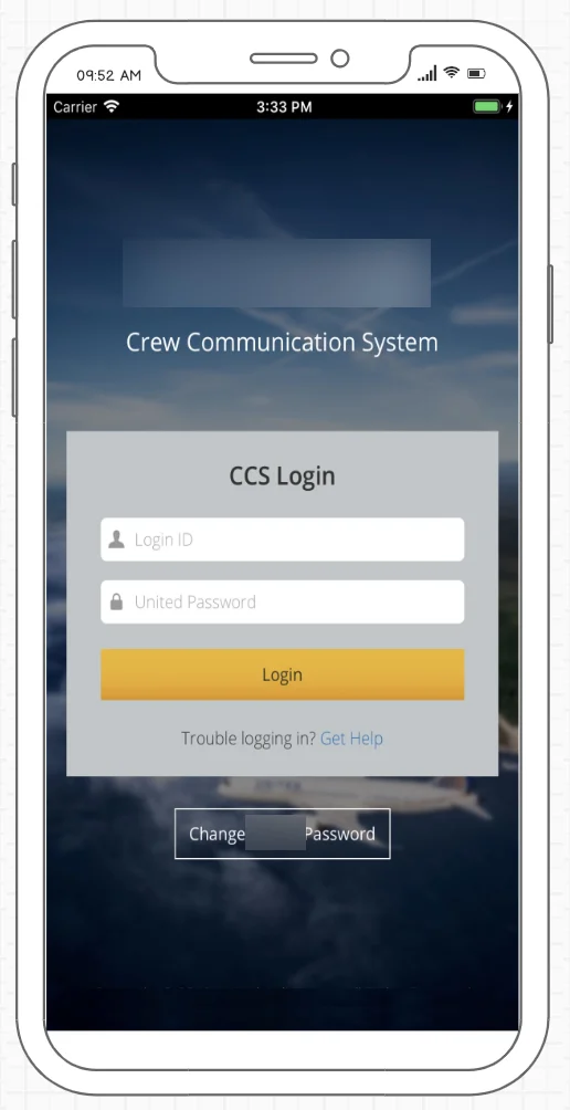
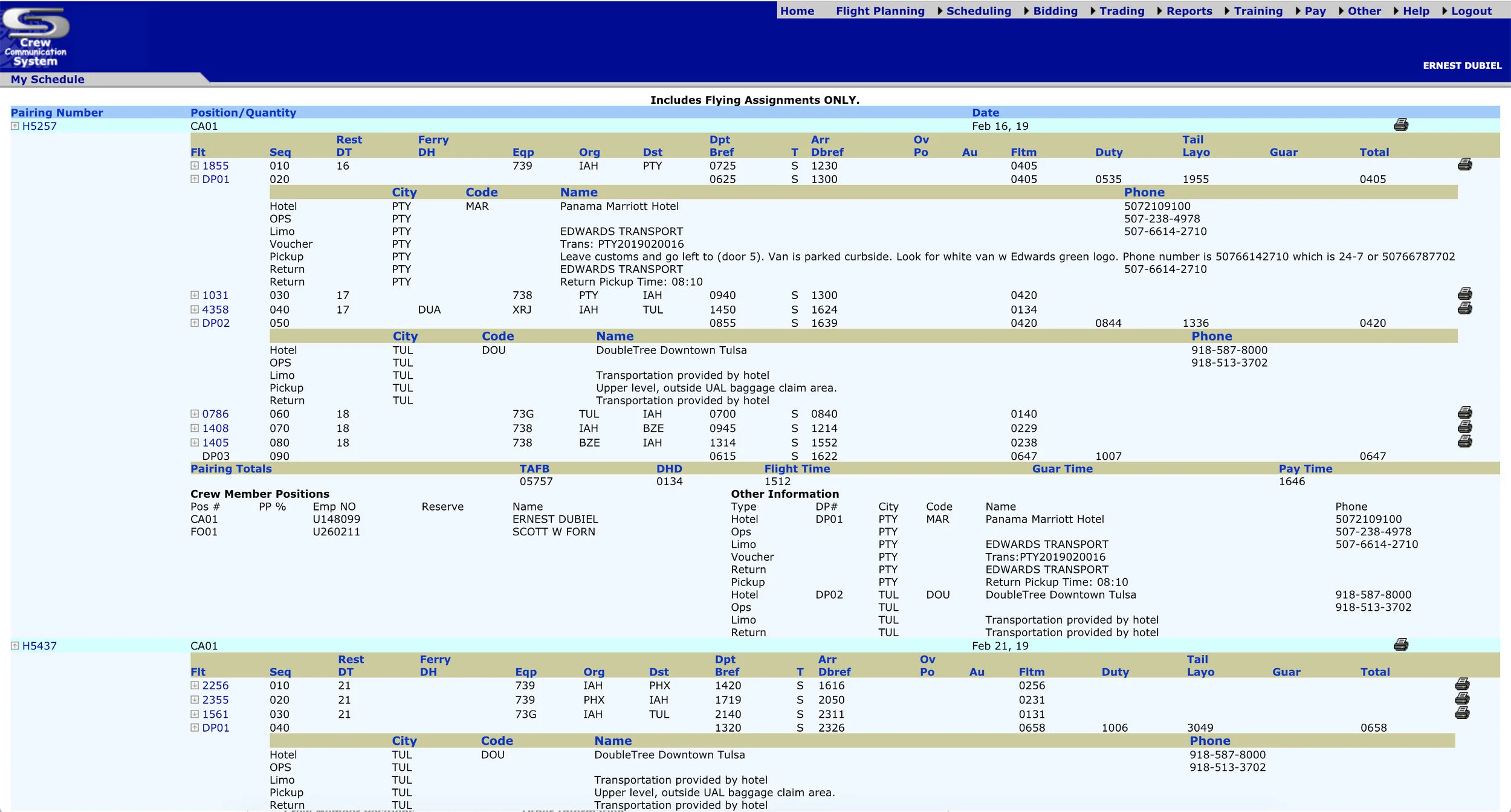
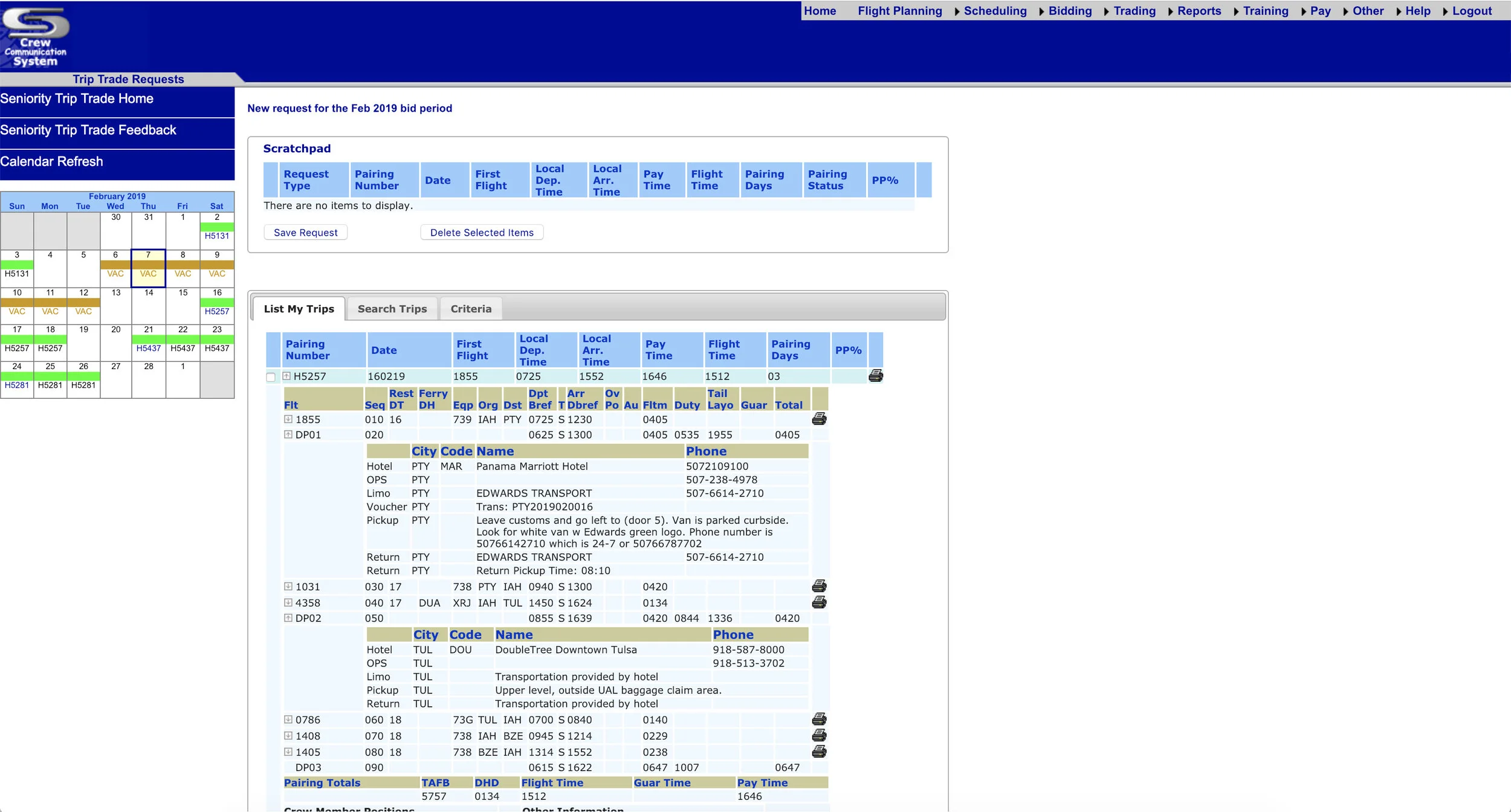
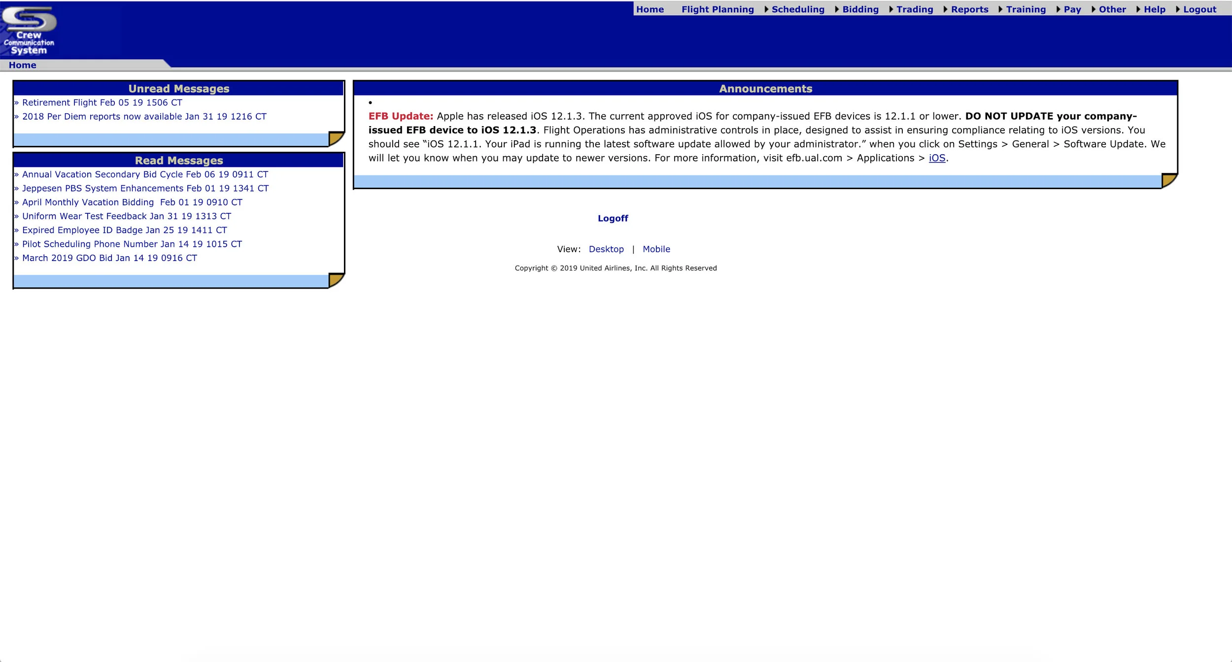
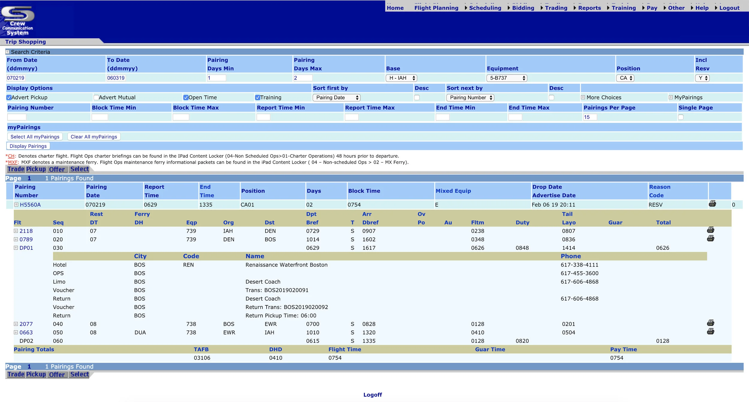
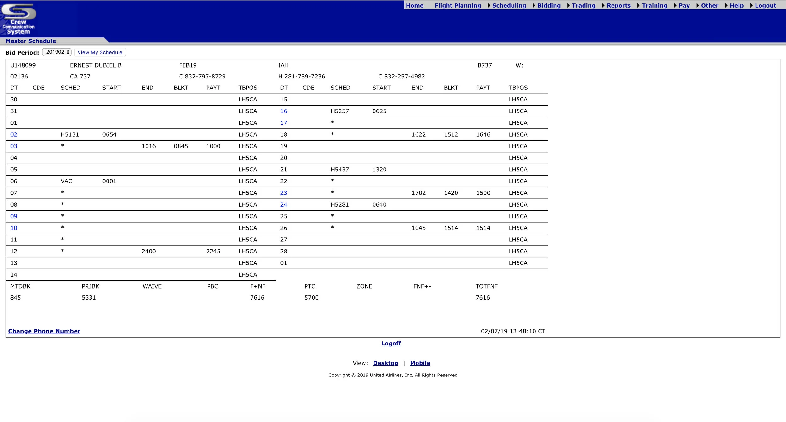
Here are some screenshots of the old version of the CCS website.
PROCESS

Research Strategy Interaction Design UI Design
User Interviews Empathy Map Responsive Wireframes Visual Design
Market Research Persona Prototypes
Competitor Analysis Sitemap Usability Testing
RESEARCH
Methodologies Used:
• Competitor Analysis
• User Interviews
User Interviews
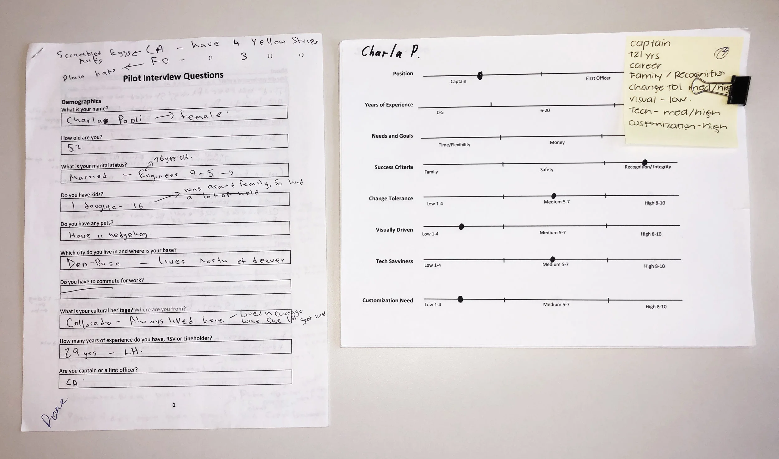
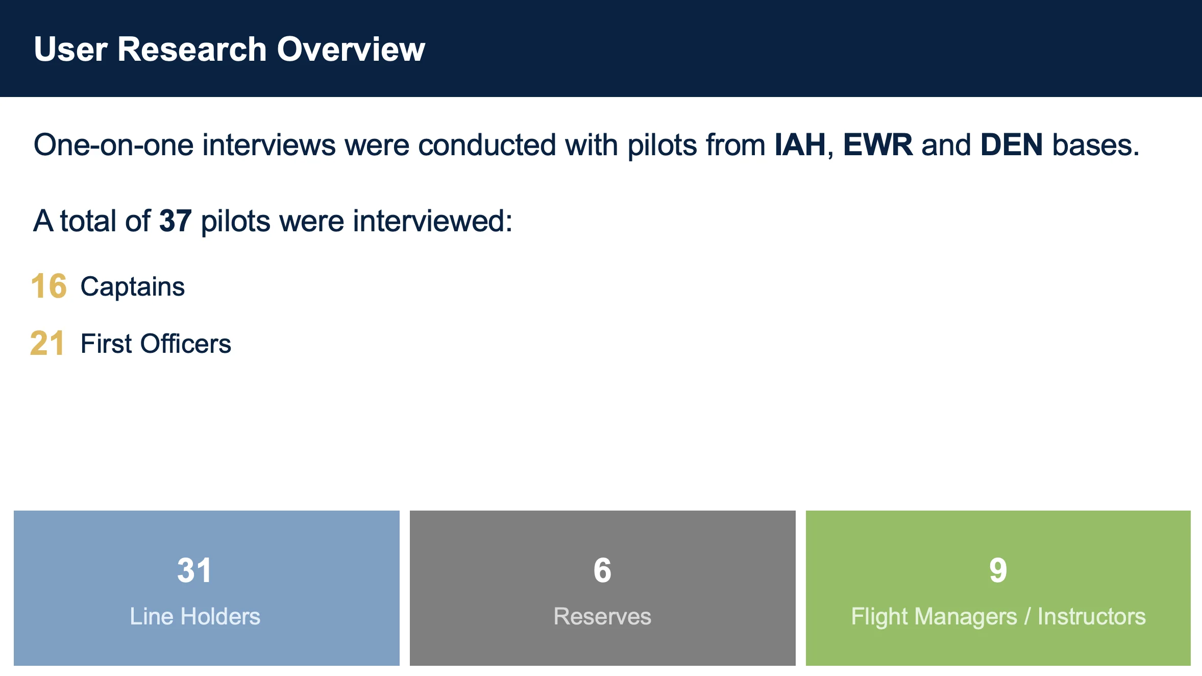
User interviews were all conducted in person. These interviews were all conducted at the Houston (IAH), Newark (EWR), and Denver (DEN) bases. I interviewed the Pilots to better understand how they used CCS, what kind of expectations, pain points, or what problems they had to constantly endure. After doing our user interviews, I synthesized our findings in a spectrum plot which I later used to create our personas for this project.
STRATEGY
Personas: With all the information and data that was collected from the user interviews a set of personas were created to help define who I was going to design for.
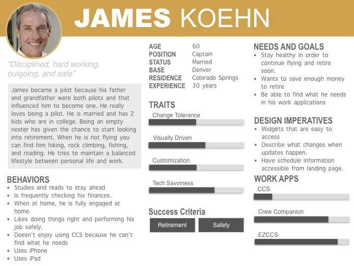
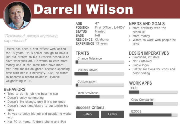
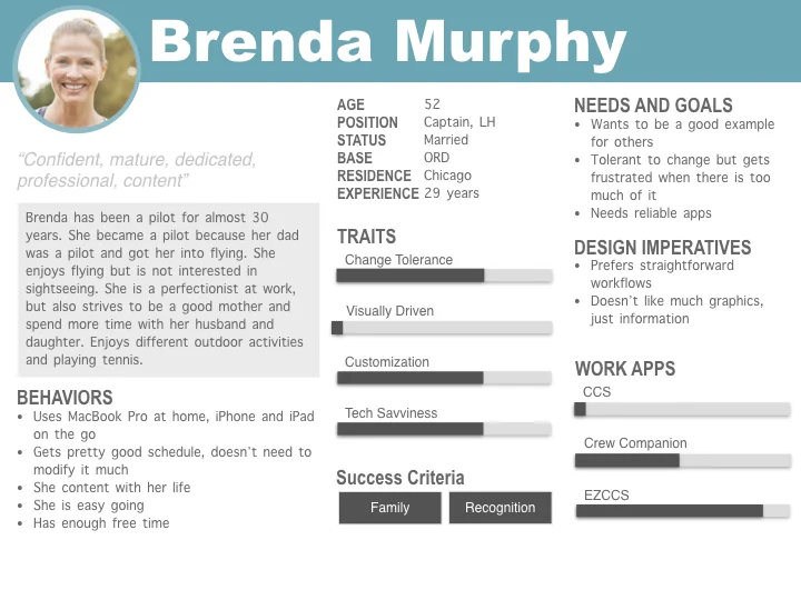
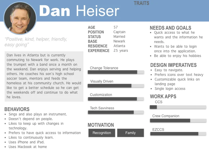
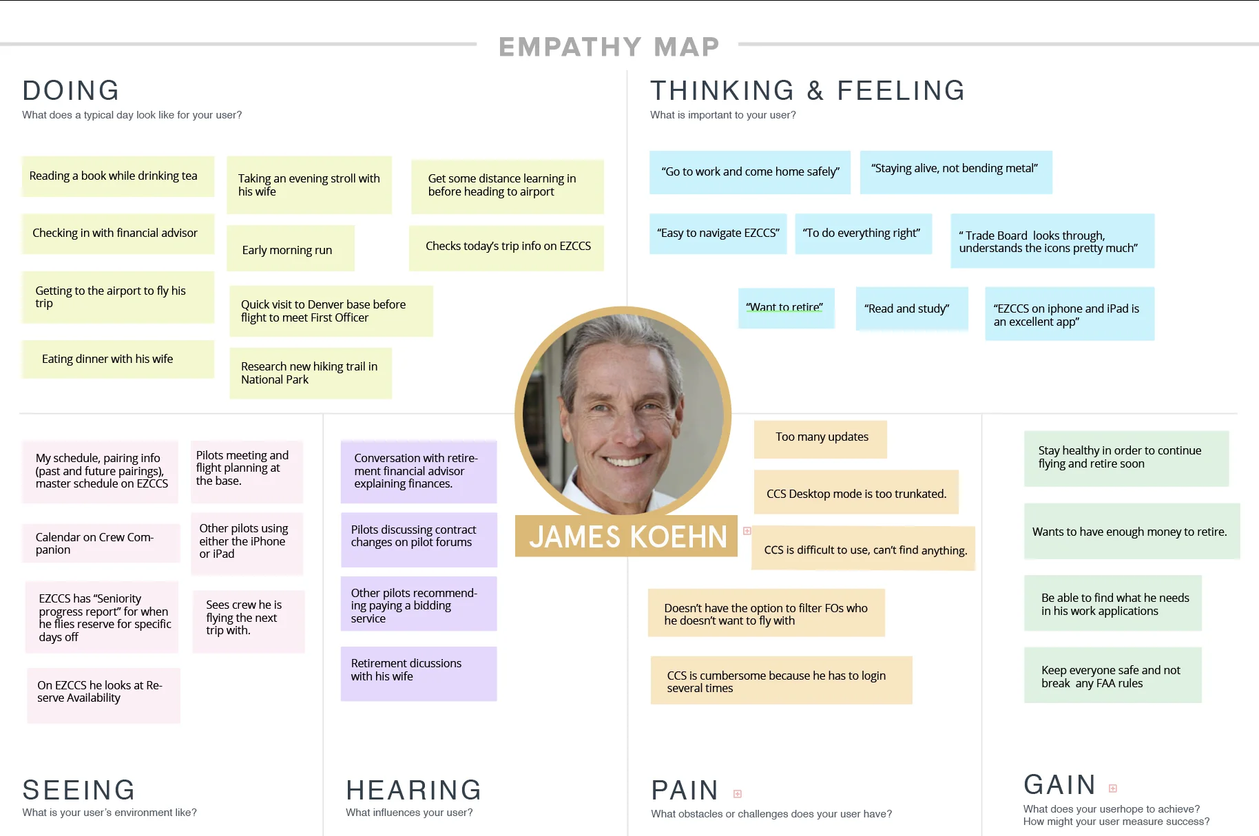
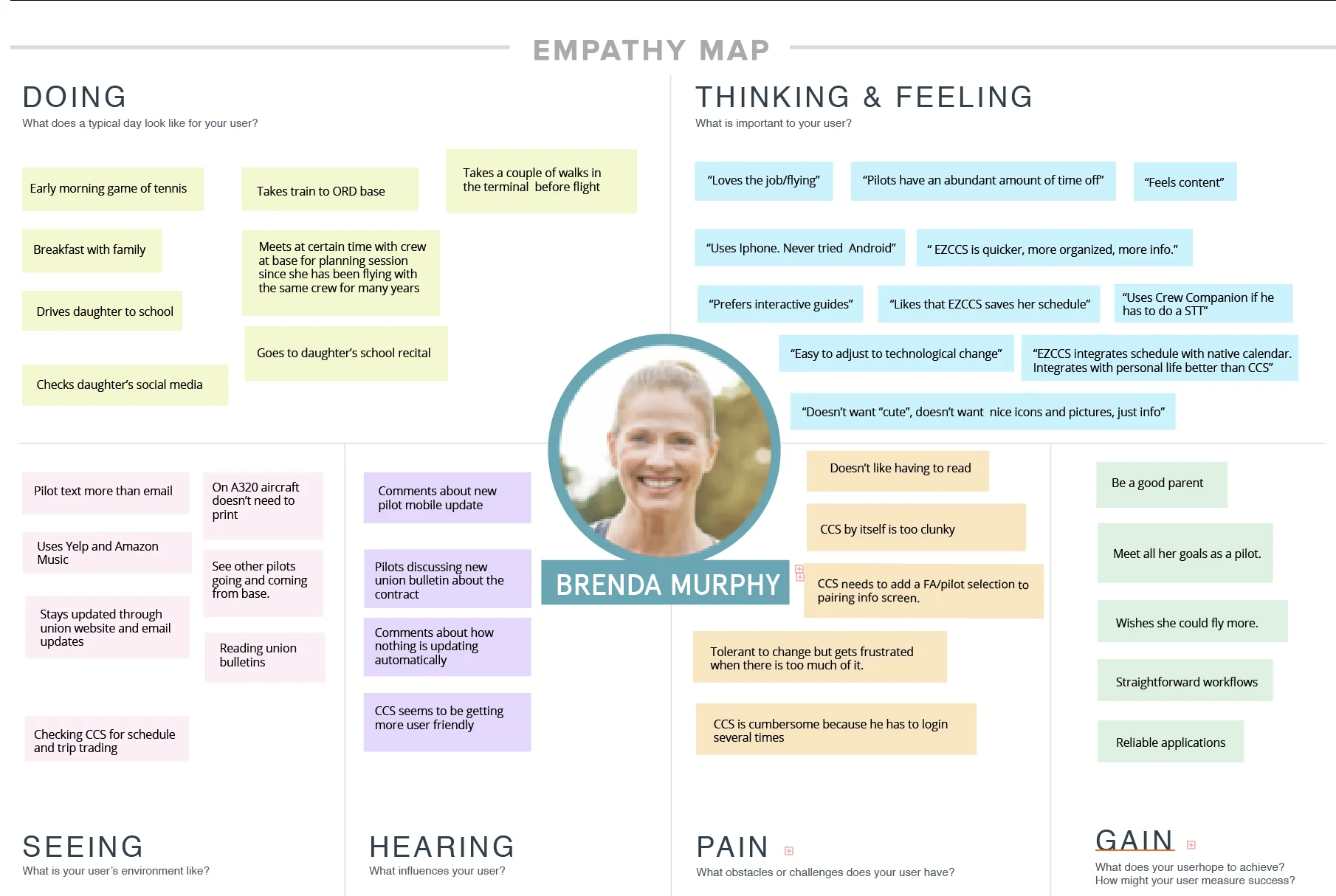
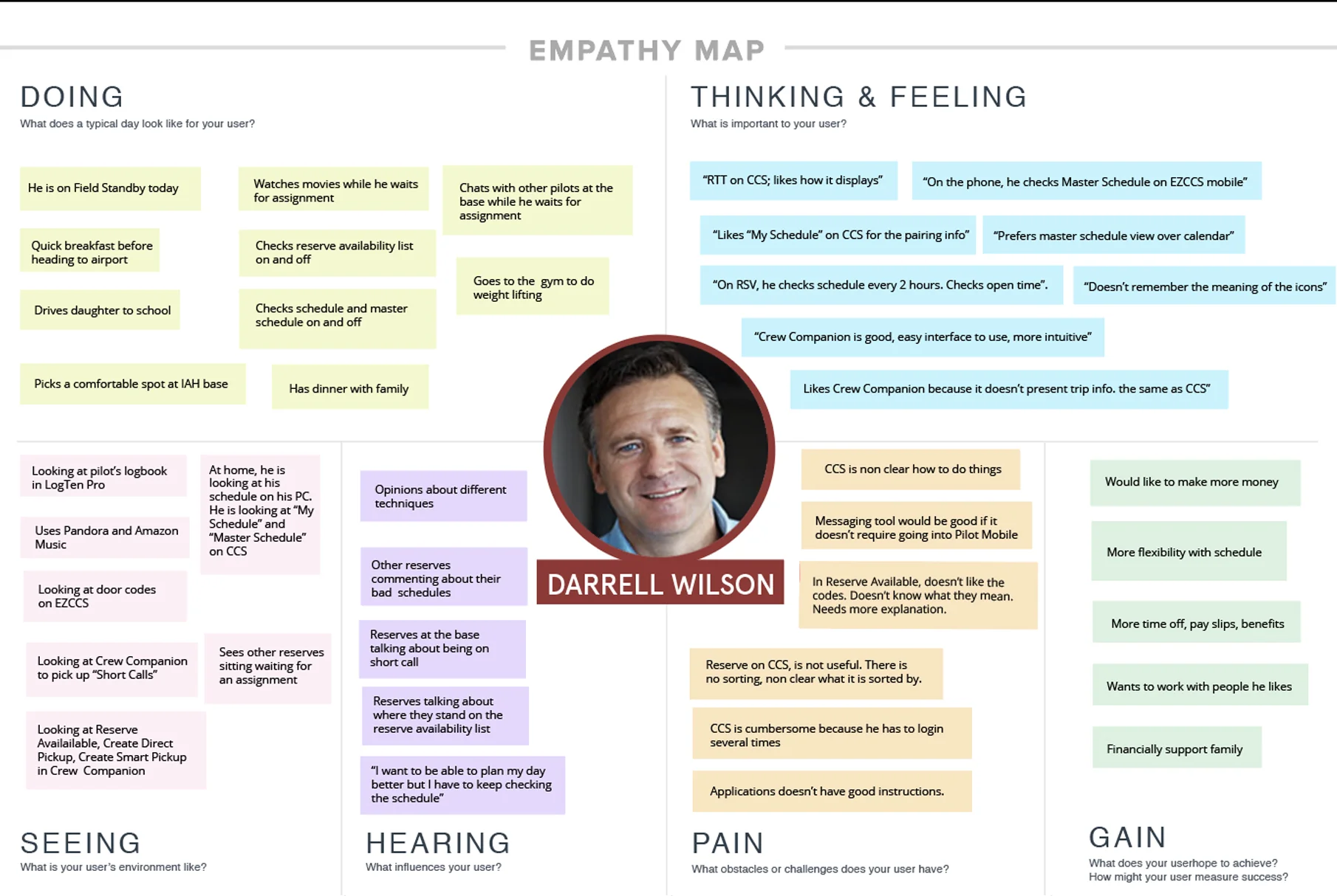
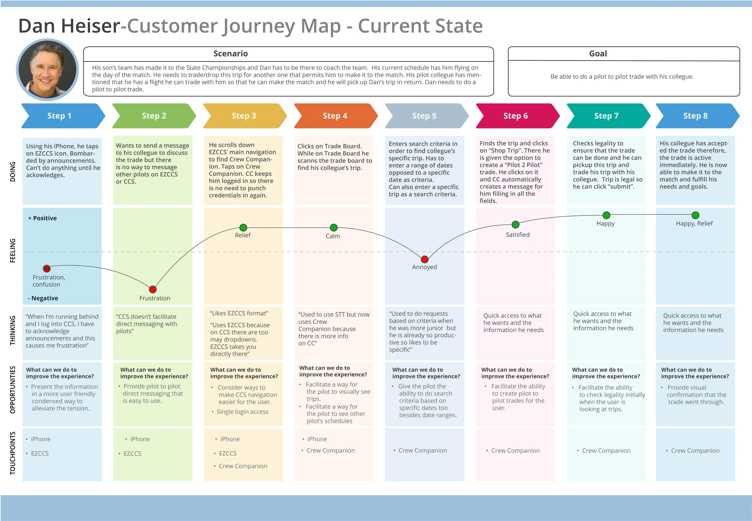
Customer Journey Map : With all the information and data I gathered from the personas, I was able to make a customer journey map for Dan Heiser.
COMPETITIVE ANALYSIS
Some findings and data that were captured from the user interviews was that the Pilots used third party applications instead of the CCS to do their daily scheduling. Competitor Analysis was done on these third party applications that the flight attendants use on a daily basis.
The complete Competitor Analysis can be viewed here:
Information Architecture
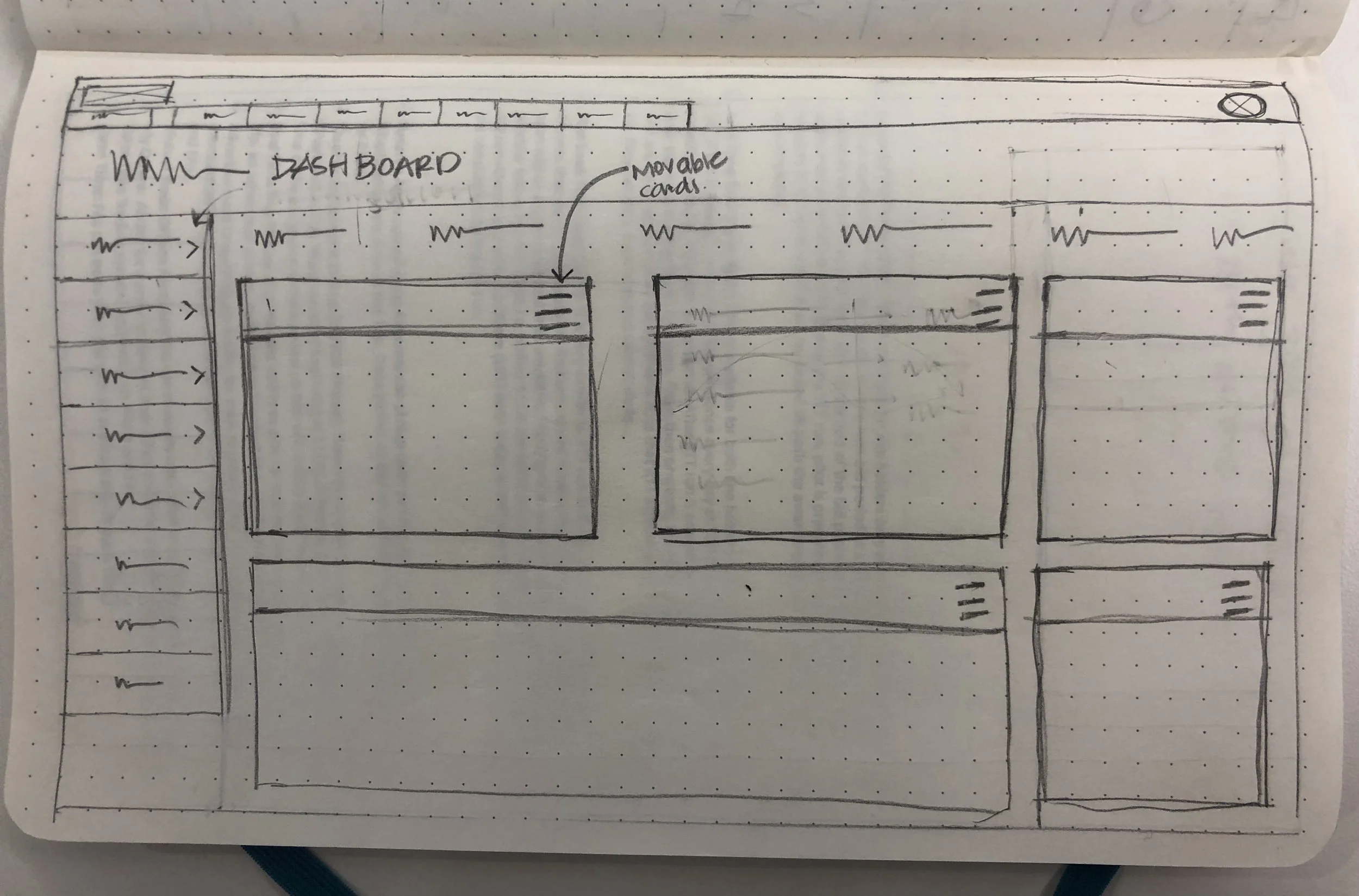
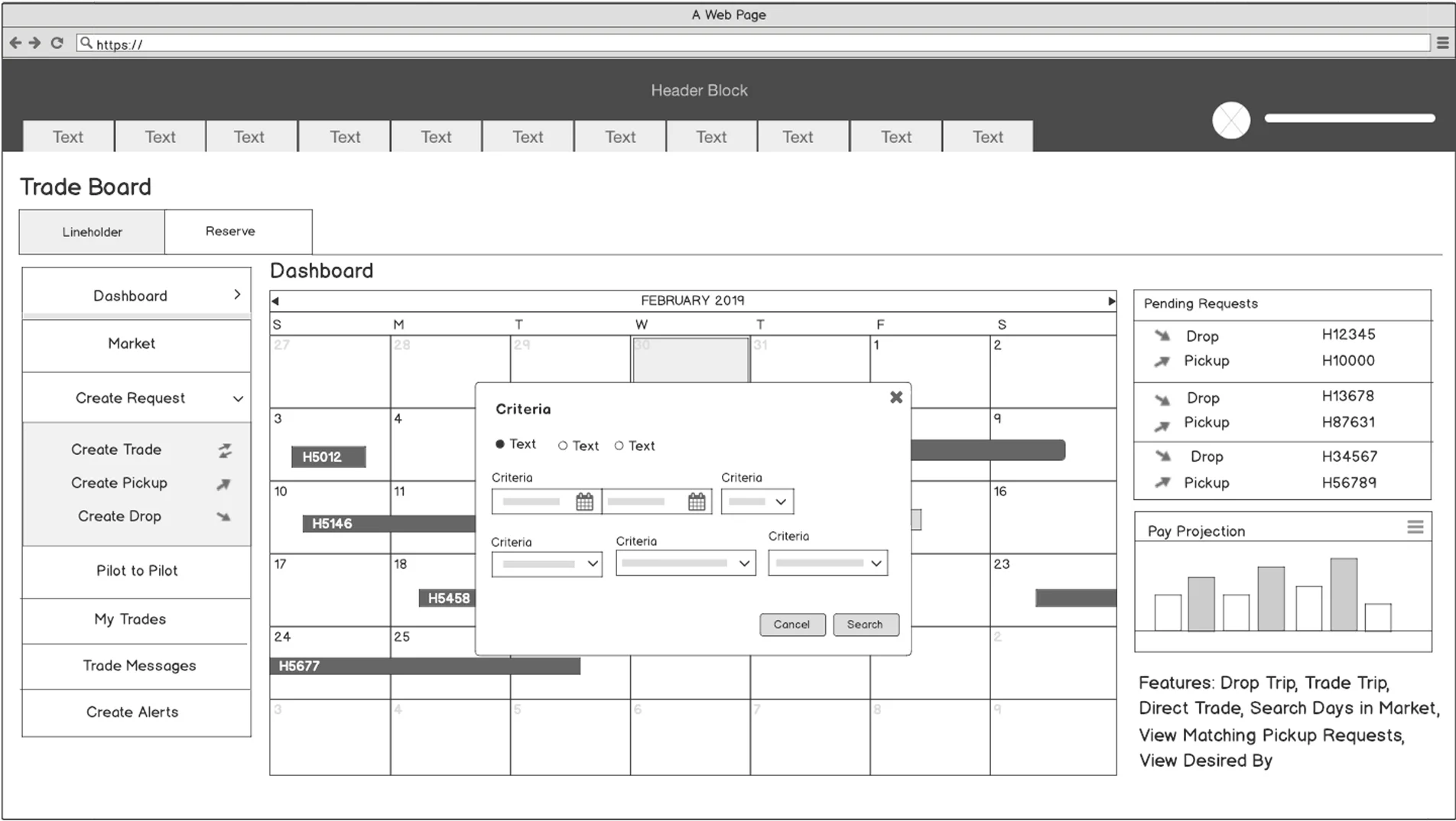
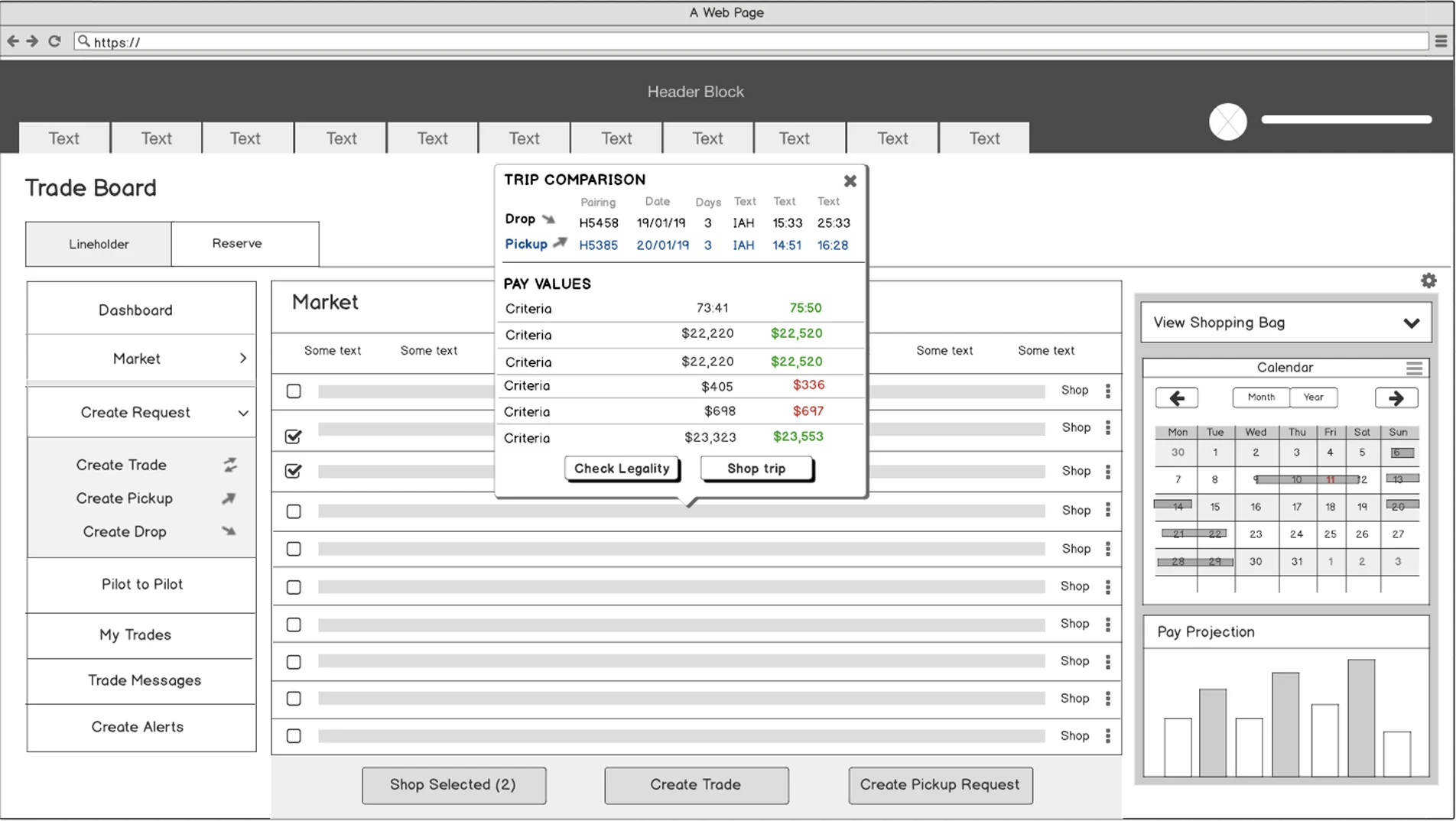
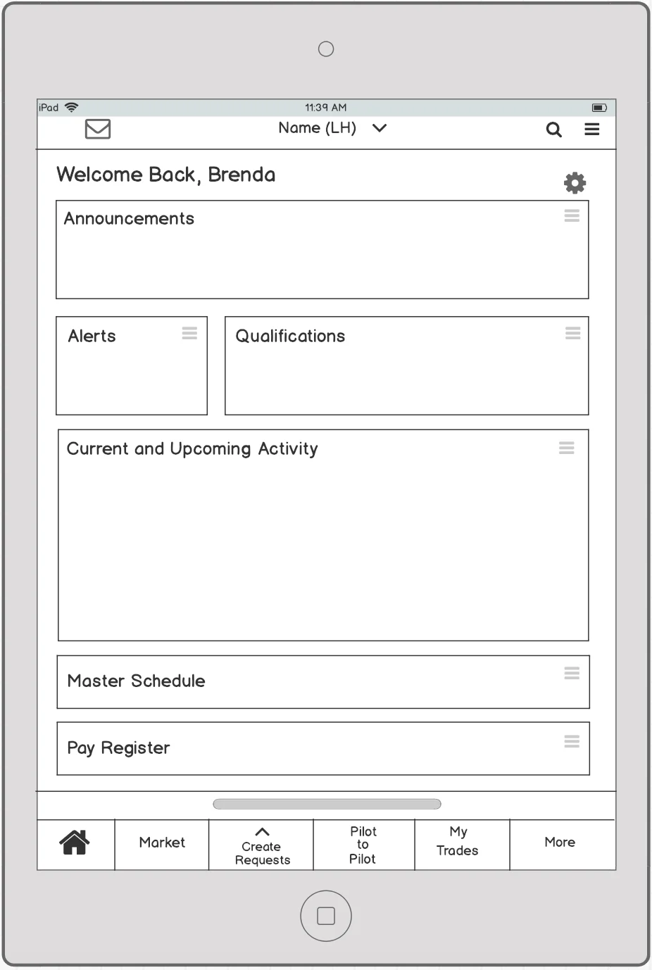
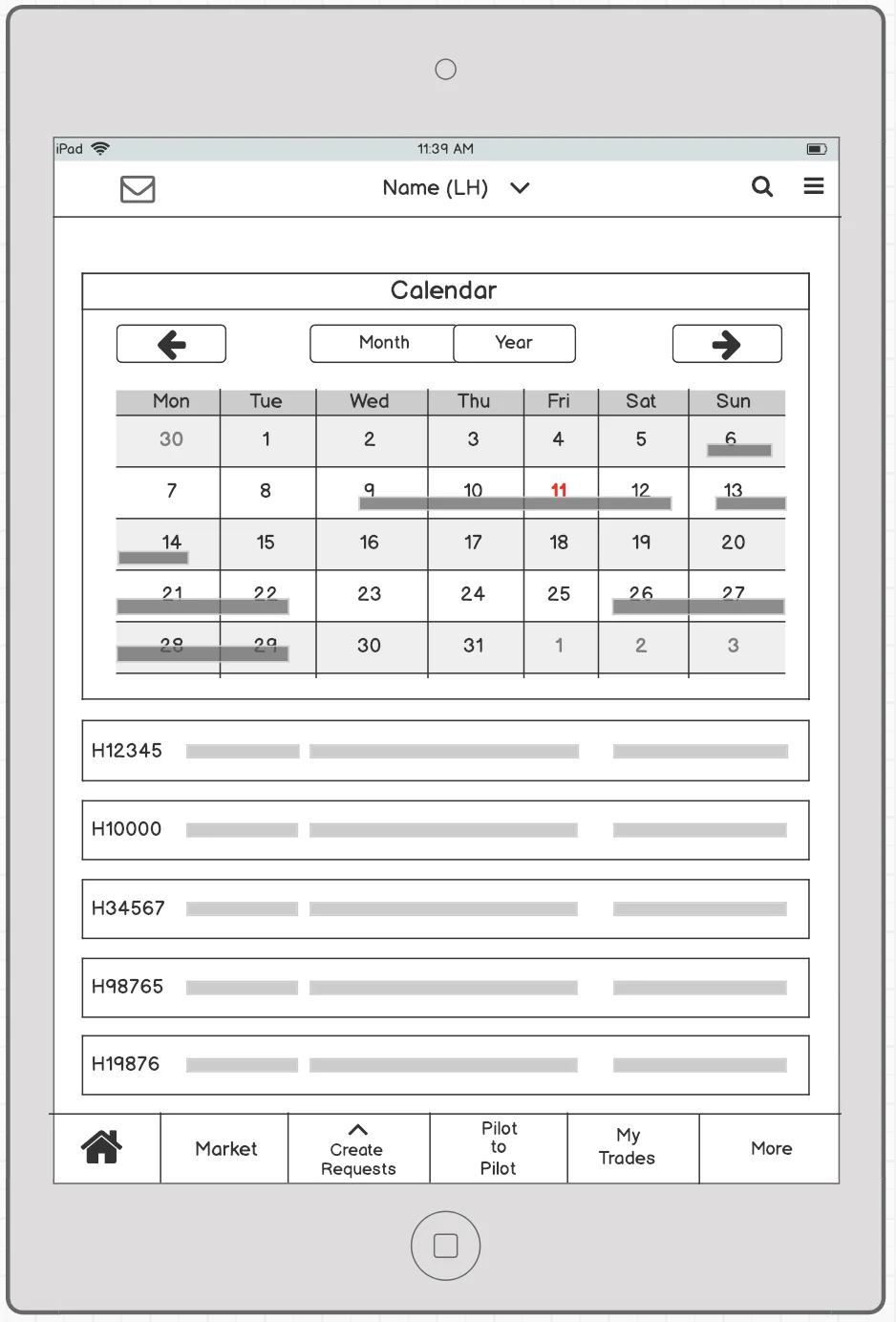
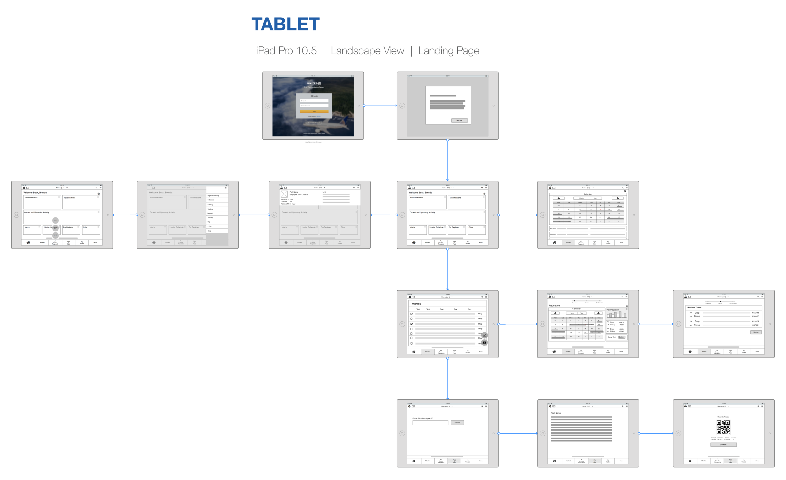
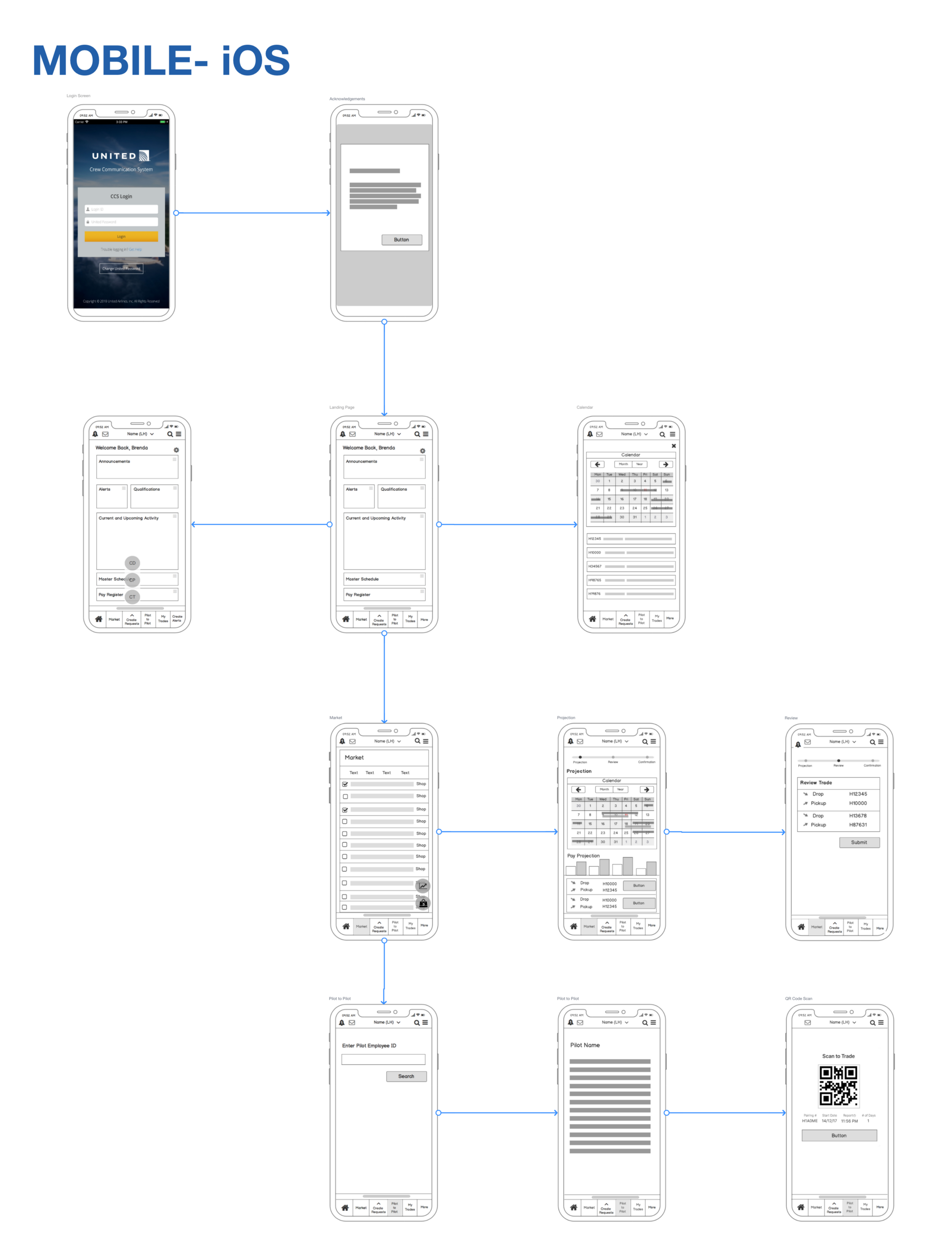
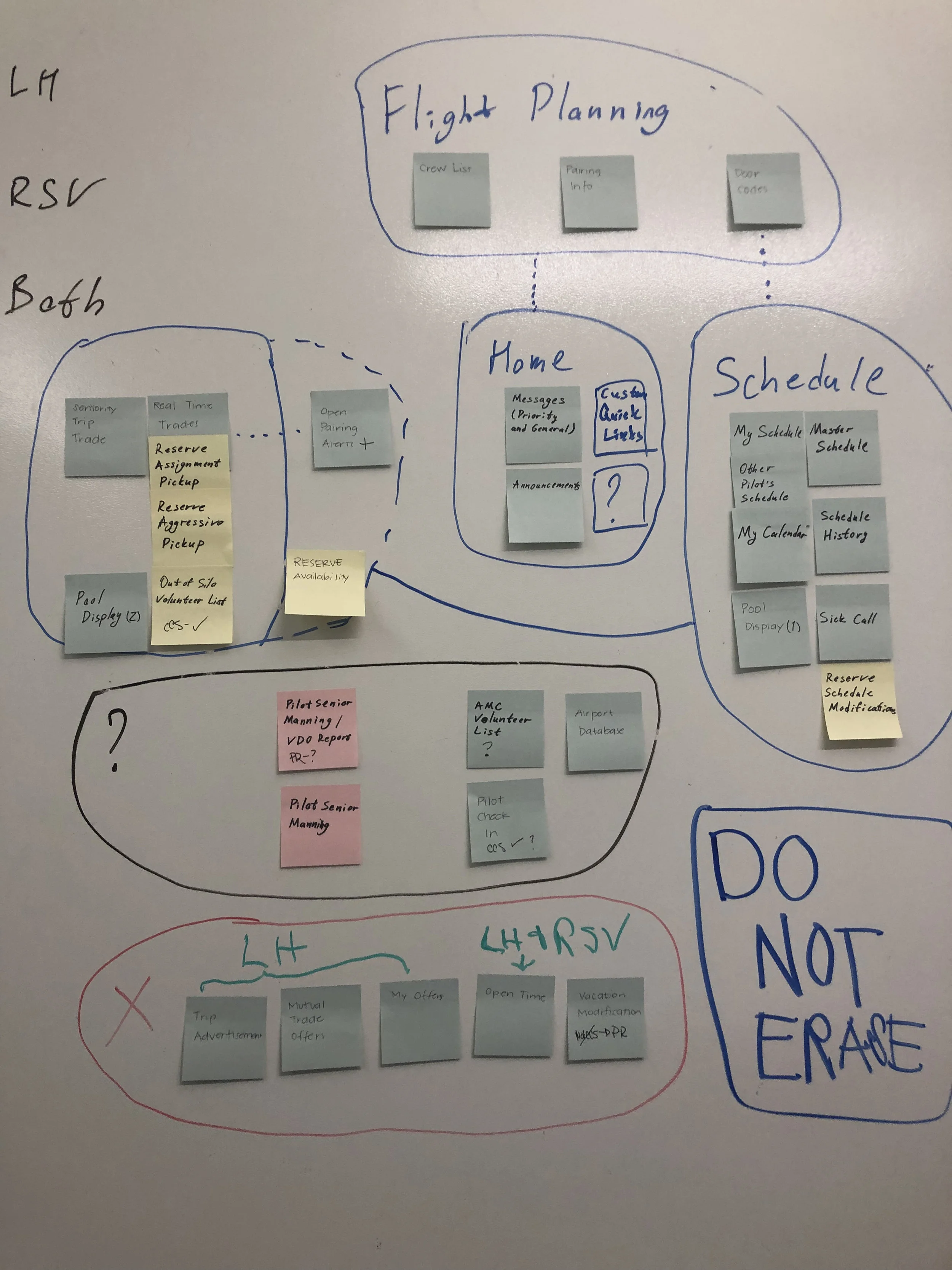
The website contained an enormous amount of diverse pages that called for very clear structure and navigation. After synthesizing the user research some of the findings dictated that the workflow for the pilots was very segmented and each segment needed quick access to the relevant information based on their position. I analyzed the information from the interviews and created a website structure that addressed the needs of users, in this case the Lineholders and Reserves. I also had to analyze the current CCS which help me identify general UI problems like confusing navigation, cluttered screens that had confusing menus and buttons. All this along with our research findings helped me determine the site layout, structure, and navigation.
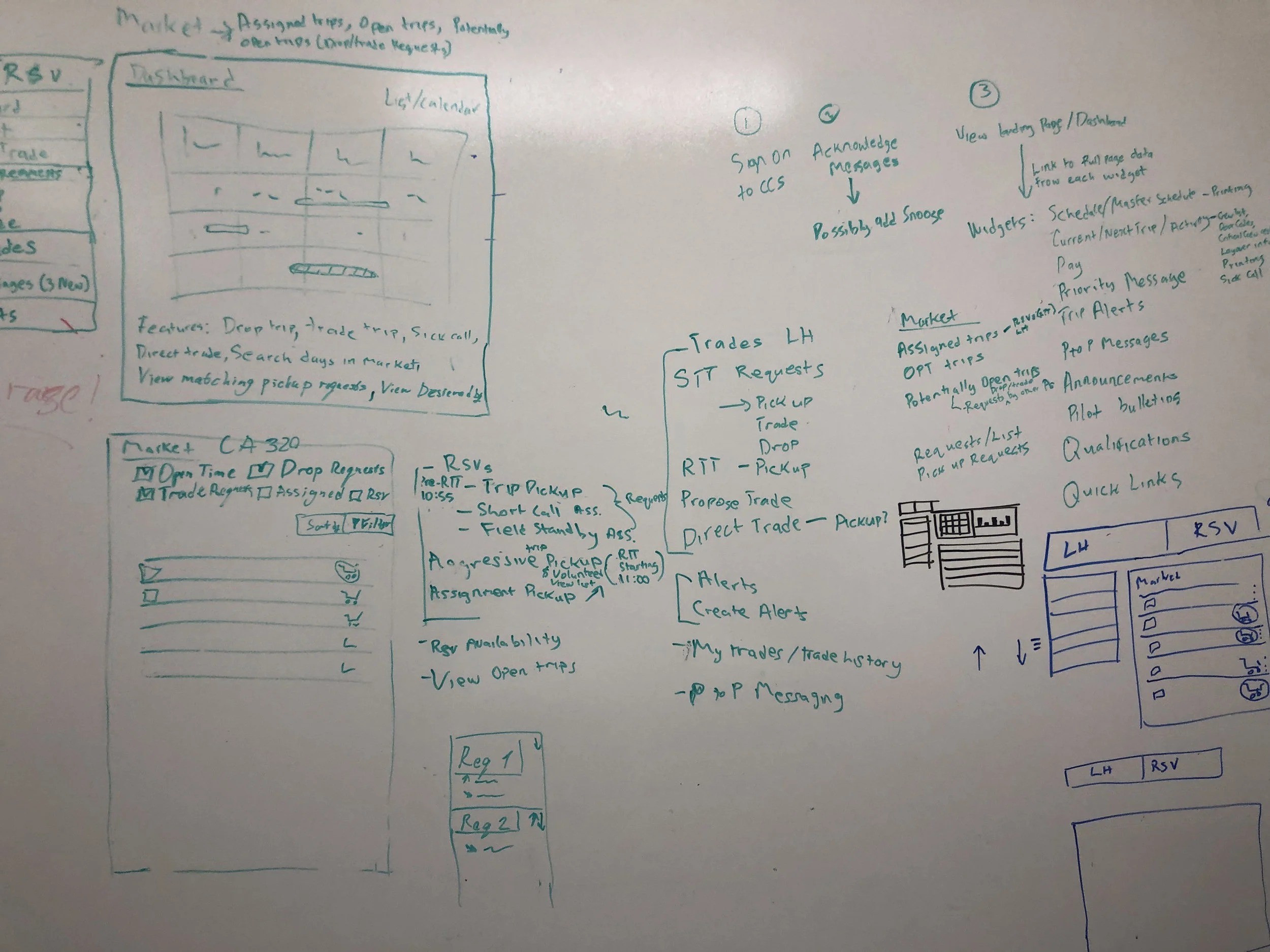
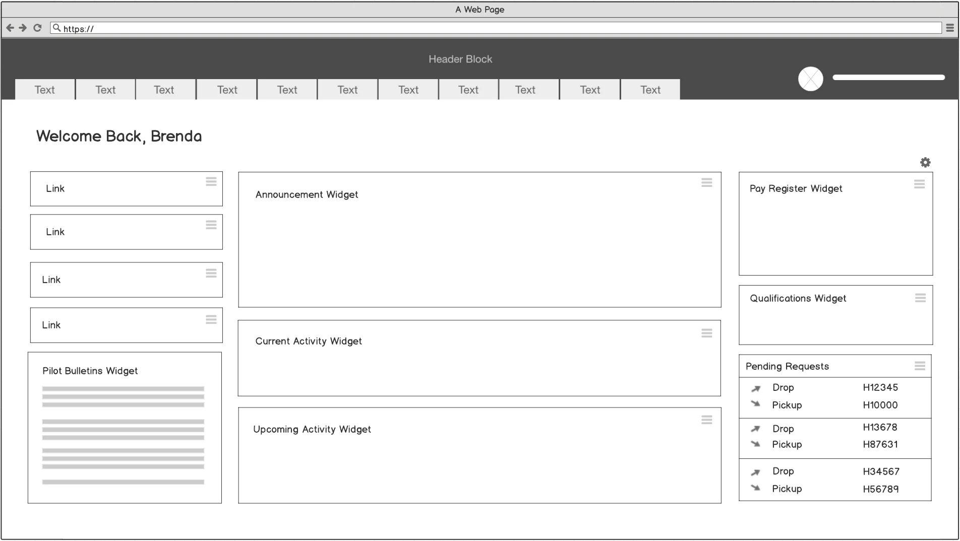
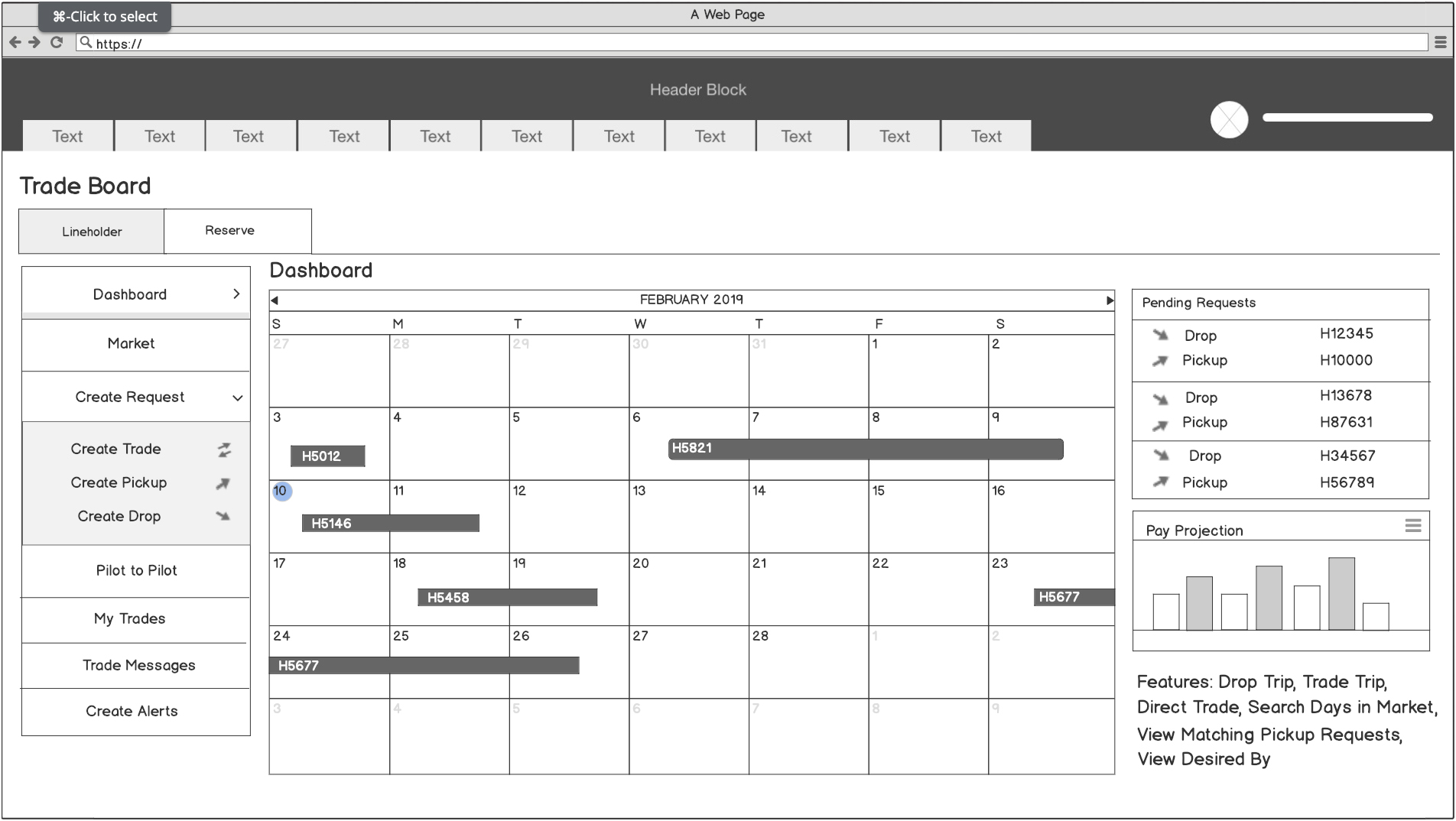
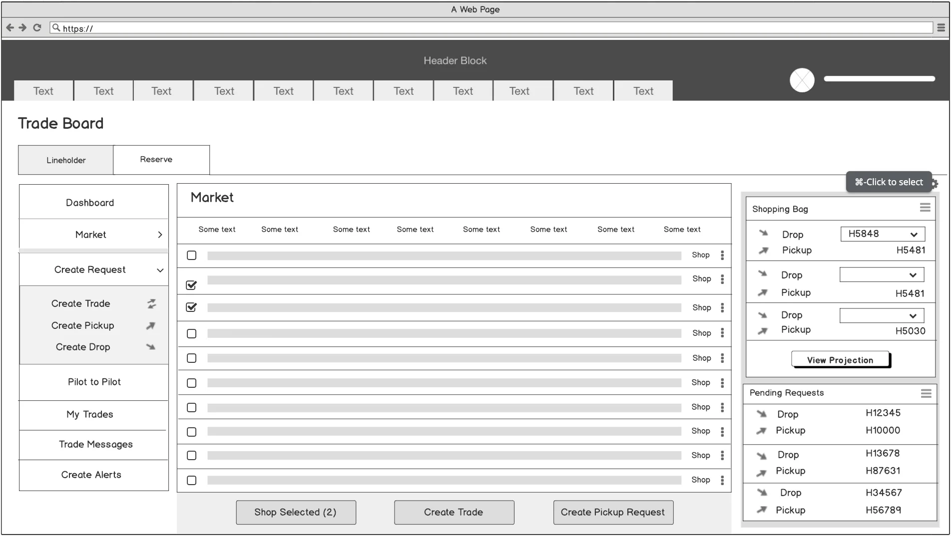
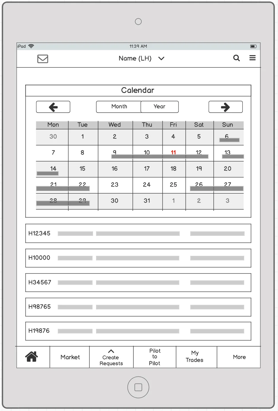
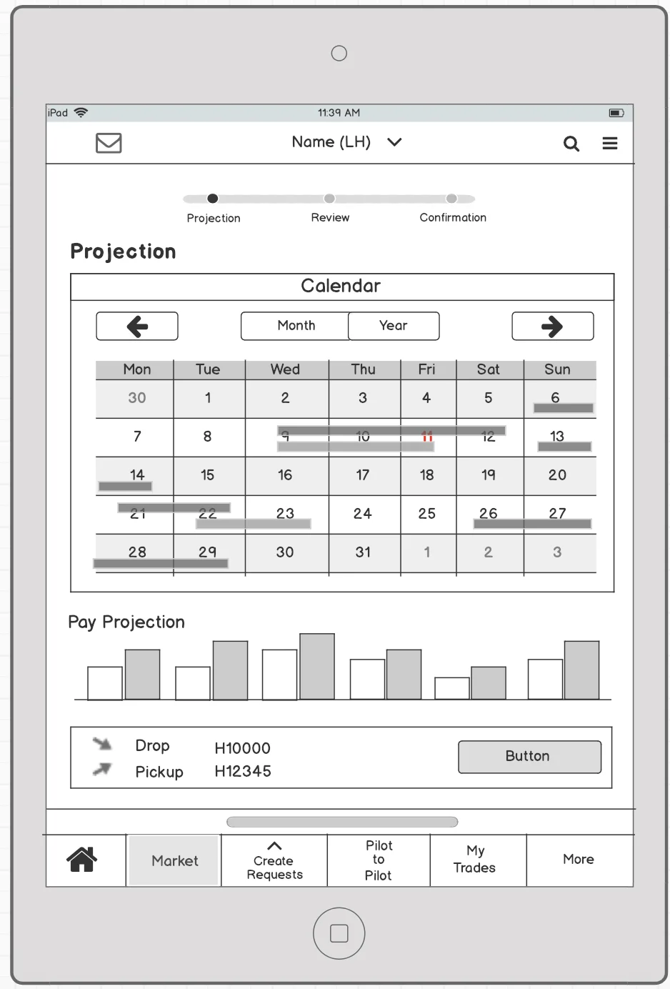
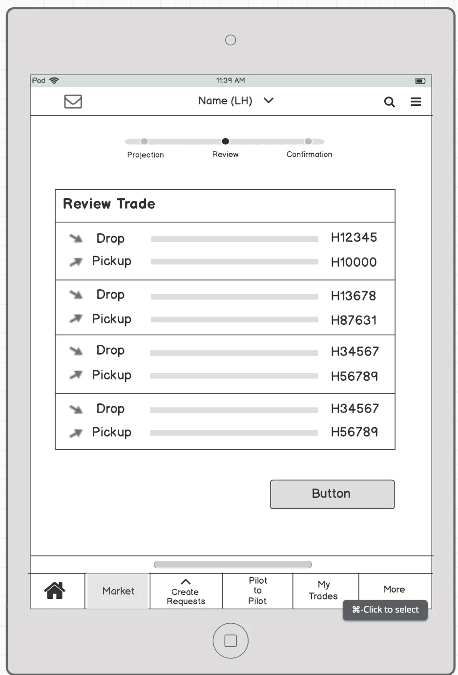
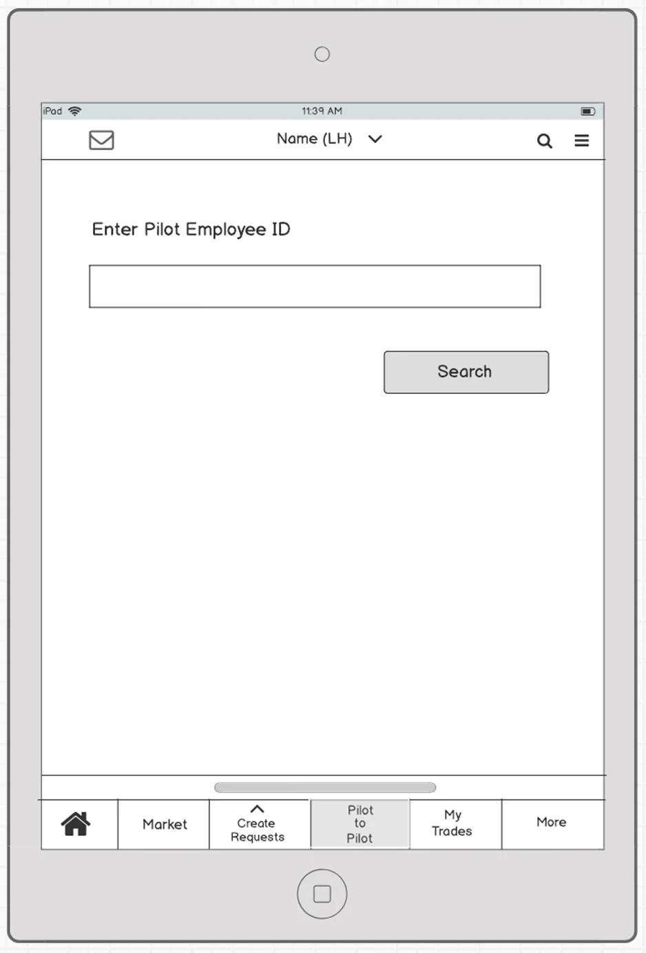
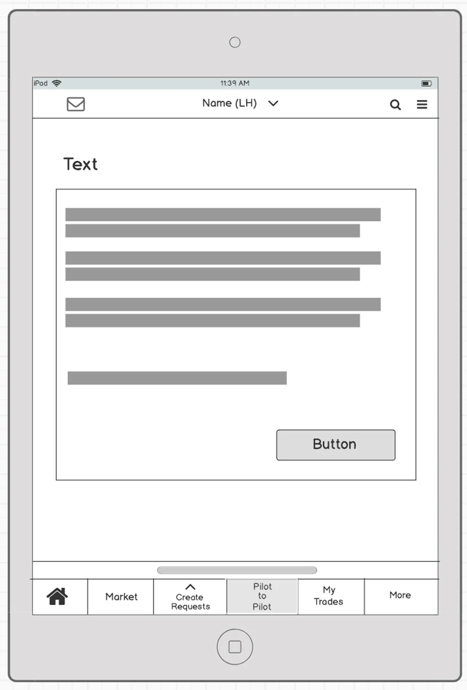
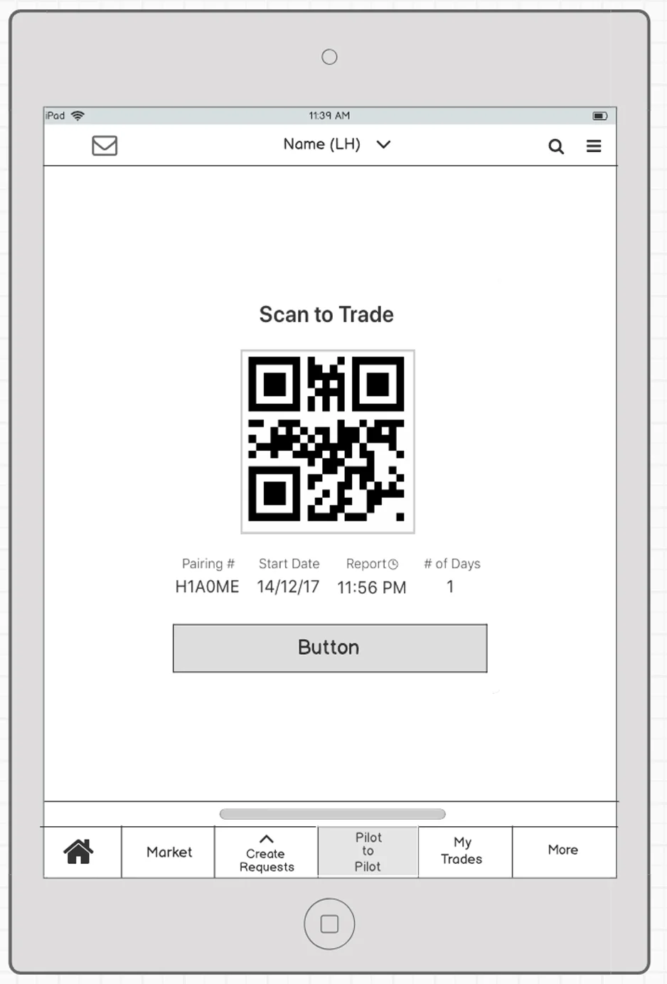
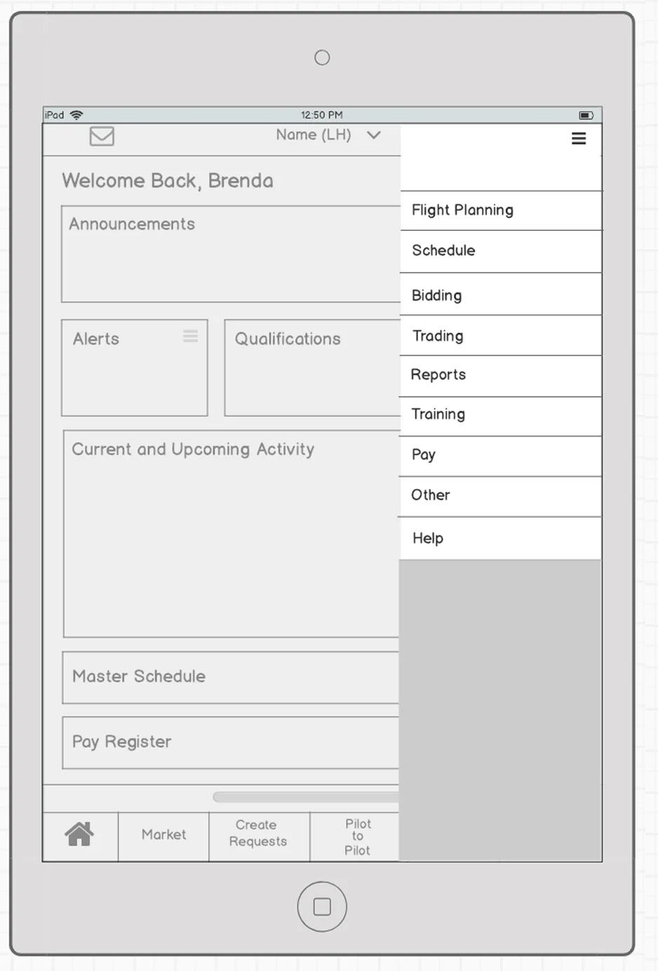
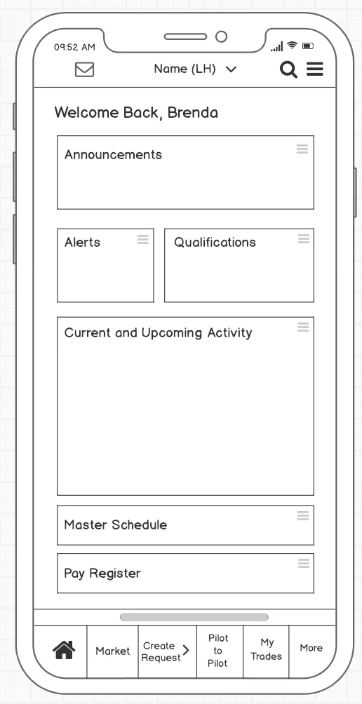
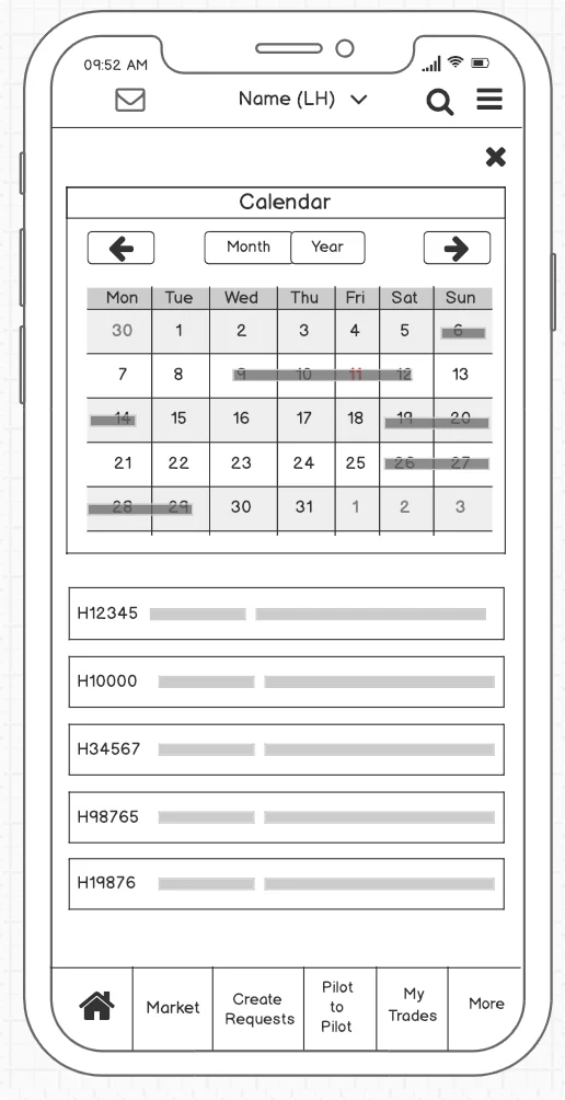
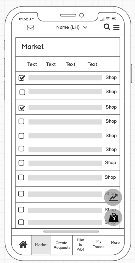
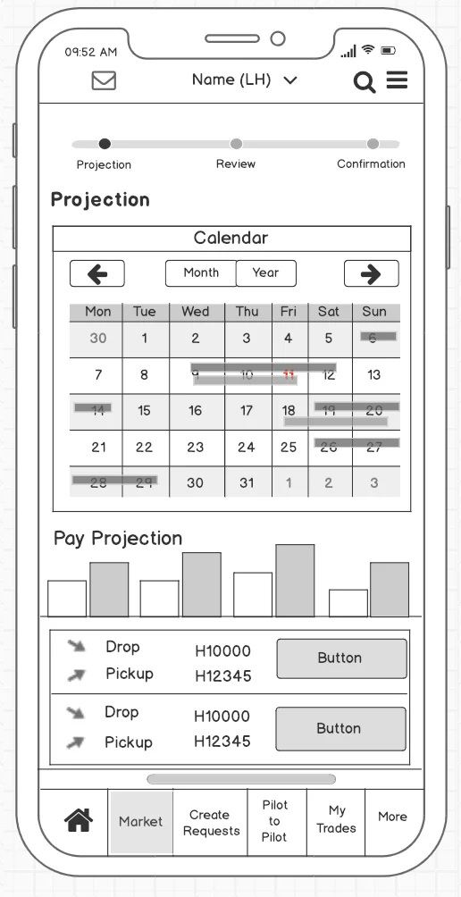
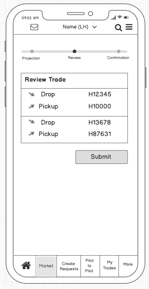
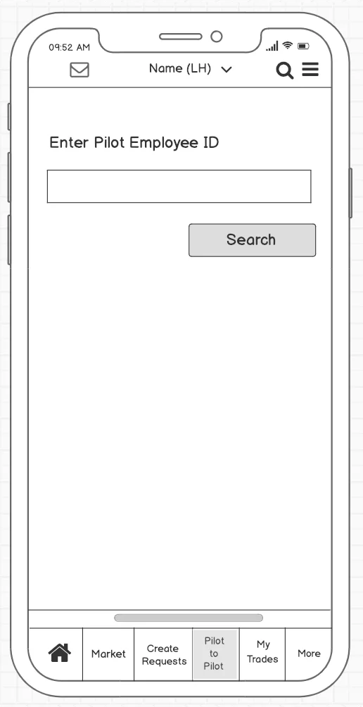
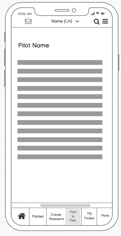
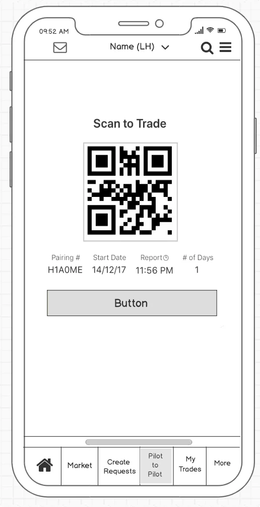
Initial Low Fidelity Wireframes using Balsamiq