TUYA TECHNOLOGIES
ANDROID - SHIPPER AND DRIVER
Client: TUYA Technologies
Role: UX/UI Designer
Tools:






OVERVIEW
SCOPE:
TUYA Technologies is a Houston-based tech company, that is developing and deploying a technology marketplace platform for shippers and drivers in the same-day business to business delivery industry. As a UX/UI Designer for TUYA, I inherited their existing applications and redesigned them to become applications that are easy to use, pleasant to use and meet the needs of our users. My role included conducting user research, wireframing, prototyping, conducting usability testing, high fidelity visual design for all our platforms which are Web, Android, and iOS.
As UX Designer for TUYA, I worked on all of their platforms: Shipper: Android and iOS
Driver: Android and iOS
CHALLENGES:
• I inherited Android and iOS mobile applications that were designed and developed by an outsourced
team. The product was designed without the guidance of a UX Designer so part of the challenge was to
redesign the mobile applications with UX design best practices.
• Update existing TUYA branding and implement it across the applications. The previously outsourced
companies that were hired by TUYA did not have an established design system so part of the challenge
was to create one in order to create cohesiveness across the applications and the website because all
of TUYA’s products looked and worked like they belonged to different companies.
• When the product was first developed, the outsourced team did no research, competitive analysis or
had instruction or interaction with drivers, shippers, or a SME so it was not geared towards the actual
needs of the user. The driver application in particular presented many usability and visual pain points for
for the drivers. Therefore I had to collaborate closely and extensively with our users and the SME among
other stakeholders to redesign the product to meet the needs of our users.
• When I had inherited this product, there was limited time to update the product before the stakeholders
and board of directors launched the product into production therefore one of the bigger challenges was
to update UI components and interactions without causing major disruptions to the customers
that started using the product at launch.
ORIGINAL MOBILE APPLICATION
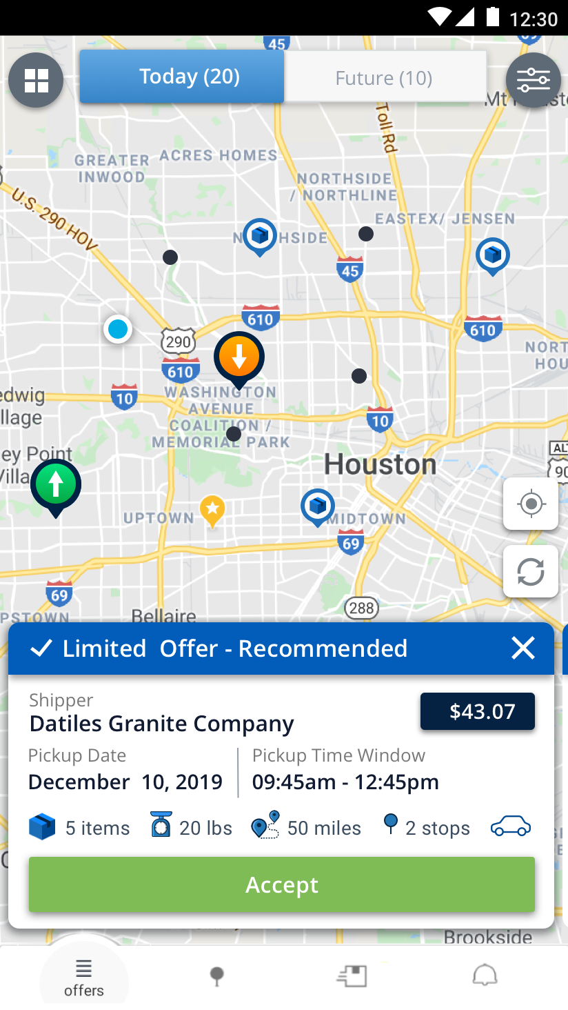
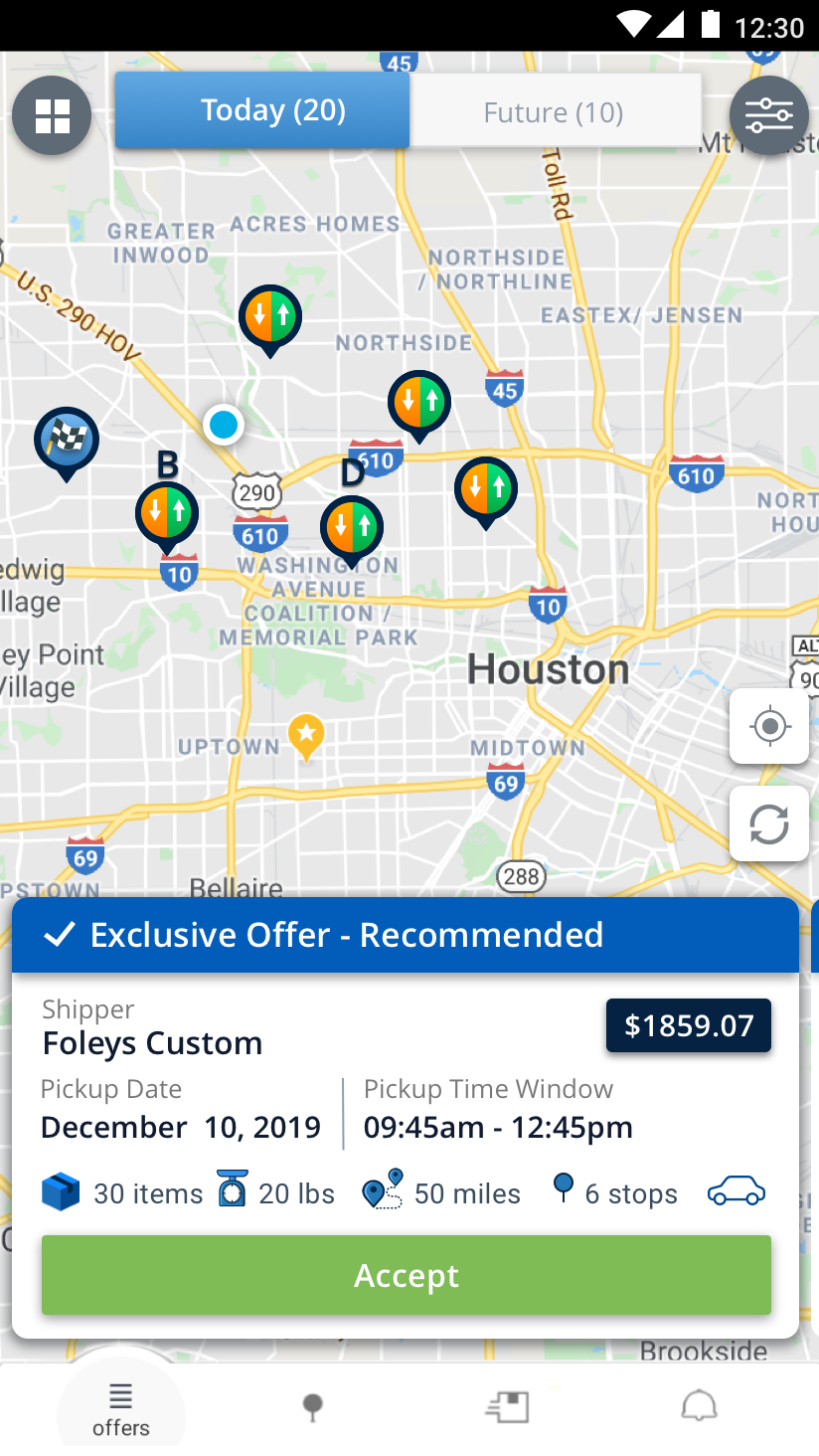
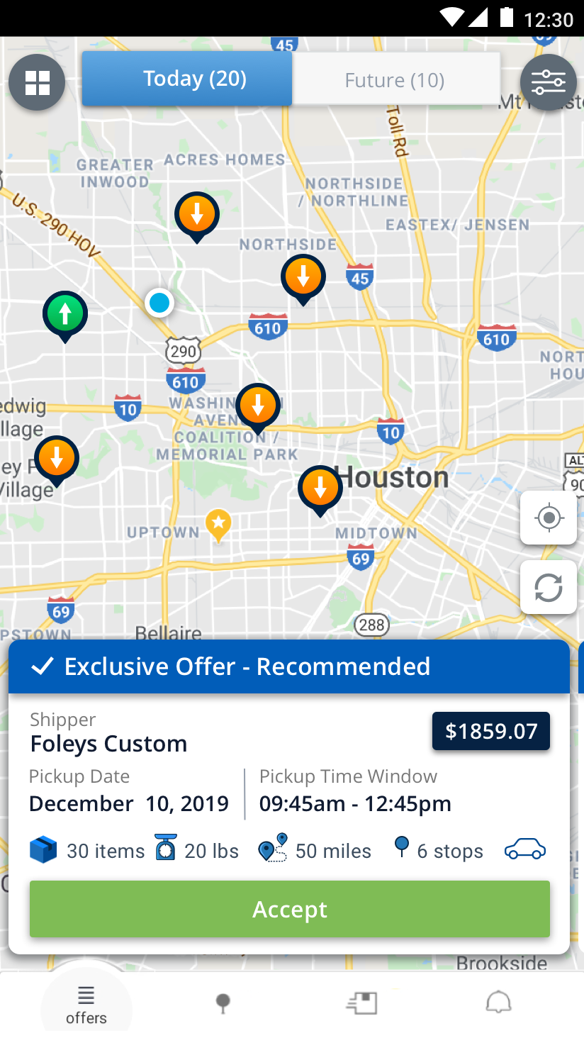
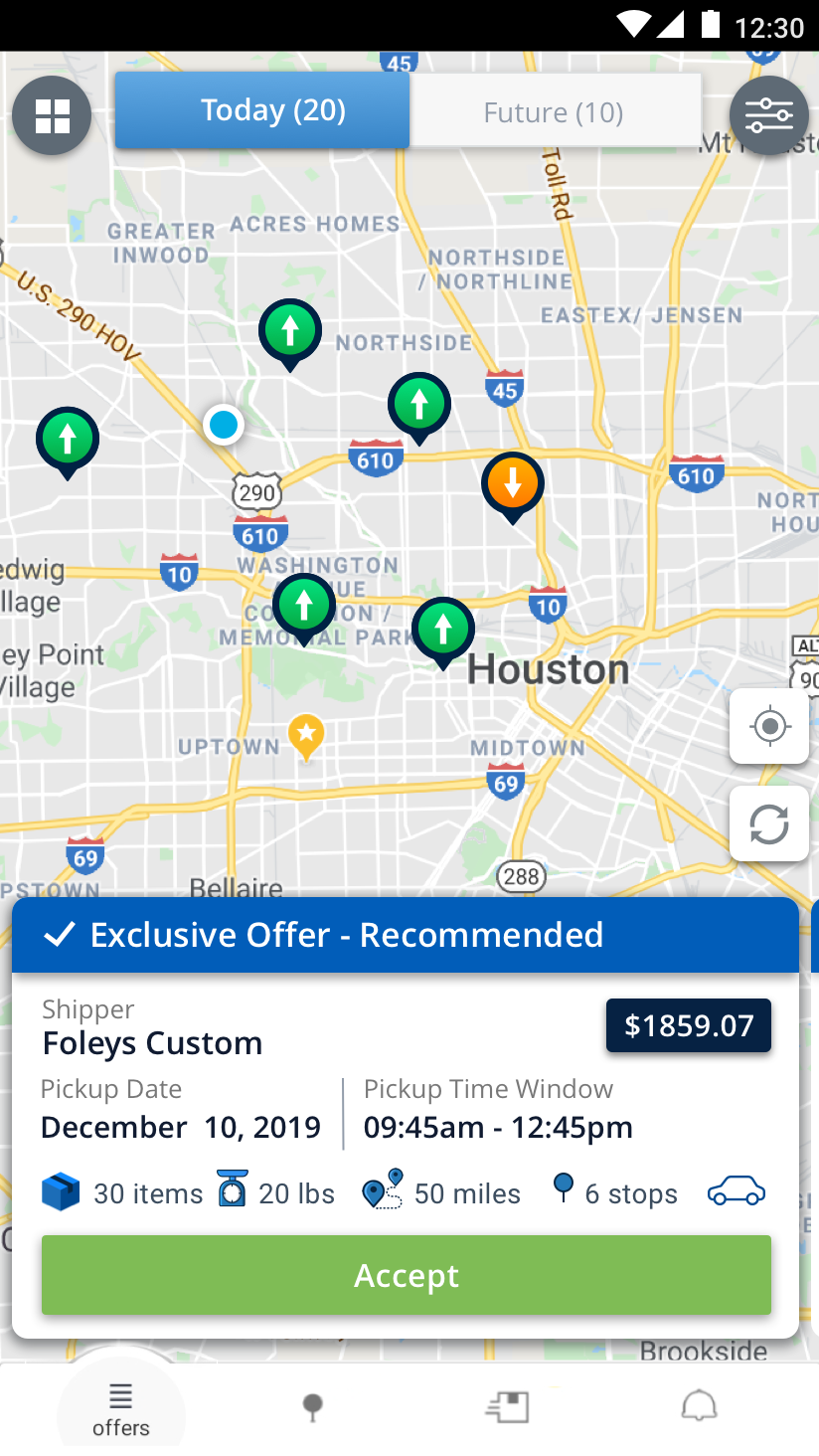
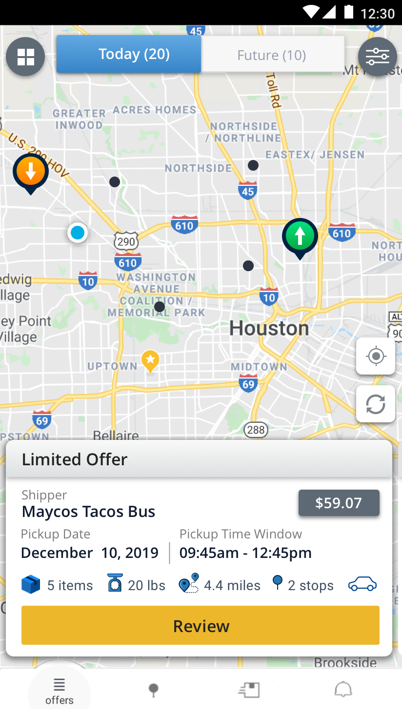
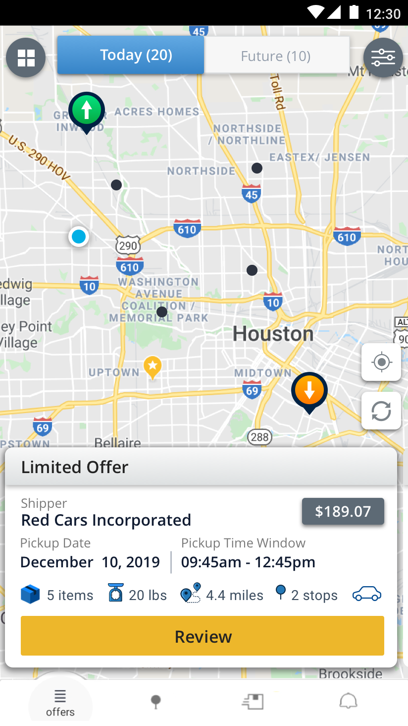
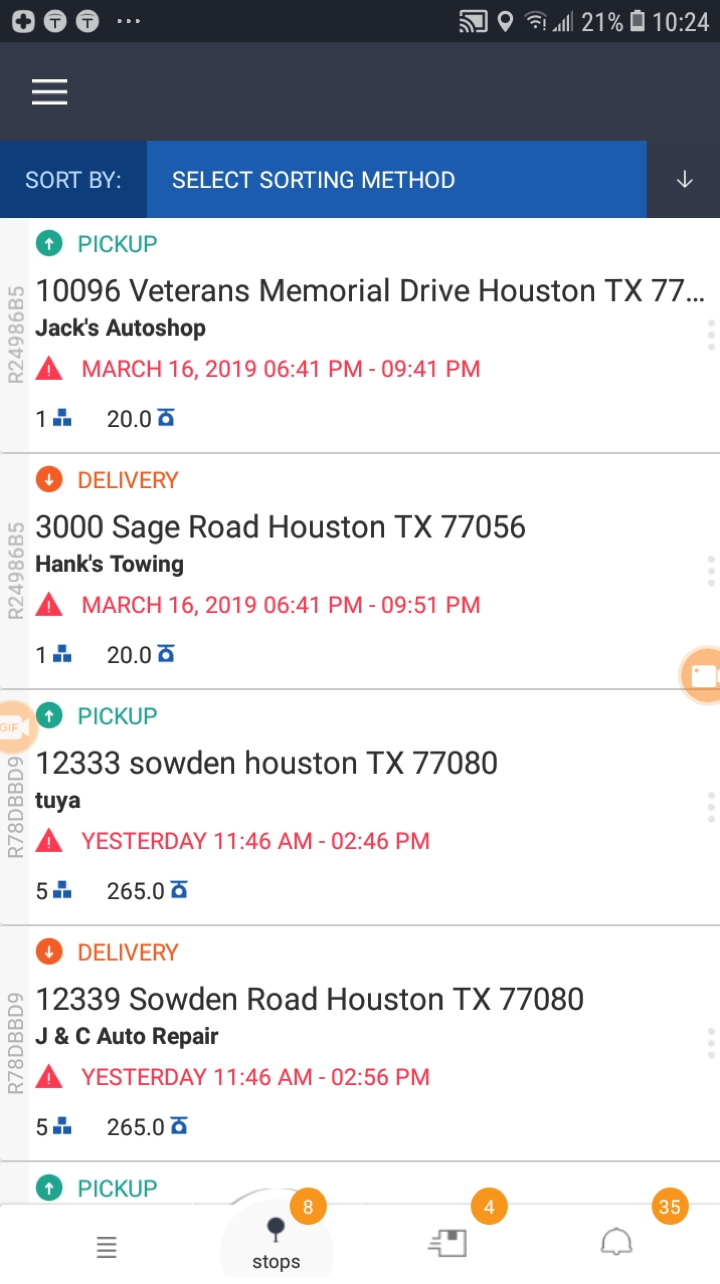
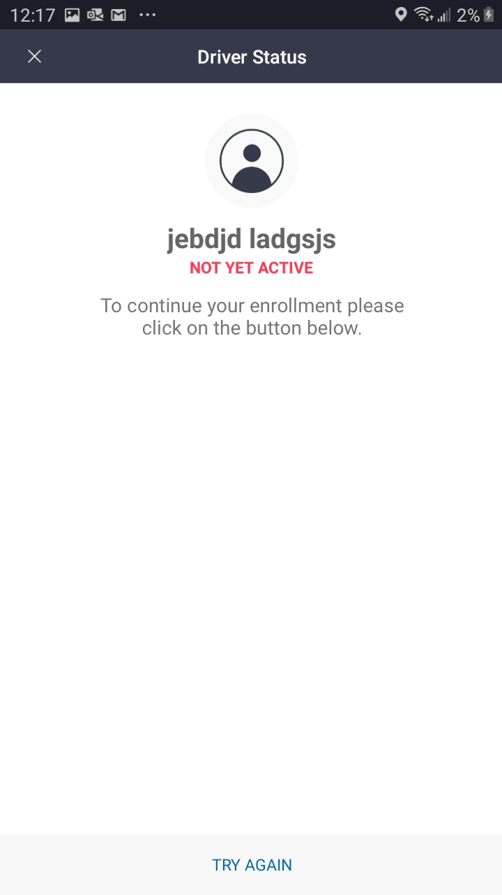
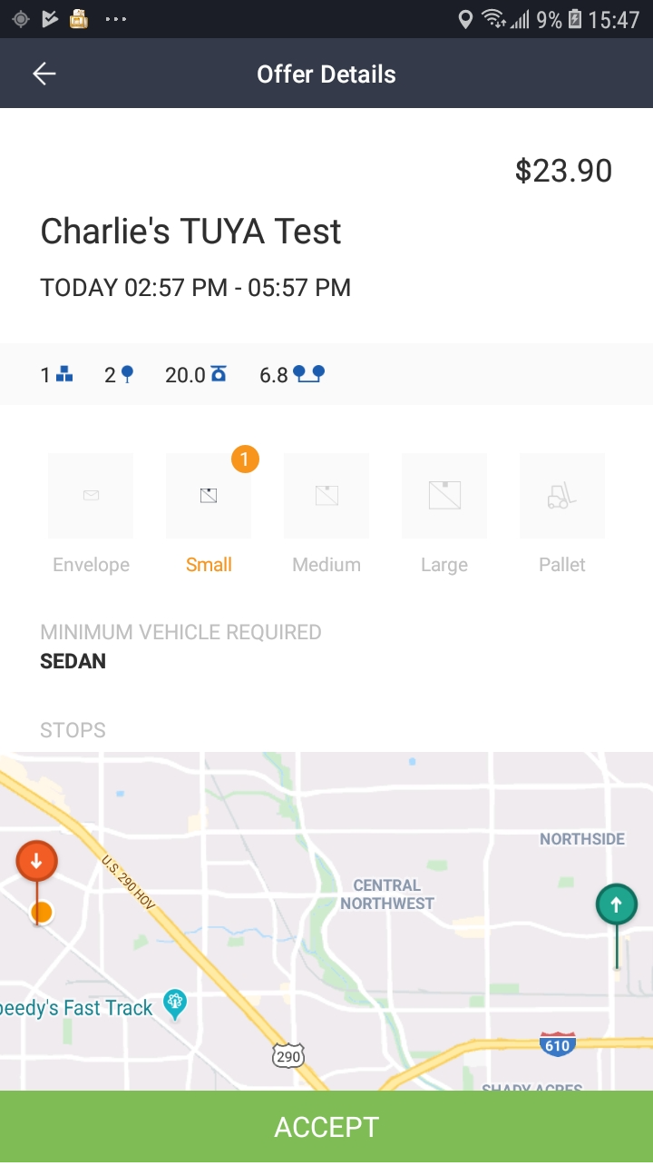
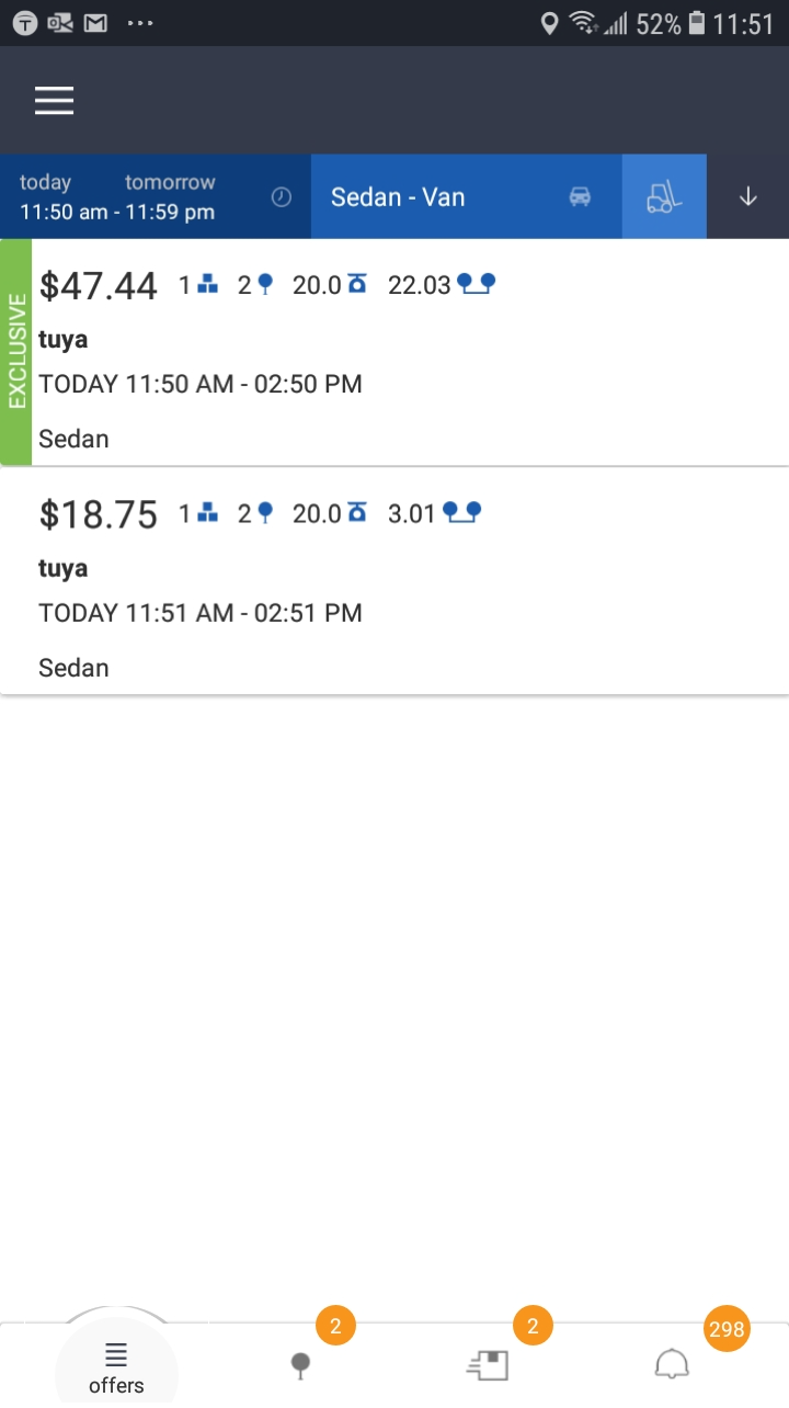
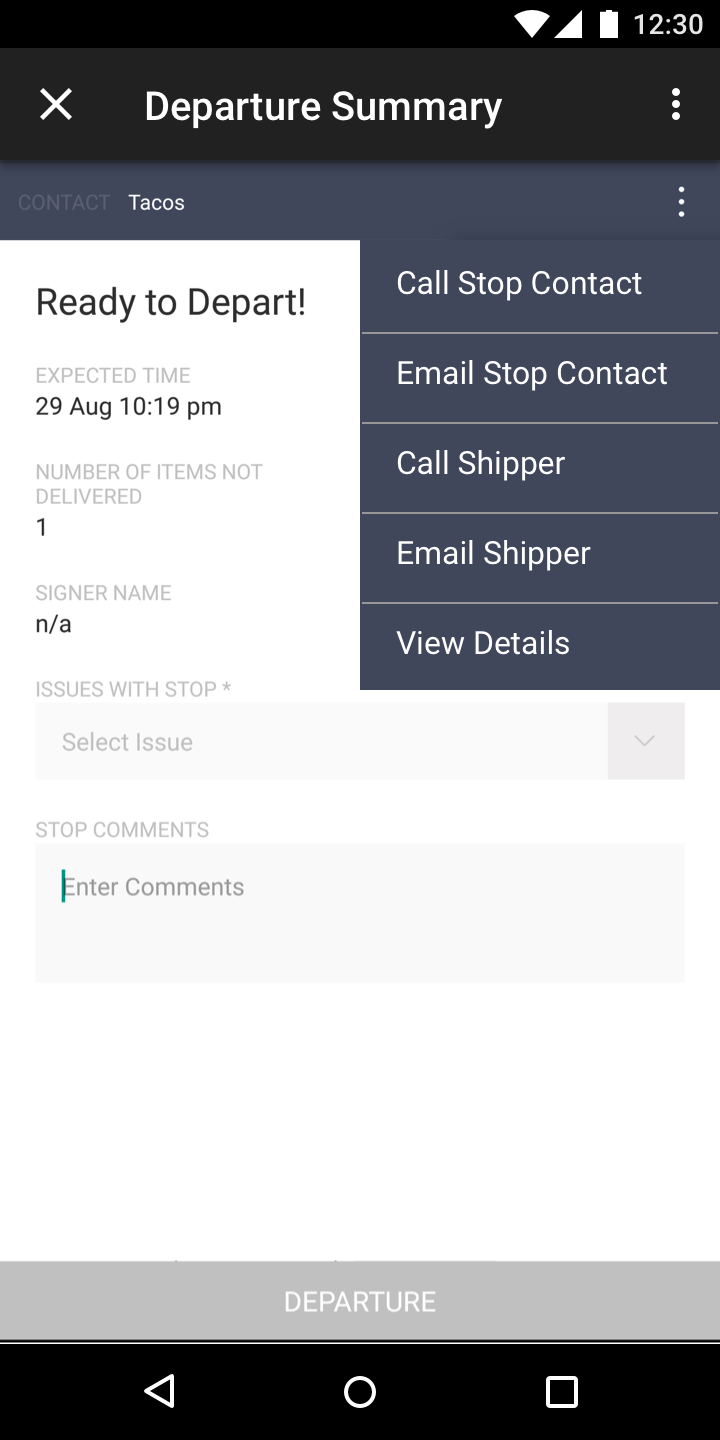
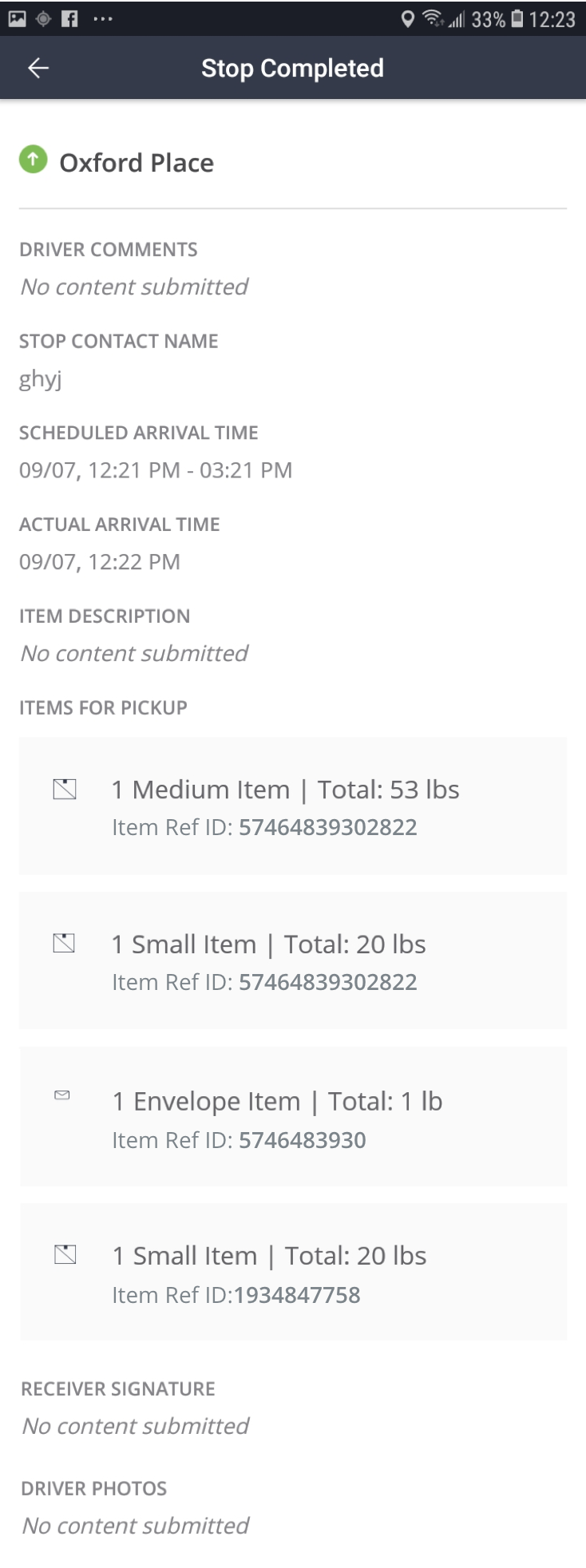
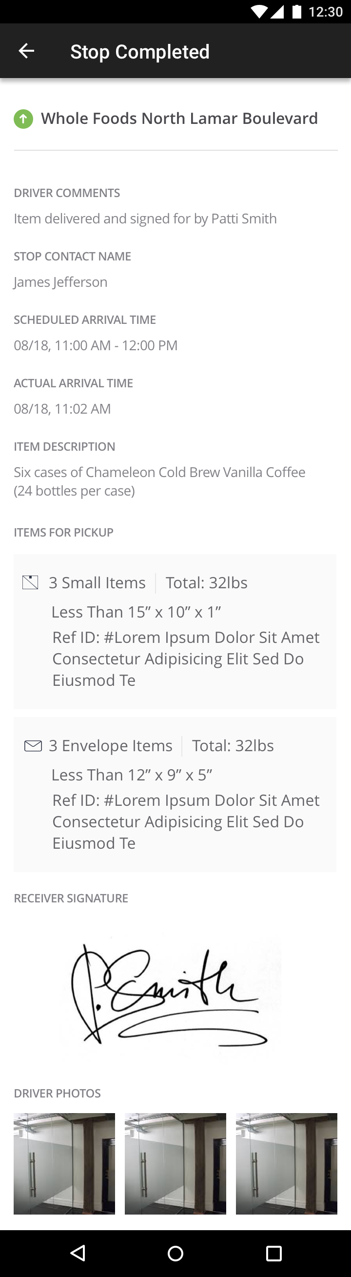
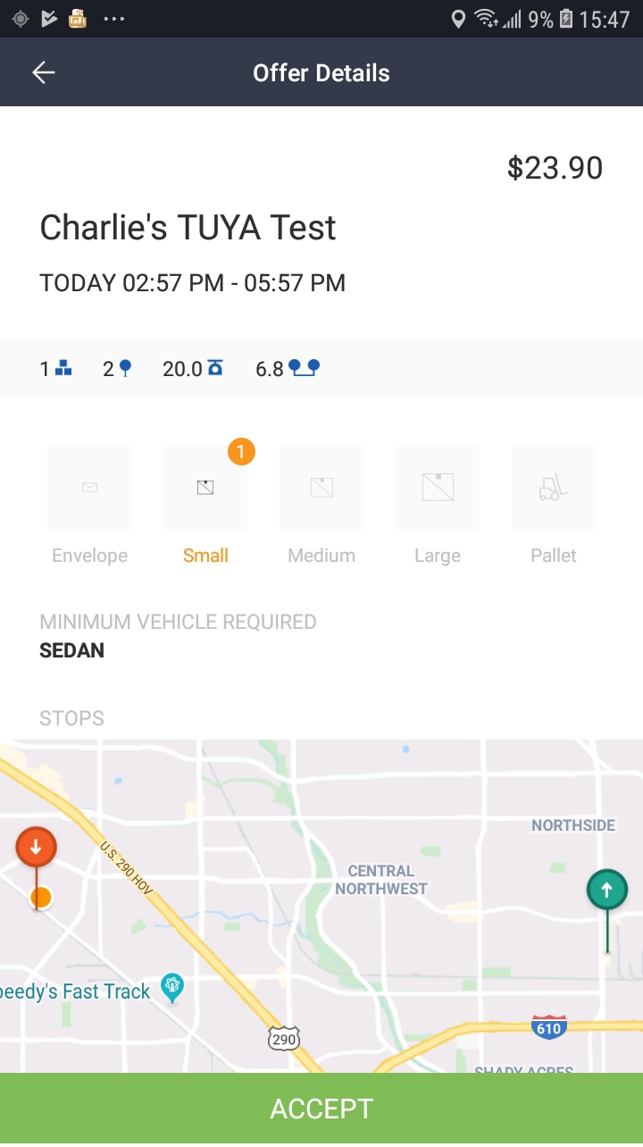
Here are some screenshots of the work done and implemented for the Driver Application - Android by the outsourced teams:
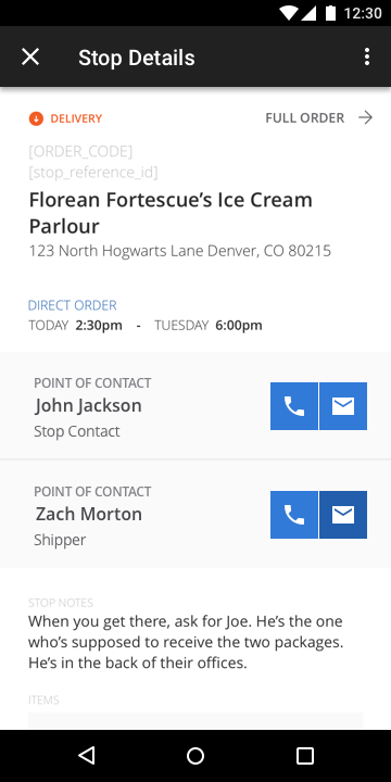
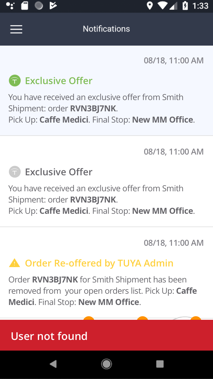
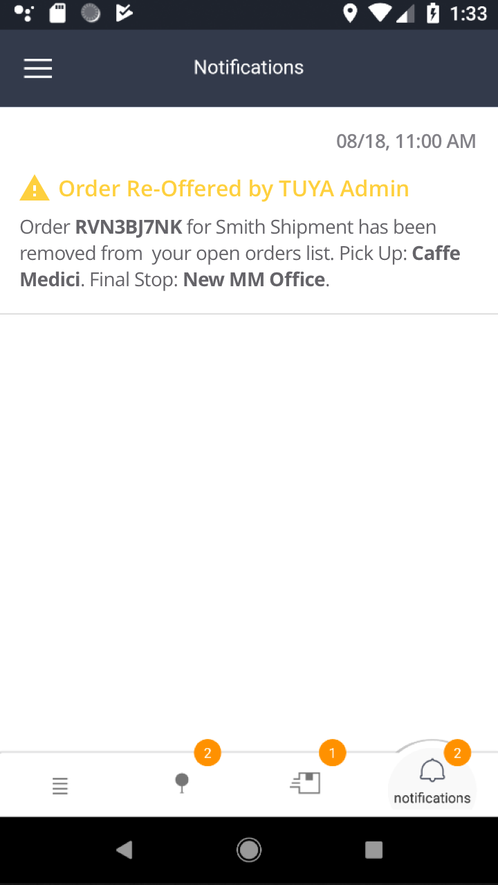
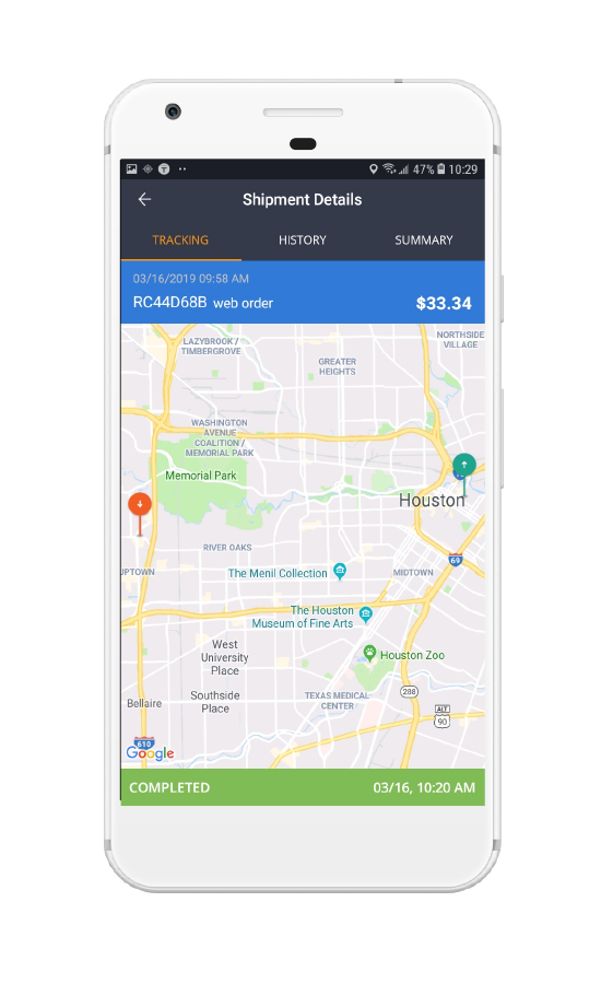
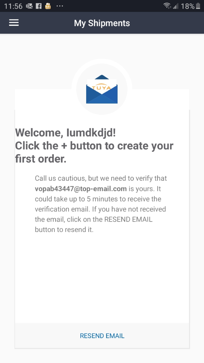
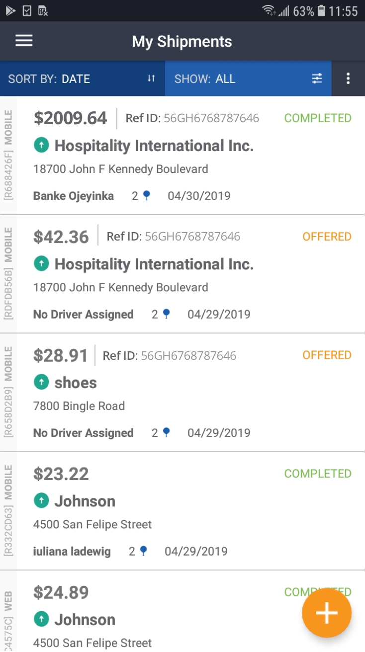
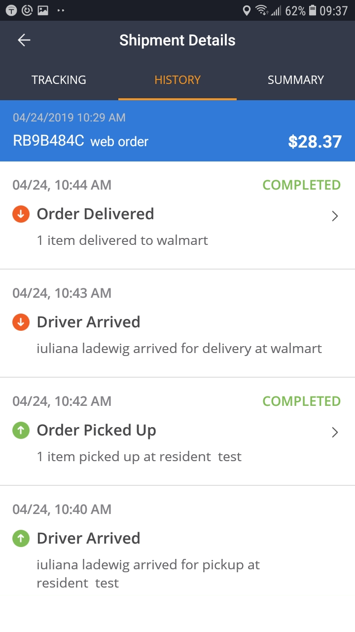
Here are some screenshots of the work done for the Shipper Application - Android by the outsourced teams that I inherited:
RESEARCH
Methodologies Used:
• Secondary Research
• Competitor Analysis
• Usability Testing of existing products
Usability Testing of the Mobile Applications - Driver and Shipper
I conducted usability testing for the driver and shipper in order to pinpoint and have an understanding of where the users were having issues or had major pain points when using the existing application. This allowed me to understand where we needed to focus a lot of attention in updating the application to create a better user experience.
Shipper Mobile Usability Testing Takeaways
Some of the takeaways I gathered from the usability testing for the Shipper application I conducted were:
“Stop name was confusing. Maybe change it to delivery location instead of “Stop Name”
because I had to actually think about what I had to type.”
“Much easier than the Shipper Web.”
“The application pushed me/navigated me right through the application.”
“Very straight forward.”
“Would like to scroll but can’t.”
Driver Mobile Usability Testing Takeaways
Some of the takeaways I gathered from the usability testing for the Driver application I conducted were:
“I will be in a car accident if I try to use this application.”
“Not user friendly.”
“There is no way to find help.”
“When you accepted and order, it didn’t tell you the address right away.”
“I do like that from the get-go it shows you on the map where you are going and how far the
job is.”
“It was super stressful and frustrating.”
“Trying to find which order was the one I just picked up was like trying to find a needle in a
haystack.”
“The stop screen is very busy.”
“I didn’t know what to do next after accepting an order.”
“I felt confident using it until I had to go find the order. That was really confusing.”
“It caused me some stressed. Compared to the shipper mobile, it was a lot harder.”
“It was time consuming. If I downloaded this and had such a hard time using it like I just did, I
would delete it immediately.”
STRATEGY
With all the information and data that was collected from the usability testing, the secondary research, and competitive analysis, it helped me move in the right direction to start redesigning the with the user’s needs in mind all the step of the way.
REDESIGN EXAMPLE
During the redesign process some pages were kept in the old design style but interaction patterns and new UI elements were gradually replaced the old ones. Always working closely with the product owner, BA, and the SME, I developed a well-received concept, which was modern, minimalist, and matched the corporate branding guide and addressed our users’ pain points to achieve an improved user experience for the mobile applications.
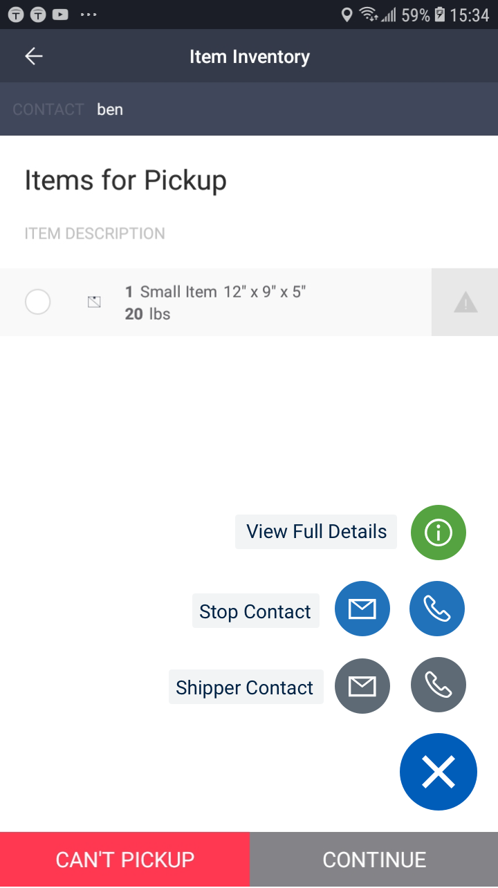
Driver Application - Full View Details
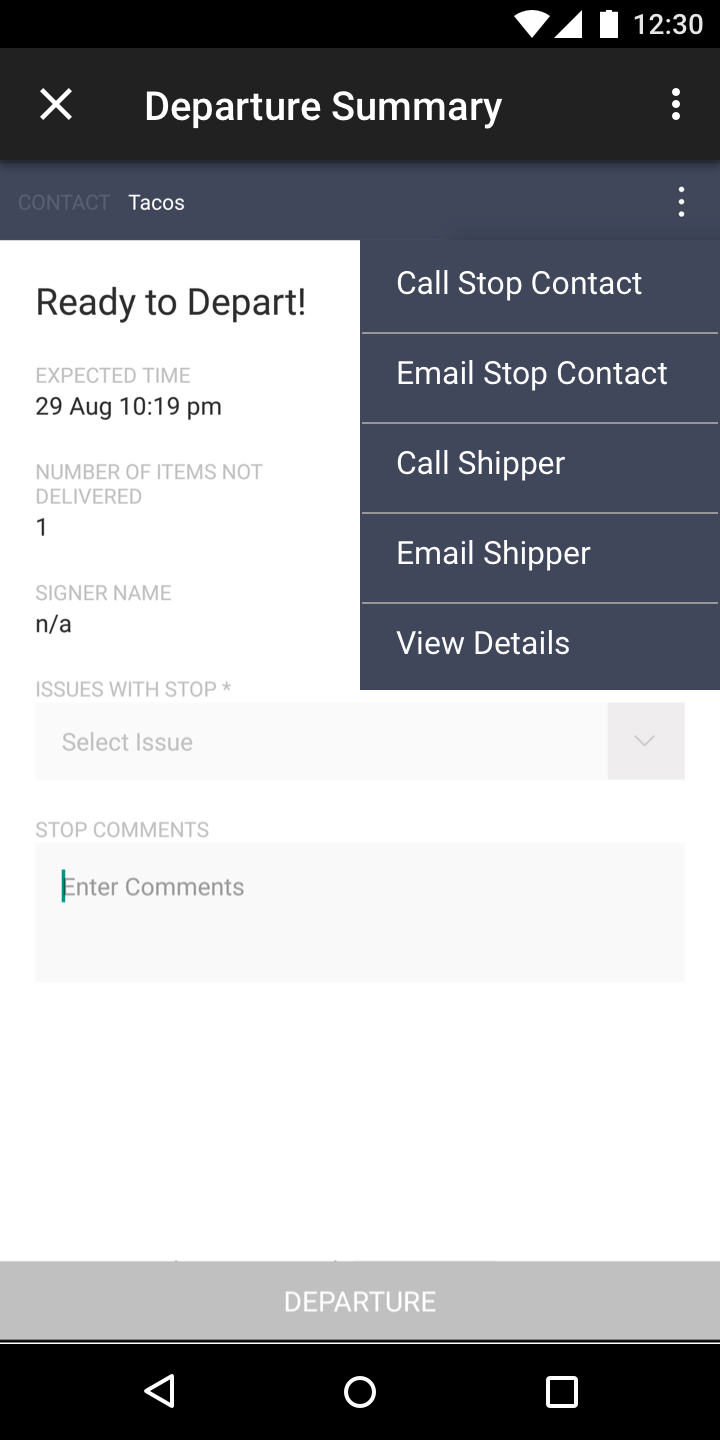
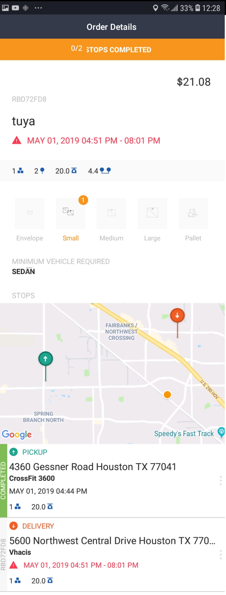
One of the major pain points that I discovered during Usability Testing and feedback gathering was that the drivers had to tap on “unarrive” every single time they went to pickup a package. This was due to the fact that when they arrived to a location, the person shipping the package wanted to know where the package would be delivered to. The original outsourced company that initially designed the application displayed this vital information on a screen where the driver would not have access to once they “arrived” to the destination, so the drivers had to tap “unarrive” on the screen to see all the delivery and pickup details.
- The information that the drivers needed was hidden in the “more options” icon. The majority of drivers
did not know what the “more options” icon was for therefore they never tapped on this.
- Another problem was that even though the driver could tap on view details, that screen lacked
important information like delivery location so it was incomplete which made the driver have to tap
unarrive anyway.
- This in turn caused a domino negative effect because on the shipper side of things, the shipper would
see the driver arriving and then unarriving which would cause distrust for the shipper and the major
models of the company was to offer transparency and comfort for the shipper. \
Original View Details Screen and Full Details Screen for Driver Application
These are the screens designed by the original outsourced company.
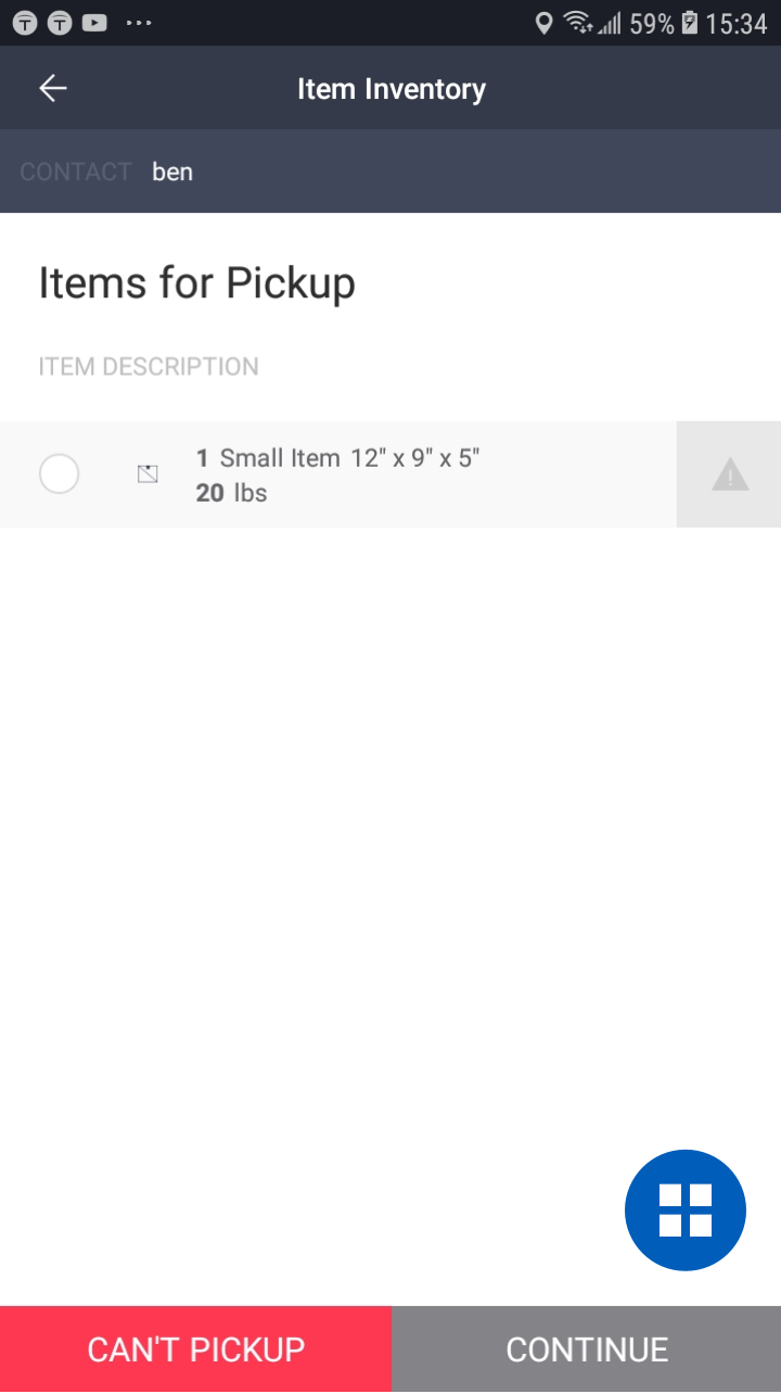
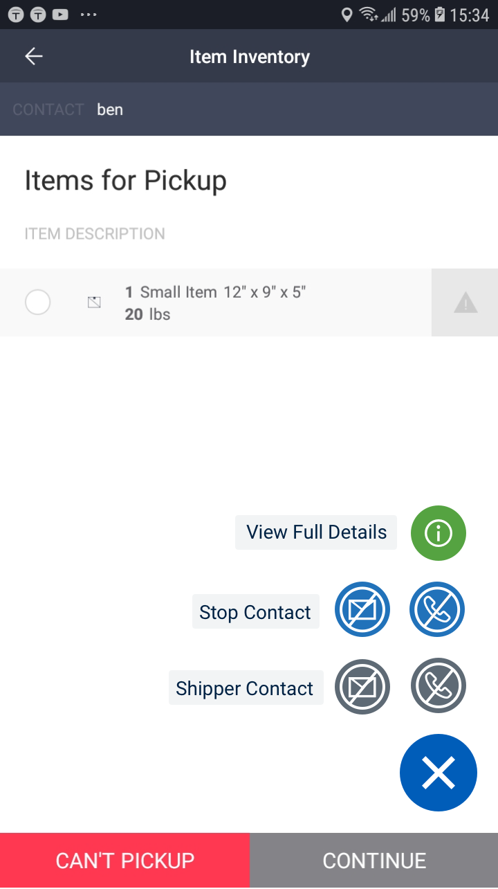
New Redesign of the View Details Screen
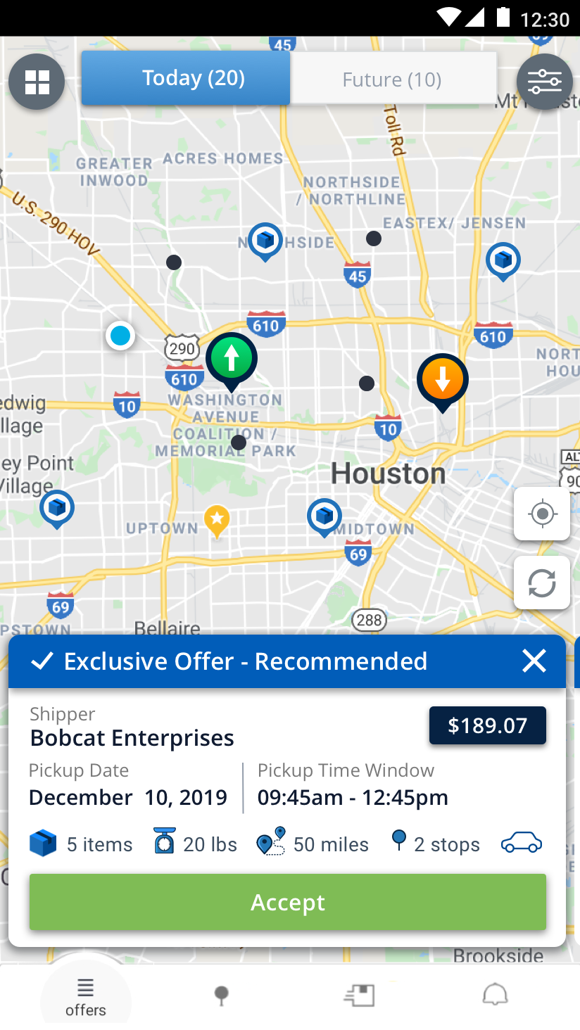
Taking into consideration the needs of our drivers along with the fact that they are constantly on the move, I designed a floating action menu button for easy access and visibility for the driver where they could access the information they needed when they needed it.
NEW FEATURES
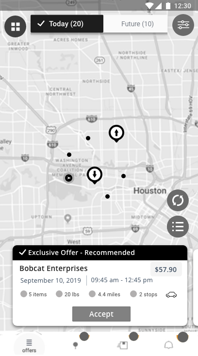
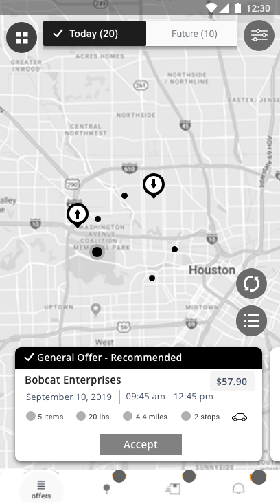
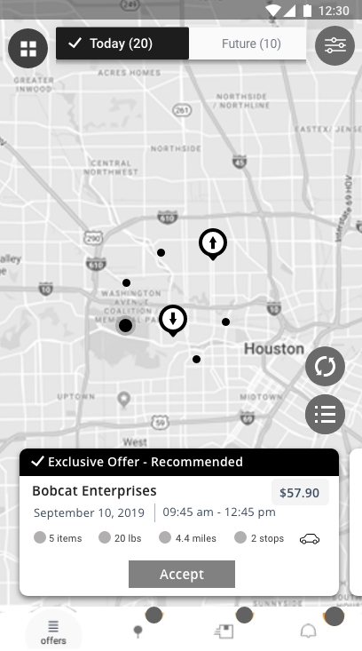
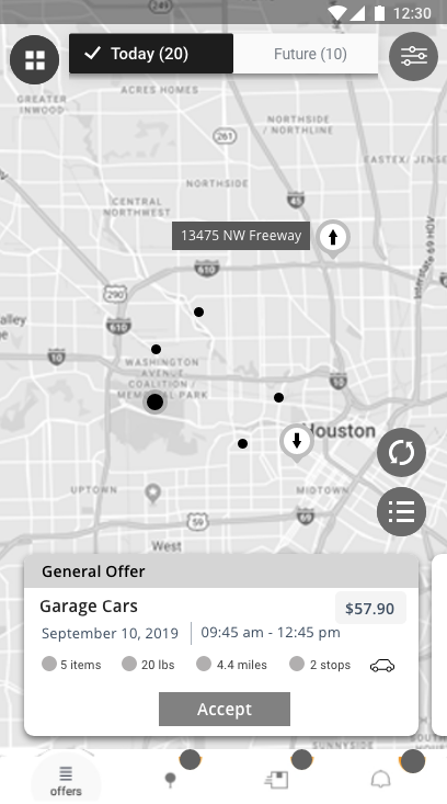
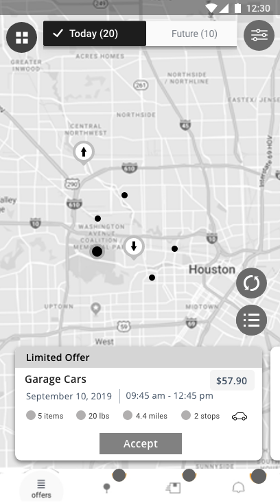
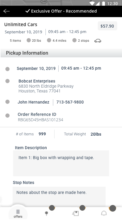
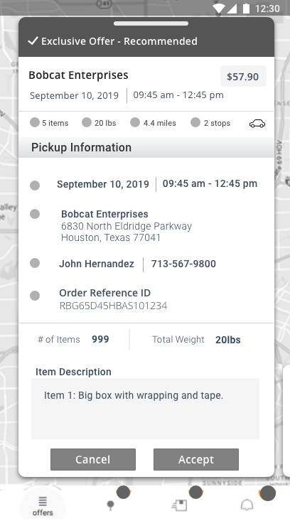
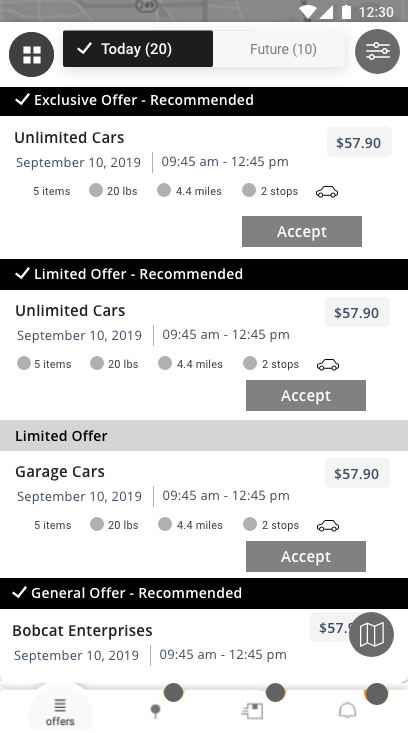
Initial Low Fidelity Wireframes using Sketch - Redesign of Offer Screen/Multi-stop New Feature
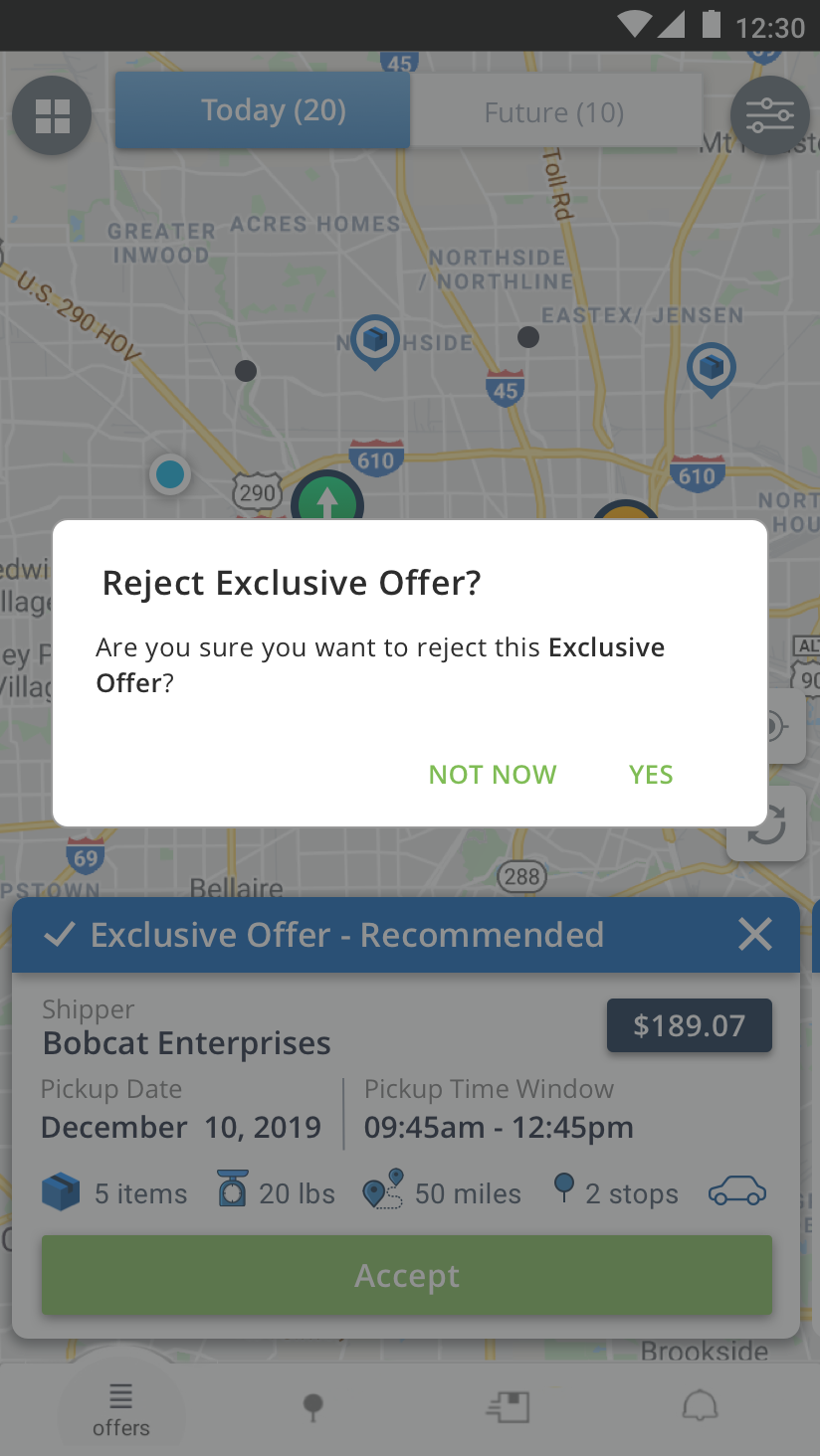
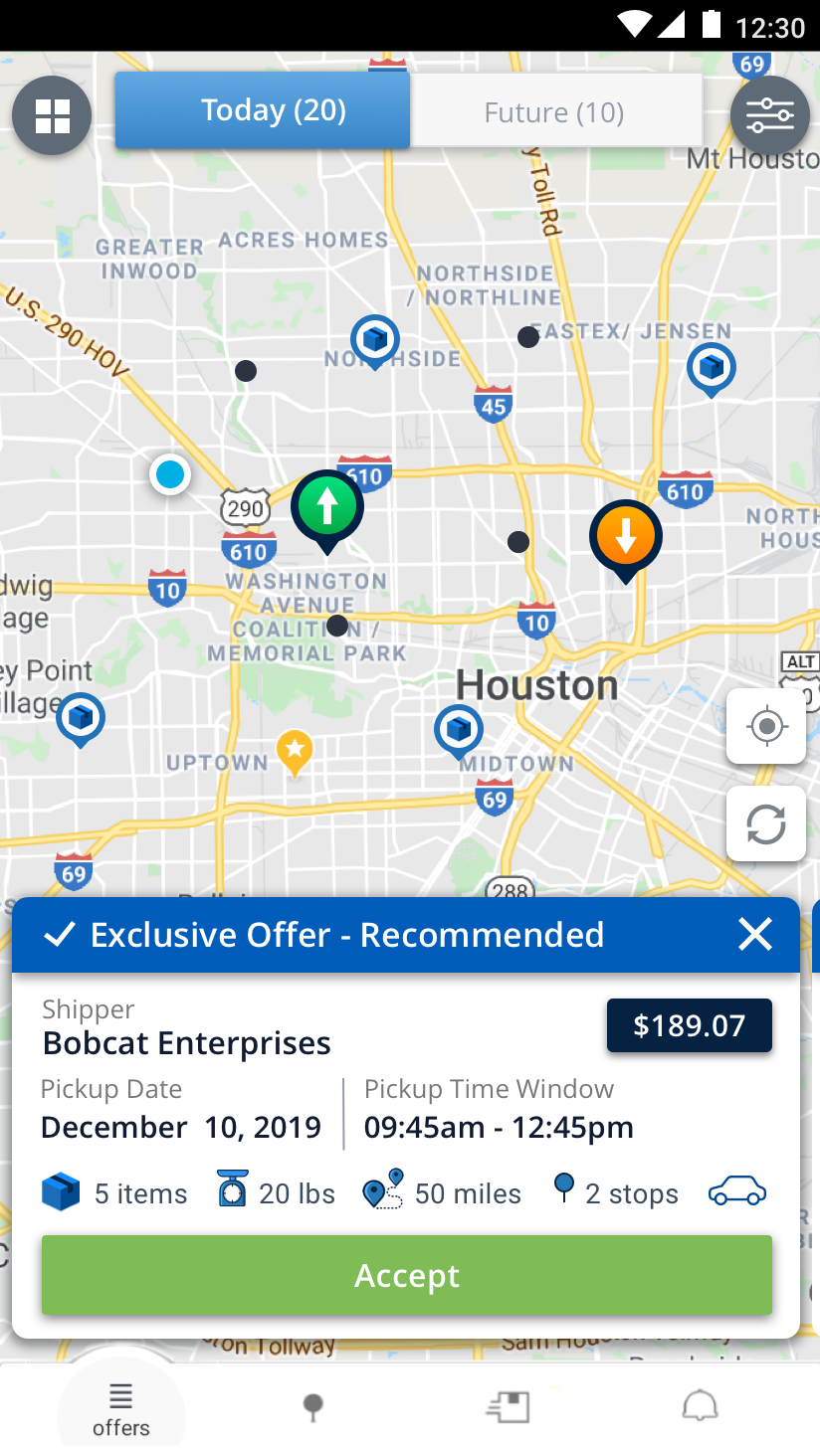
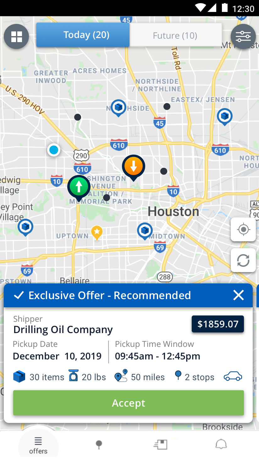
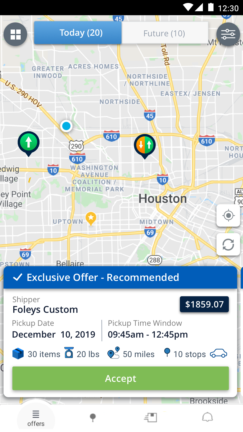
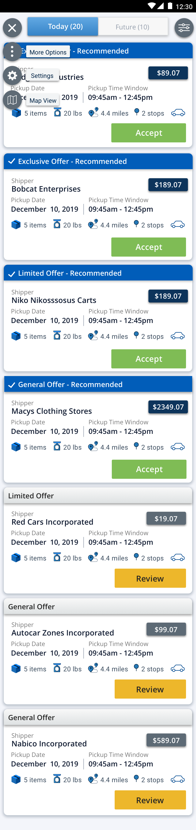
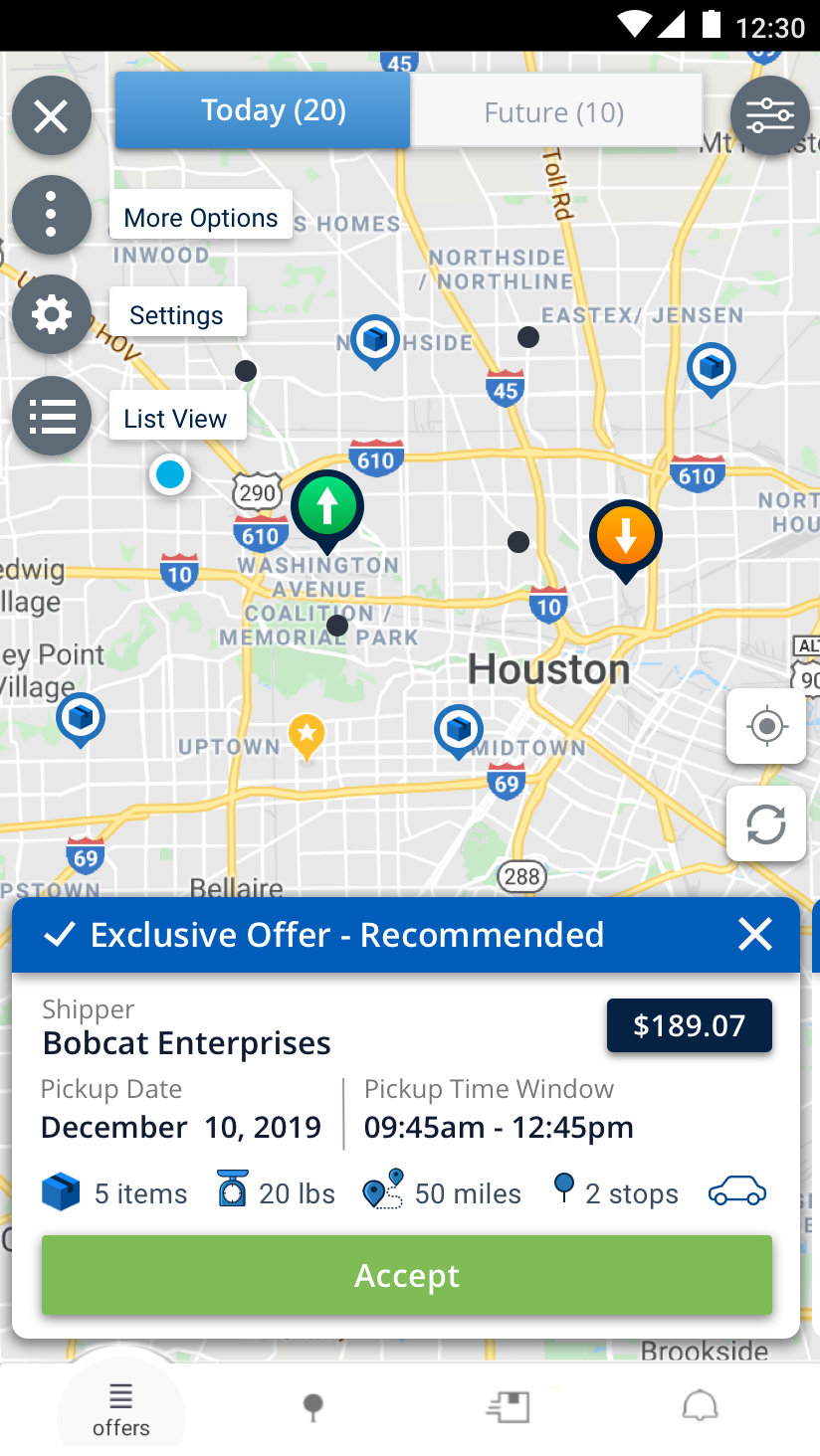
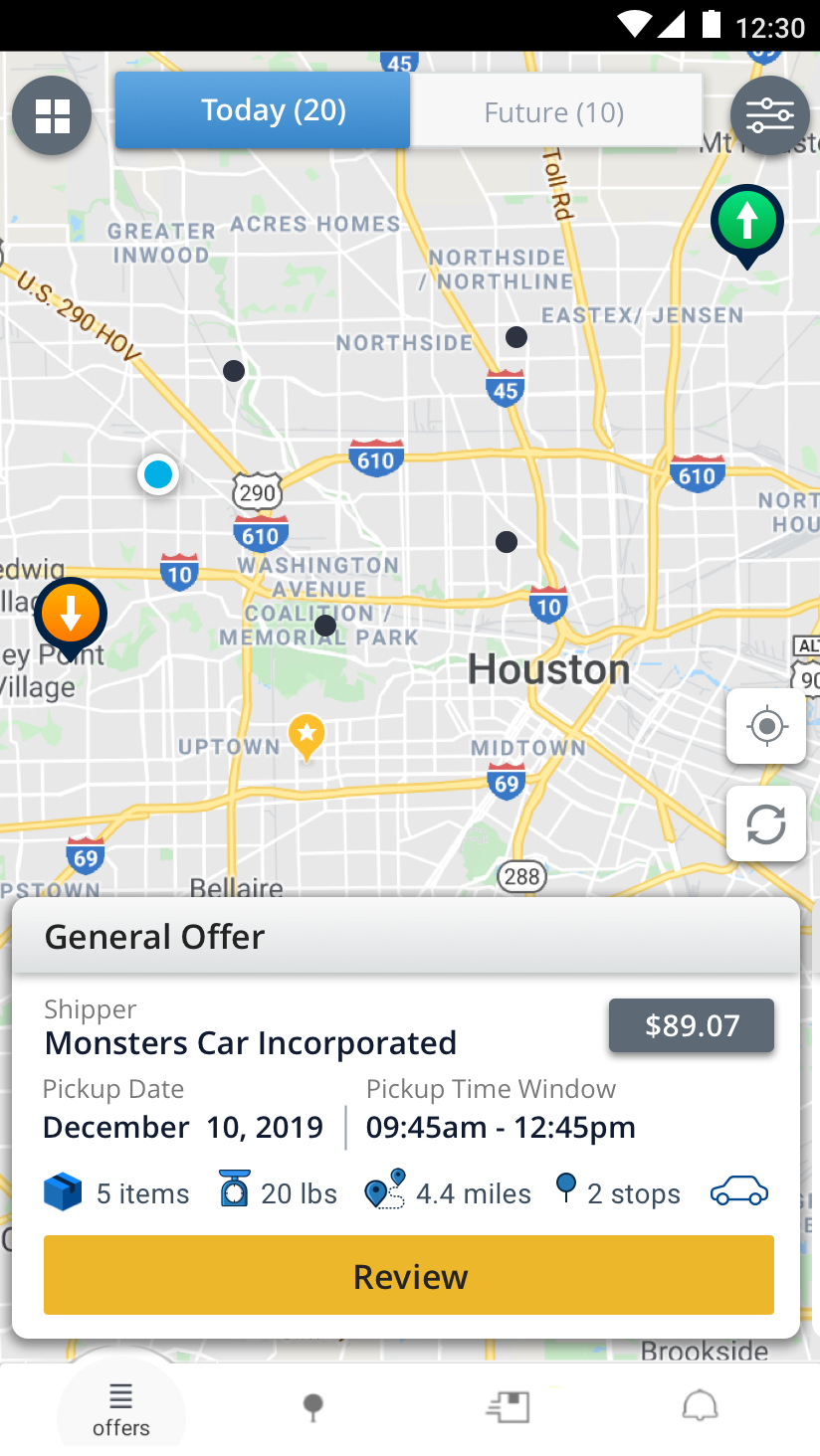
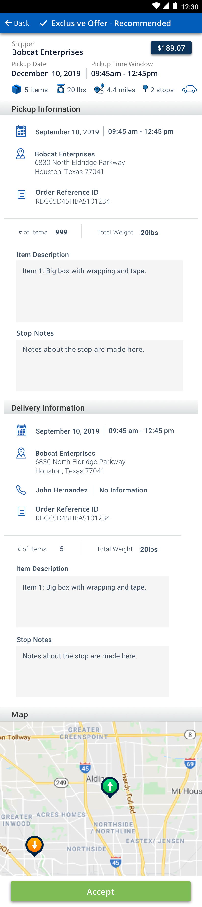
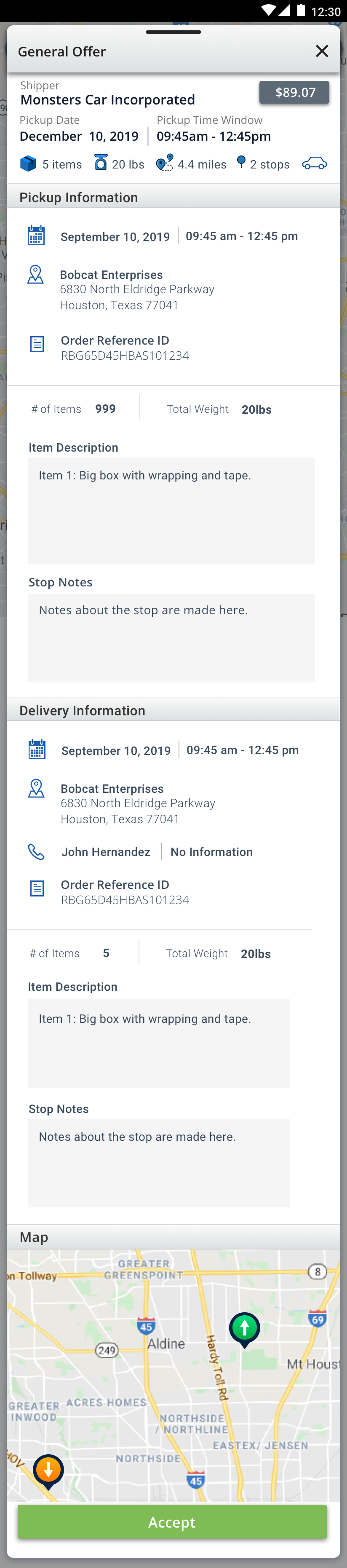
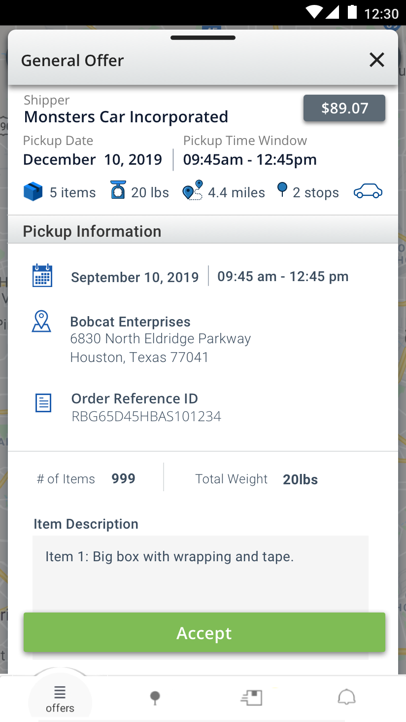
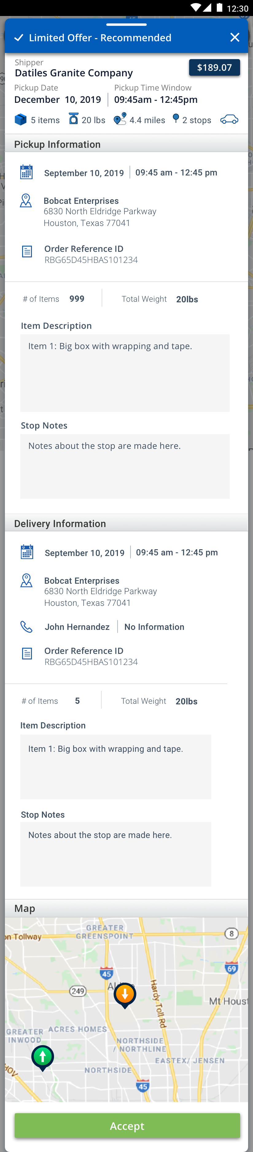
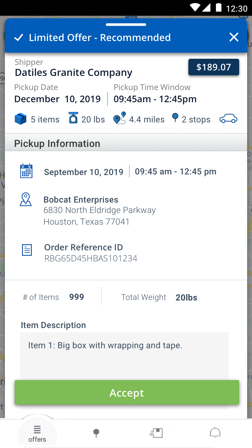
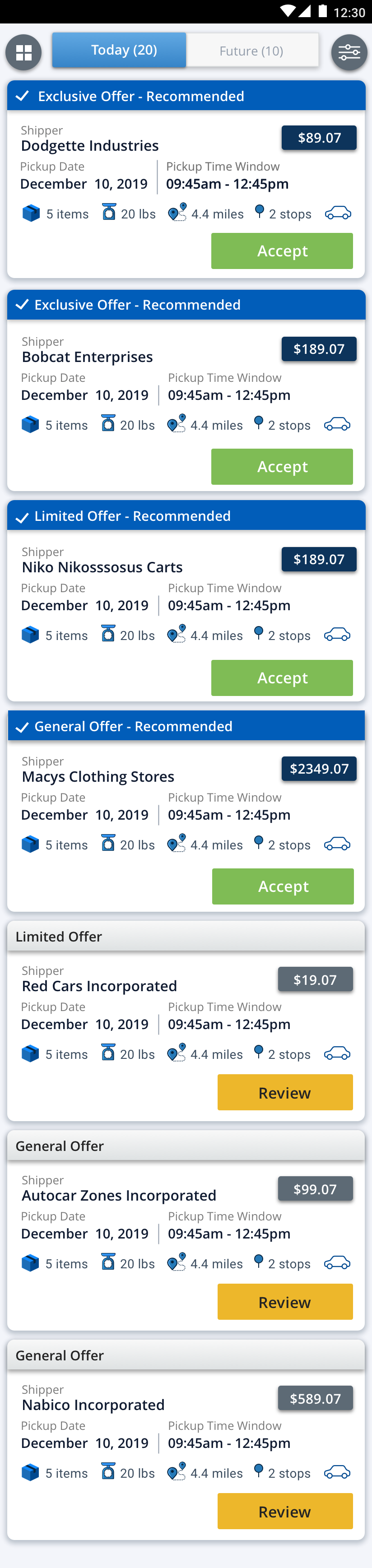
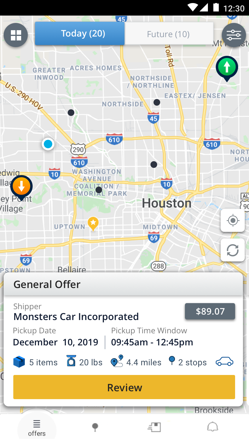
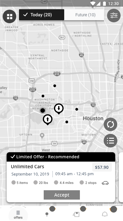
One of the new screens/workflows I designed was this new feature called Multi-Stop. Along with the integration of the new feature called Muti-stop, I redesigned the “Offers” screen for the driver application. Prior to designing the low-fidelity wireframes on the computer, I did some brainstorming with the requirements and all the research I did, in mind. Keeping the project scope in mind and all the research and feedback I had gathered, I grabbed my notebook and a pencil and I sketched out some ideas of what I visualized the new multi-stop might look like integrating all the requirements. There were several rounds of iterations made to the feature before a finalized version was complete.
Different iterations of the low fidelity wireframes for Redesign of Offer Screen/Multi-stop New Feature:
Visual Design
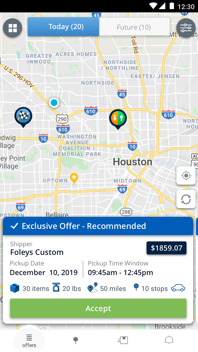
High Fidelity Wireframes: Visual design was done implementing TUYA branding. A significant effort went into trying to create cohesiveness with the shipper web and shipper mobile application since the original state of the applications looked like they all belonged to different companies.