UNITED AIRLINES FLIGHT ATTENDANT SCHEDULING WEBSITE - CCS
Client: United Airlines
Role: UX Designer • Interaction Design
Tools:




OVERVIEW
SCOPE:
When United Airlines and Continental Airlines merged, each company used a unique scheduling system and website for their flight attendants. The UX team was tasked with the complete overhaul and redesign of the Crew Communications System integrating both Unimatic (Pre-merger United) and CCS systems (Pre-merger Continental Airlines) that the Flight Attendants use to bid for their work trips, look at their schedules, trade trips with other flight attendants, look at their pay register, etc. The outcome would be a website designed using the principles of User Experience Design and UX best practices. This was the first time that UX Design would be used in United Airlines Crew IT to design a website. The CCS had been in production since 1998 without any major updates to the interface. The new fully responsive website would be used on a daily basis by the 27,000 flight attendants employed by United Airlines.
CHALLENGES:
• Re-design their current website and turn it into a responsive website (desktop, tablet, and mobile) that covers the main functionality: Electronic Bulletin Board and subsequent pages along with a brand new landing page.
• Implement United branding guidelines.
• Re-design of several important pages currently being used by the flight attendants.
• Work closely and extensively with the Flight Attendant Union and the JIT(business) among other stakeholders to ensure compliance with regulations and other requirements.
ORIGINAL WEBSITE
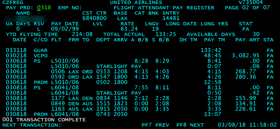
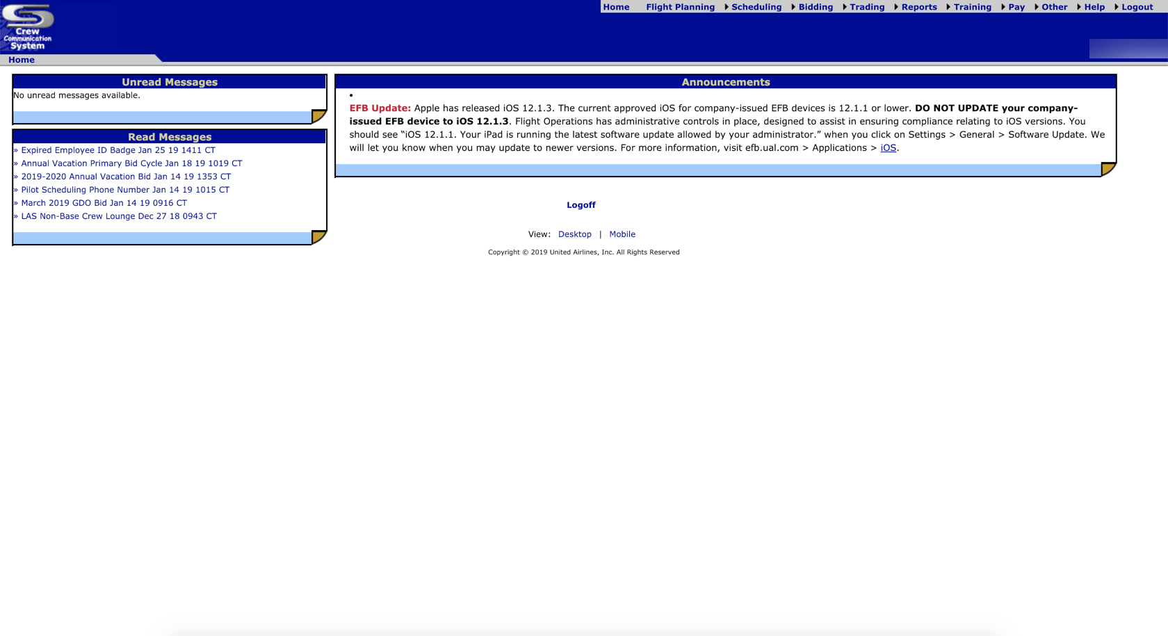
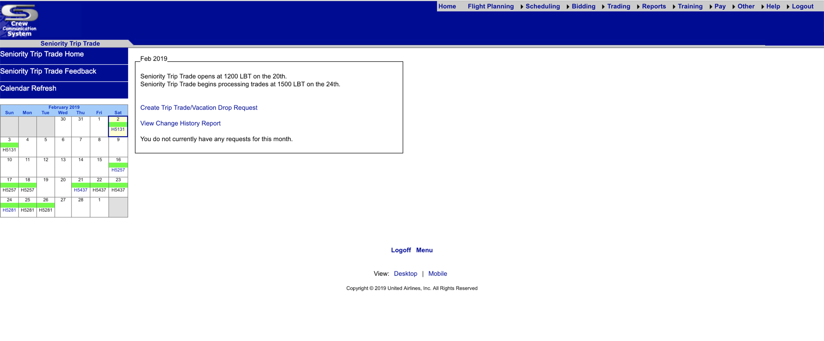
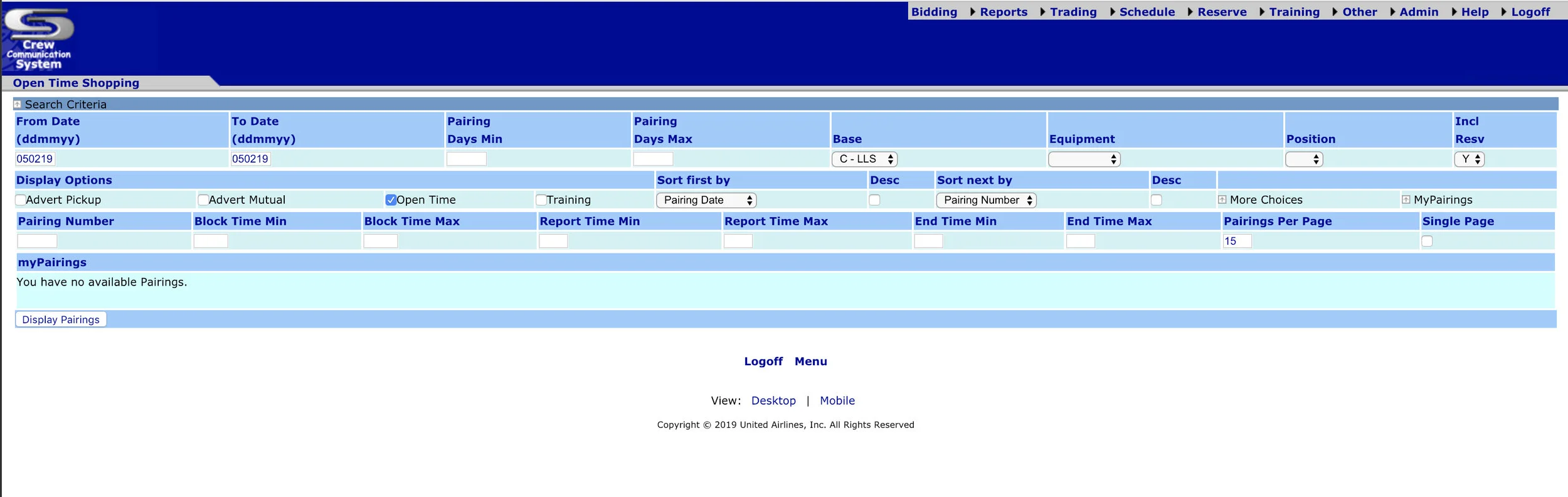
Here are some sample images of the old versions of the CCS website.
RESEARCH
Methodologies Used:
• Secondary Research
• Competitor Analysis
• Interviews
User Interviews
User interviews were conducted in person. These interviews were conducted at the Houston (IAH), Denver (DEN), San Francisco (SFO) bases, and at the Willis Tower in Chicago. A total of 42 Flight Attendants were interviewed, 21 of them were from United Airlines (pre-merger), 17 Continental Airlines, and 6 participant focus group.
Takeaways
Some of the pain points gathered from the user interviews we conducted were:
• User had to type in a lot of the information instead of quickly selecting the data they needed.
• User interface was outdated.
• Too many dropdowns
• The way information was presented was confusing and was hard to understand.
STRATEGY
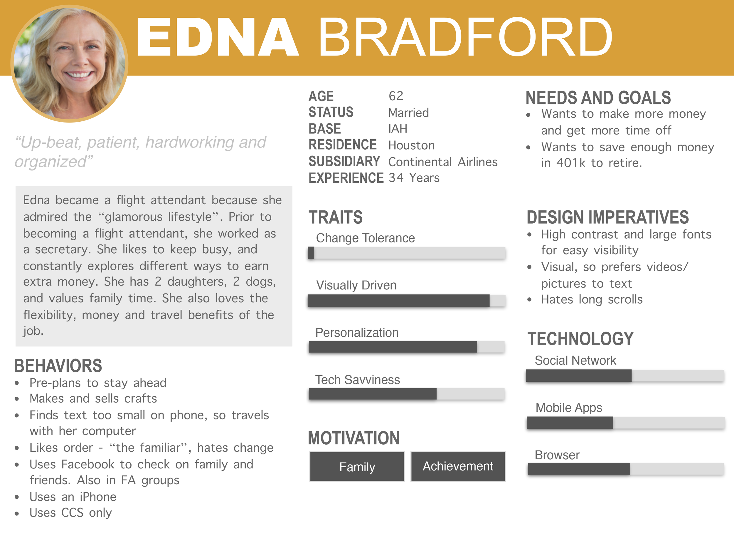
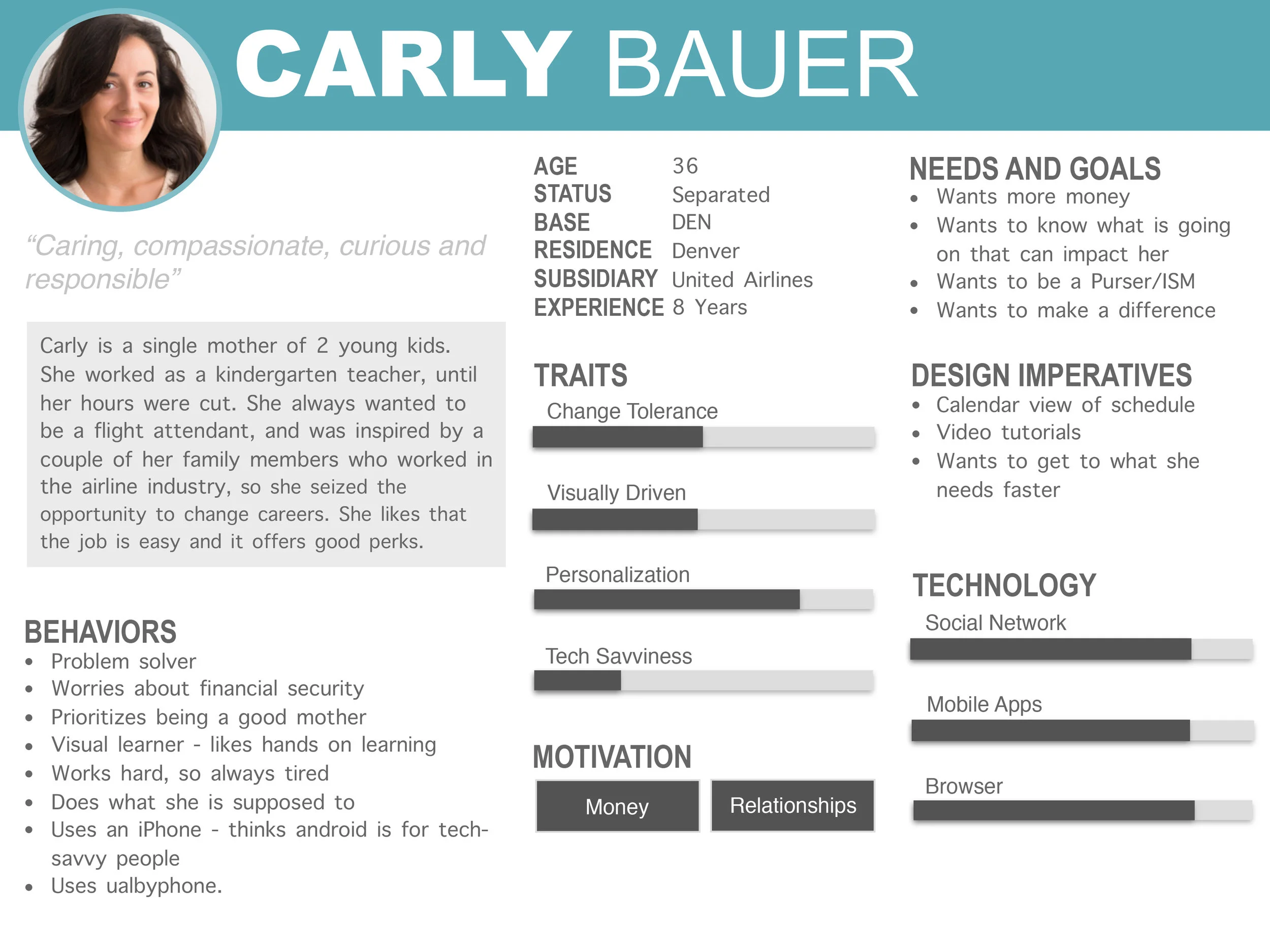
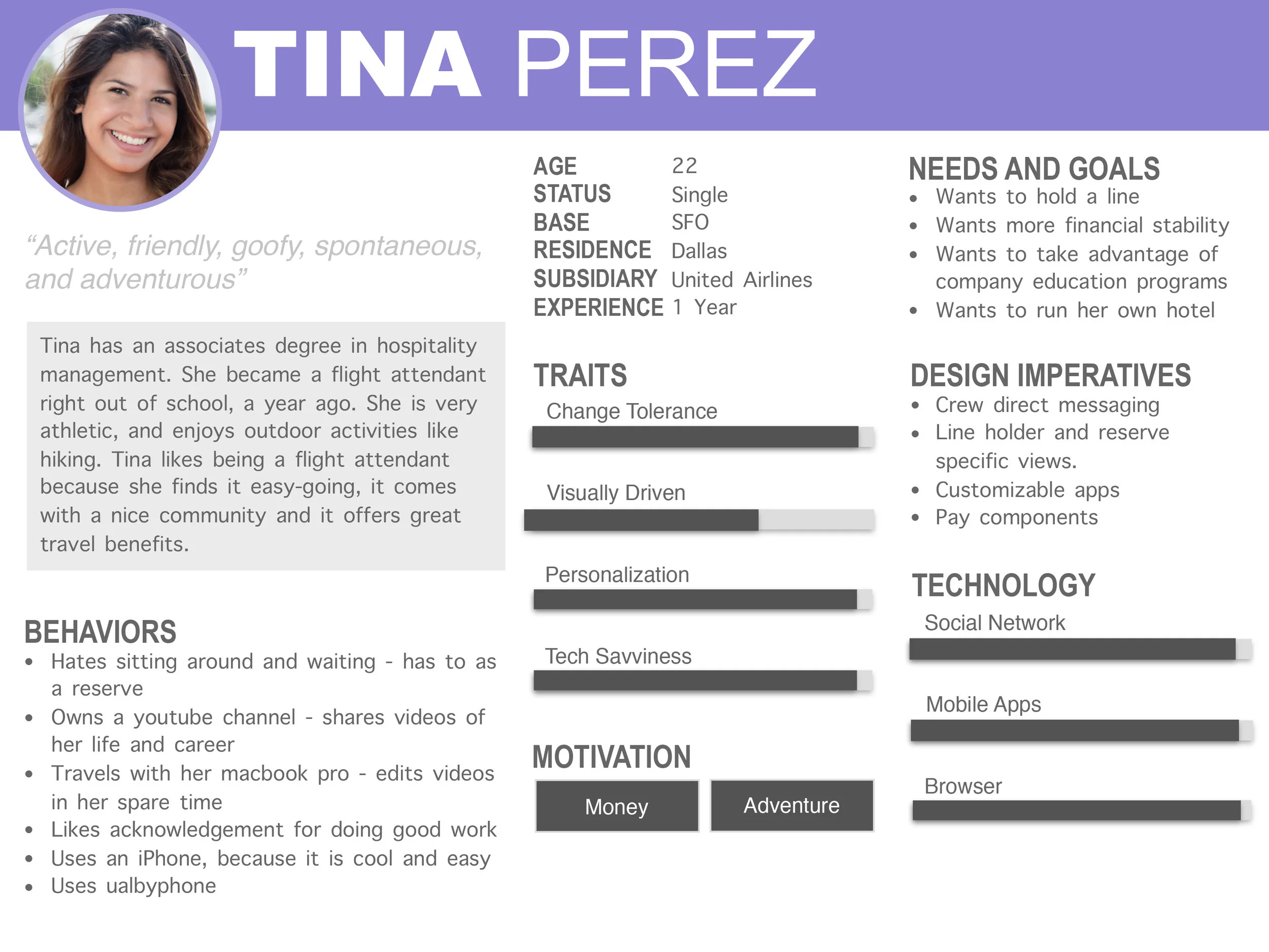
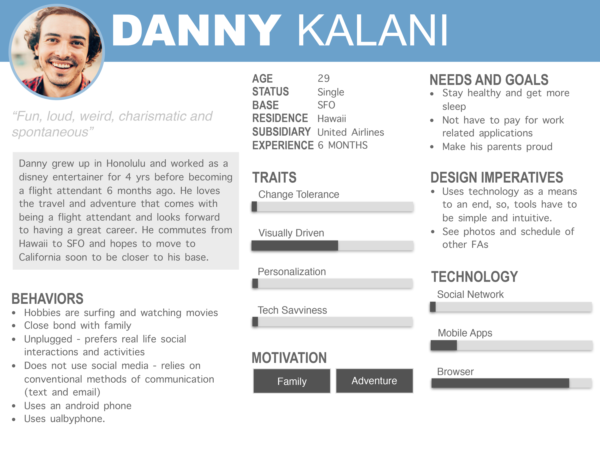
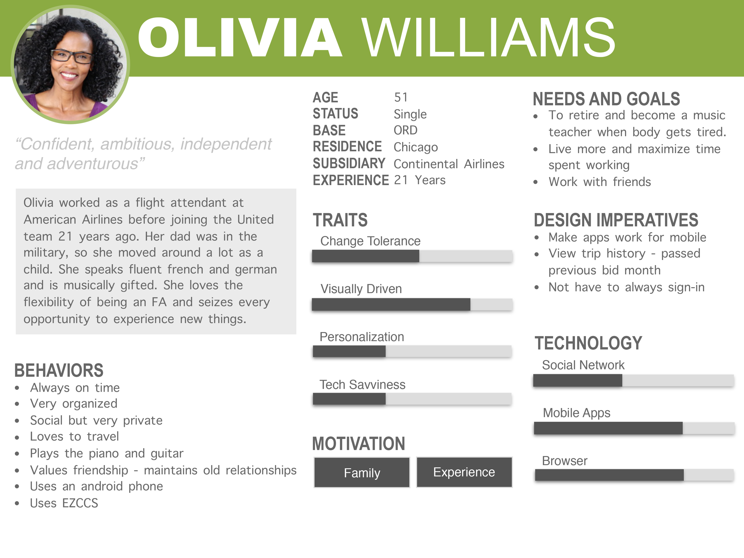
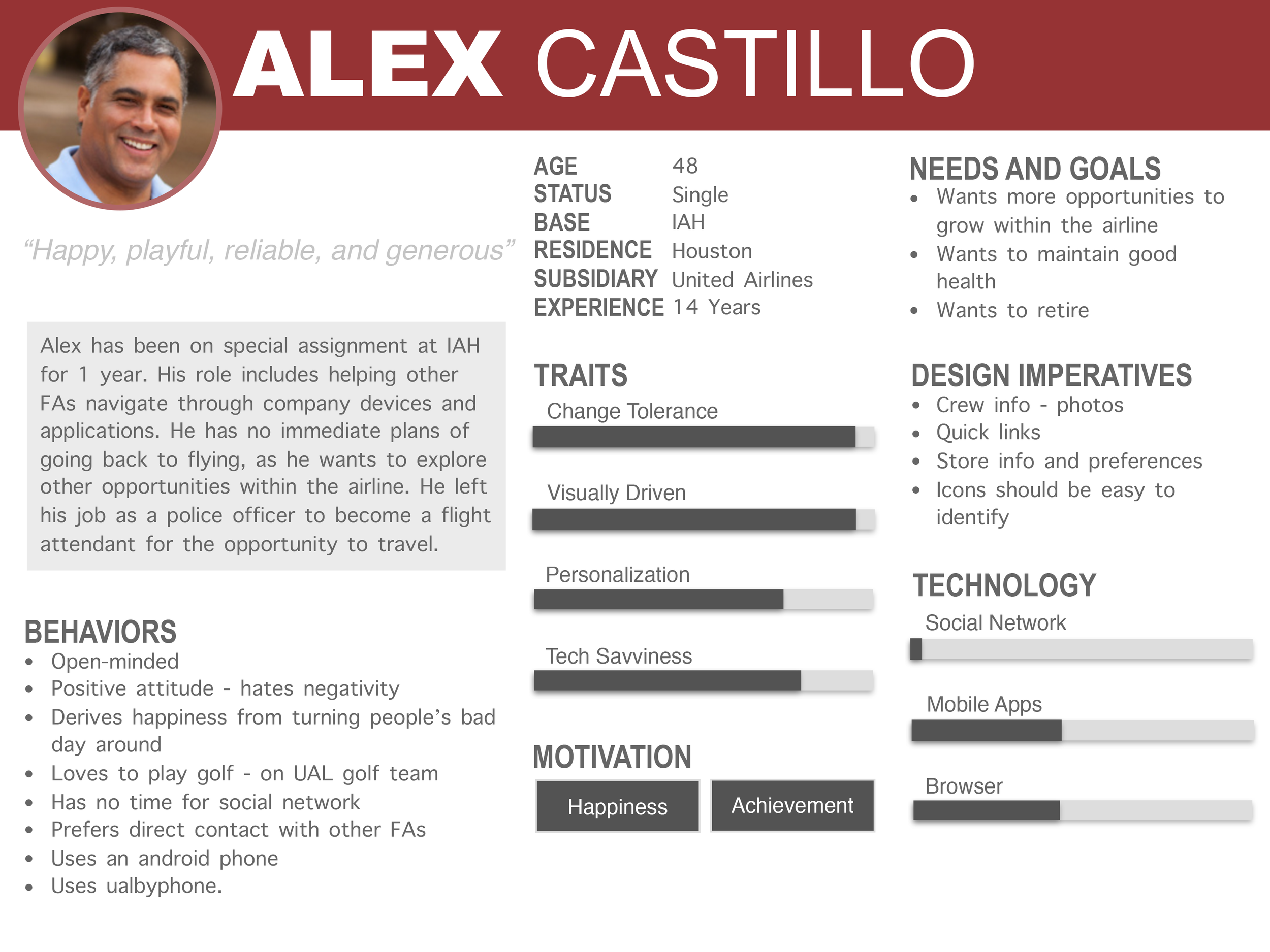
Personas: With all the information and data that was collected from the user interviews a set of personas were created to help define who I was going to design for.
COMPETITIVE ANALYSIS
Some findings and data that were captured from the user interviews were that the Flight Attendants used third party applications instead of the CCS to do their daily scheduling. Competitor Analysis was done on these third party applications.
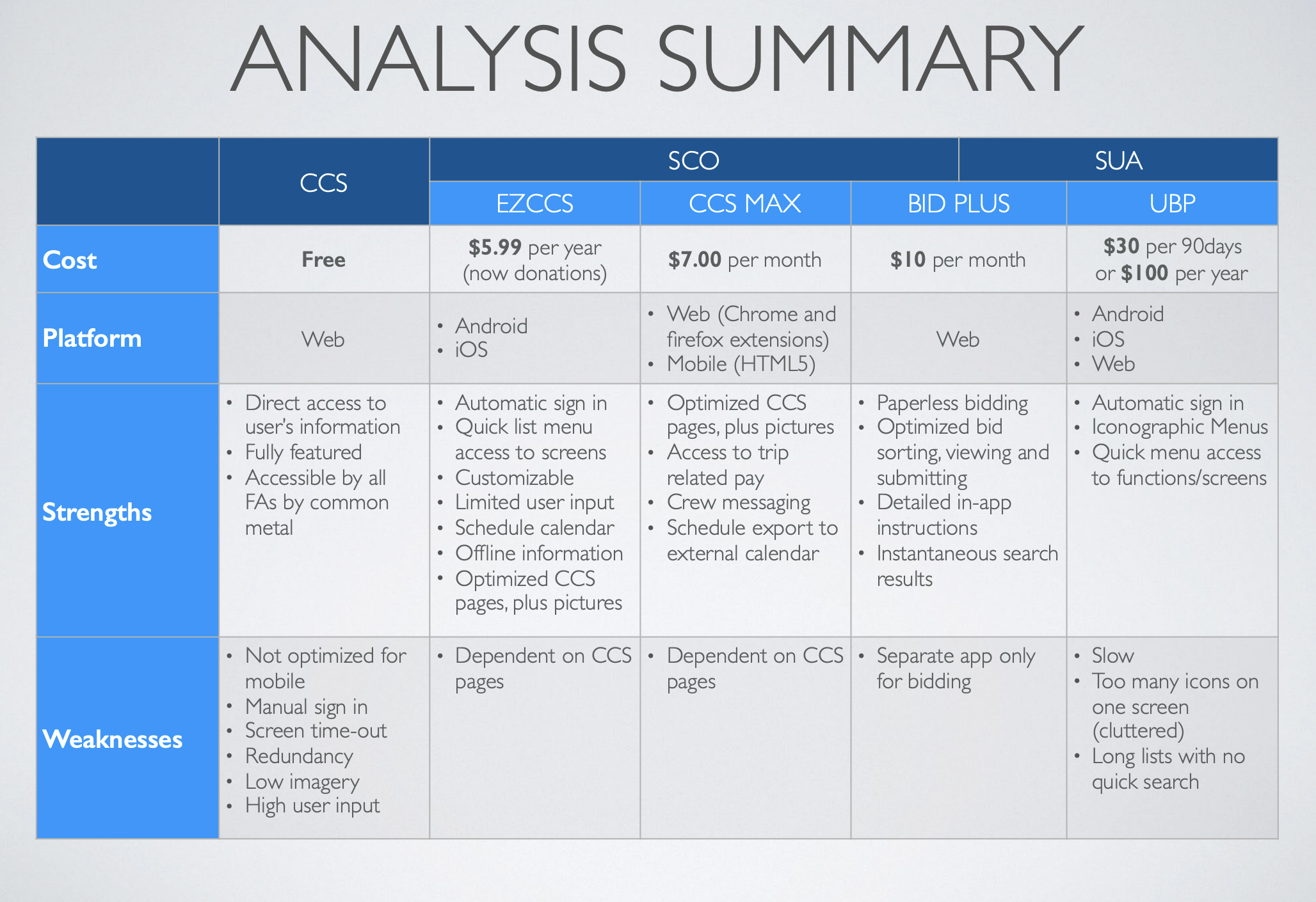
The complete Competitor Analysis can be viewed here:
Interaction Design and Information Architecture
A complete redesign of the Crew Communication System was required when the United/Continental merger happened. This meant gathering business requirements and technical requirements along with collaboration with business analysts, developers, SMEs, and other stakeholders and turned that into a set of core user flows, sitemaps, and initial wireframes. Due to the large size of the project and the amount of pages included in the website, I have included only the process for certain pages to showcase work done.
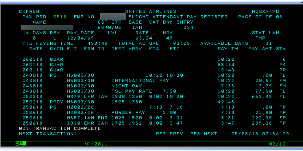
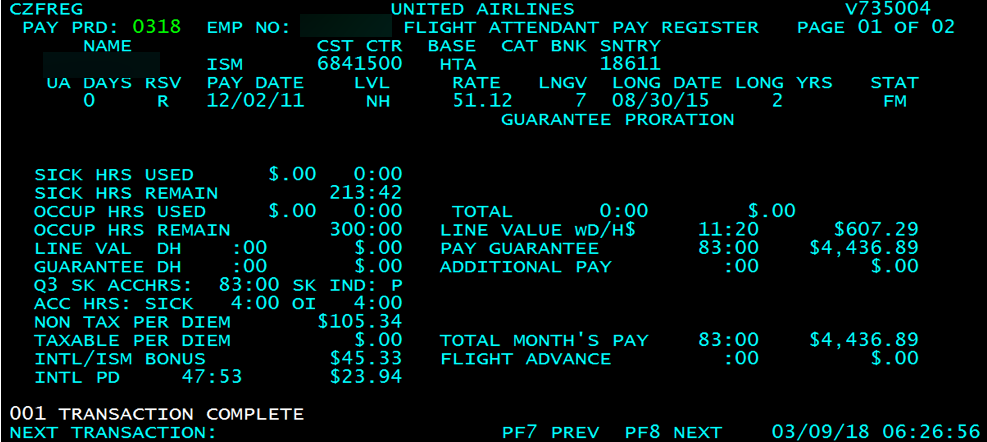
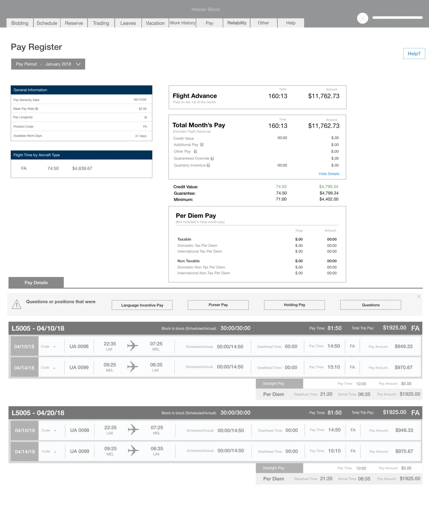
Pay Register: In collaboration with the union, business analysts, and SME’s. I had to understand how the pay registered worked, what all the entries meant, and I had to translate this into a new pay register that was easy to use, easy to understand, and learnable for the Flight Attendants based on the business requirements established by the union and user research. Some of the user research findings indicated that users were having a hard time understanding the original pay register. They had a hard time reading it, understanding what each field meant, and basically didn’t know how they were getting paid.
Original Pay Register
Initial Low Fidelity Pay Register Wireframes using Adobe XD and Sketch
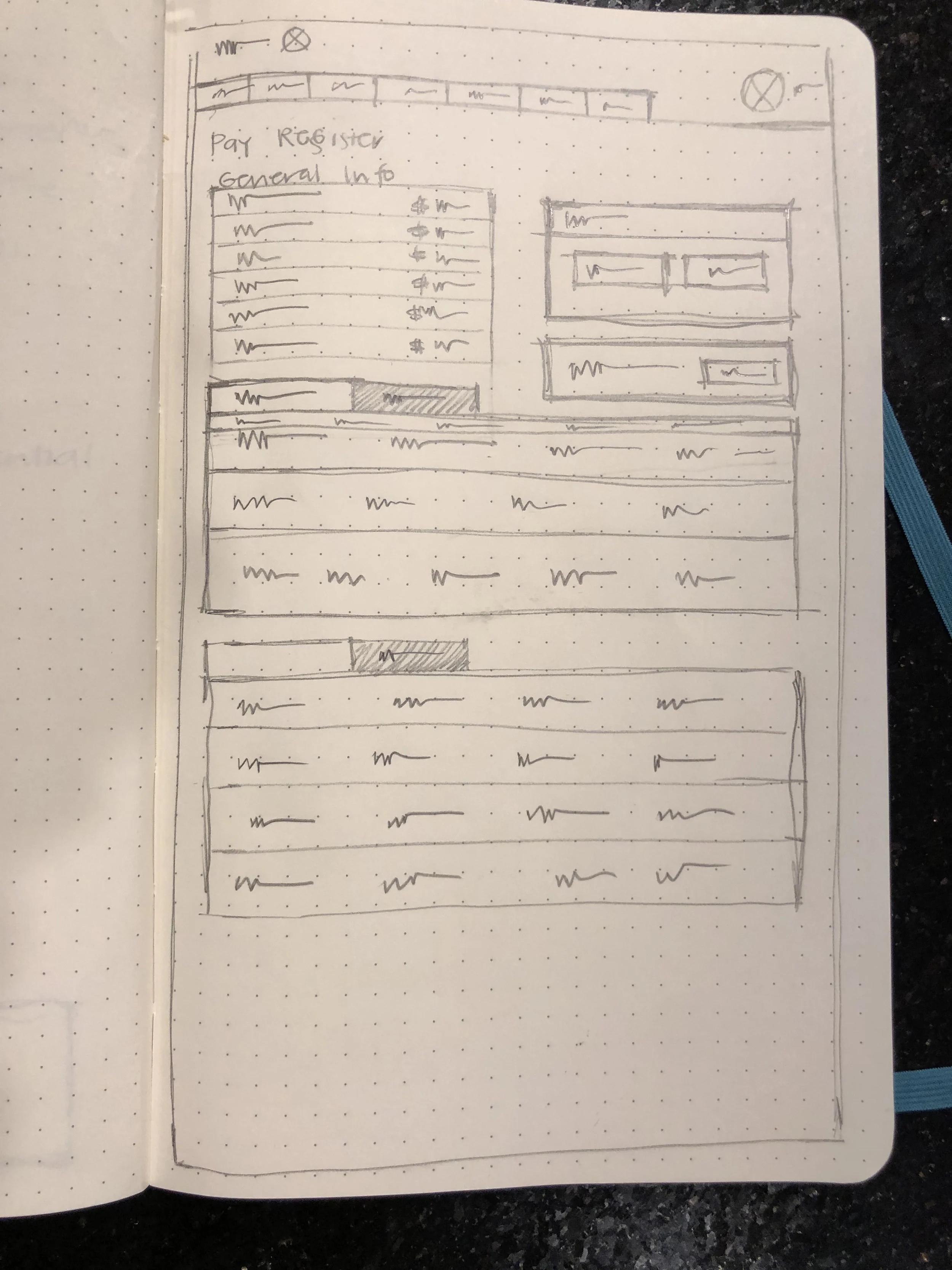
Prior to designing the low-fidelity wireframes on the computer, I did some brainstorming. Keeping the project scope in mind and my personas, I grabbed my moleskine notebook and a pencil and I sketched out some ideas of what I visualized the new pay register might look like integrating all the requirements. After this, I translated these ideas to low fidelity wireframes to illustrate the overall layout of the product interface, define the rules for displaying information and define the behavior of its elements. When sketching out ideas, I looked at current banking applications as a reference to see what potential competitors were currently designing keeping in mind my own target audience, my user flows, and my previous user research.
There were several rounds of iterations made to the Pay Register before a finalized version was complete. A lot of the iterations were made due to legalities surrounding the Flight Attendant Union and the JIT, ensuring that the verbiage being used aligned with the Flight Attendant contract.
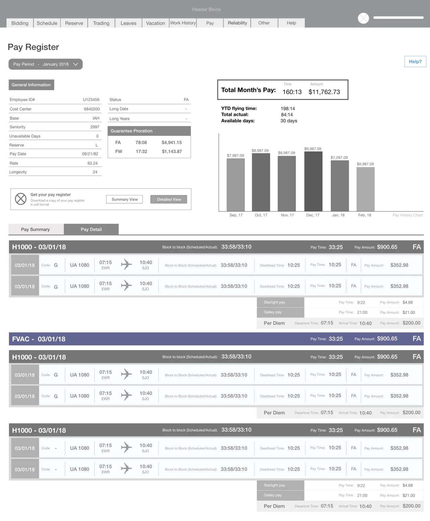
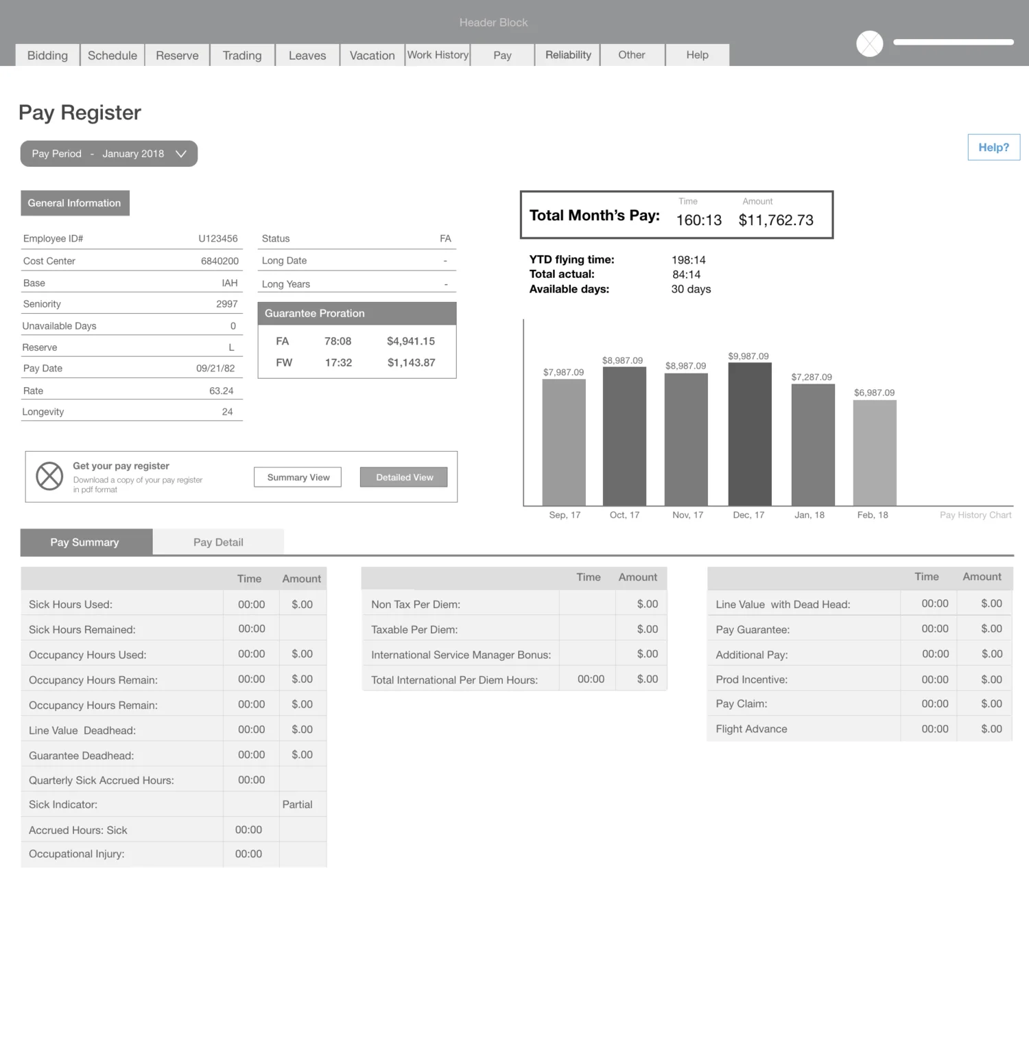
Here are my sketches and different iterations of the wireframes for the Pay Register:
Visual Design
United Airlines branding guidelines were used when it came time to work on the visual design aspect of the website :
High Fidelity Wireframes: After several iterations, high fidelity responsive wireframes were designed for desktop, tablet, and mobile for the Pay Register
Final Pay Register
USER TESTING AND PROTOTYPING
We visited the IAH base (Houston) and SFO (San Francisco) base to gather general user feedback and to do usability testing for the market. One of the several iterations we did to the website after it went into production was that we added checkboxes to facilitate the selection for the Flight Attendants.
Test Objectives:
• Test how how easy is it for the user to complete a full trip transaction from start to finish.
• Determine if the checkboxes have been designed in a way that it makes the user feel
comfortable and pleasant to use.
• How easy it is for users to accomplish the basic task of adding trips to their cart in the market.
• Gather general feedback about the website and understand any pain points or problems they may
have been experiencing.
Test Methodology:
• In person usability testing.
• Participants were men and women between the ages of 25- (+)60.
• Invision hi fidelity prototype was used for testing participants for the checkbox in the market.
• QA website used by the team.
Tasks:
• Users were asked to shop for a few trips and add it to their cart and go through the motions of
completing the transaction.
• For general feedback: the users were to complete the steps for the task they were logging into the
CCS for.
Test Goals
• Users should be able to easily add trips to their cart by clicking on the checkboxes.
• 100% of the participants should be able to complete the transaction process of a time travel
destination.
• Less than 5% or fewer of the participants experience a problem.
A high fidelity prototype was created using INVISION for usability testing: