ZEIT TIME TRAVEL
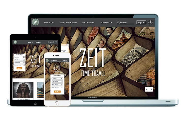
Client: ZEIT Time Travel
Role: UX Designer • Interaction Design • Branding • Visual Design • UI Design
OVERVIEW
SCOPE:
For this case study the scope was proposed by DESIGNLAB's UX Academy.
ZEIT, a subsidiary of the Virgin group in accordance with the International Concordance on Time Travel, is a new cutting edge travel company offering a new way to travel. A total of 289 destinations all over the world ranging from prehistoric times through today have been approved for time travel.
CHALLENGES:
• Design a responsive e-commerce website that is easy to use and that allows customers to browse through all all different trip categories and details, filtering via interests and classifications.
• Design a logo for the company that can be modern and historical at the same time.
PROCESS

Research Strategy Interaction Design UI Design
Secondary Research Empathy Map Responsive Wireframes Logo & Icon Design
Market Research Persona Prototypes Style Guide
Competitor Analysis Feature Matrix Usability Testing UI Kit
User Interviews Card Sorting Visual Design
Sitemap
User Flow
RESEARCH
Research Goals:
Since this was a new concept with no prior research, I had to do some secondary research on basic travel trends that currently exist. I needed to understand who the target audience was along with the following:
• Learn what issues people currently face when they travel?
• Why people want to time travel?
• Learn what issues people have when booking their travels online?
• Identify people's choices for destinations and activities when they travel?
Methodologies Used:
• Secondary Research
• Customer survey
• Interviews
Synthesizing Research
I developed a series of questions for the interview portion of my research. The interviewees were adults ranging from the ages of 18-64 yrs old.
Key takeaways from my user research:
• Participants enjoy traveling and try to travel as often as possible.
• Booking their travels: Common factors among the participants when booking their travels were price, length of the trip, and where they will be going.
• Majority of participants use a website to book their travels. Only one uses a travel agent to book their travels.
• All the participants were interested in time travel.
• All participants showed concern regarding safety and time travel.
STRATEGY
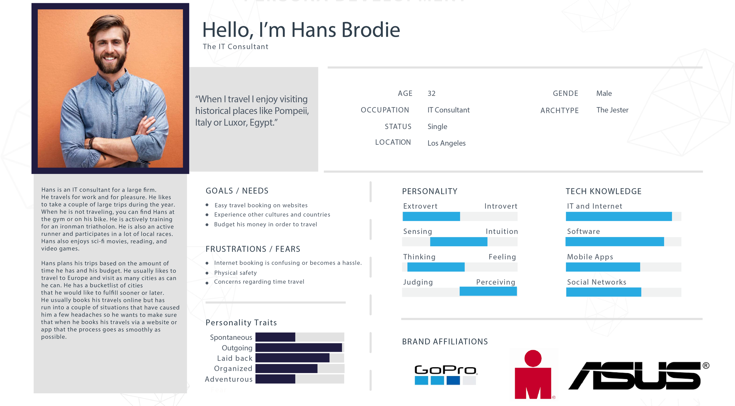
Persona: With all the information and data I collected from my research I created a primary persona to help define who I am going to design for.
Hans is an IT consultant and travels for business and pleasure. He takes several large trips a year. He usually books his travels online but has run into a couple of situations that have caused him a few headaches so he wants to make sure that when he books his travels via website or app that the process goes as smoothly as possible.
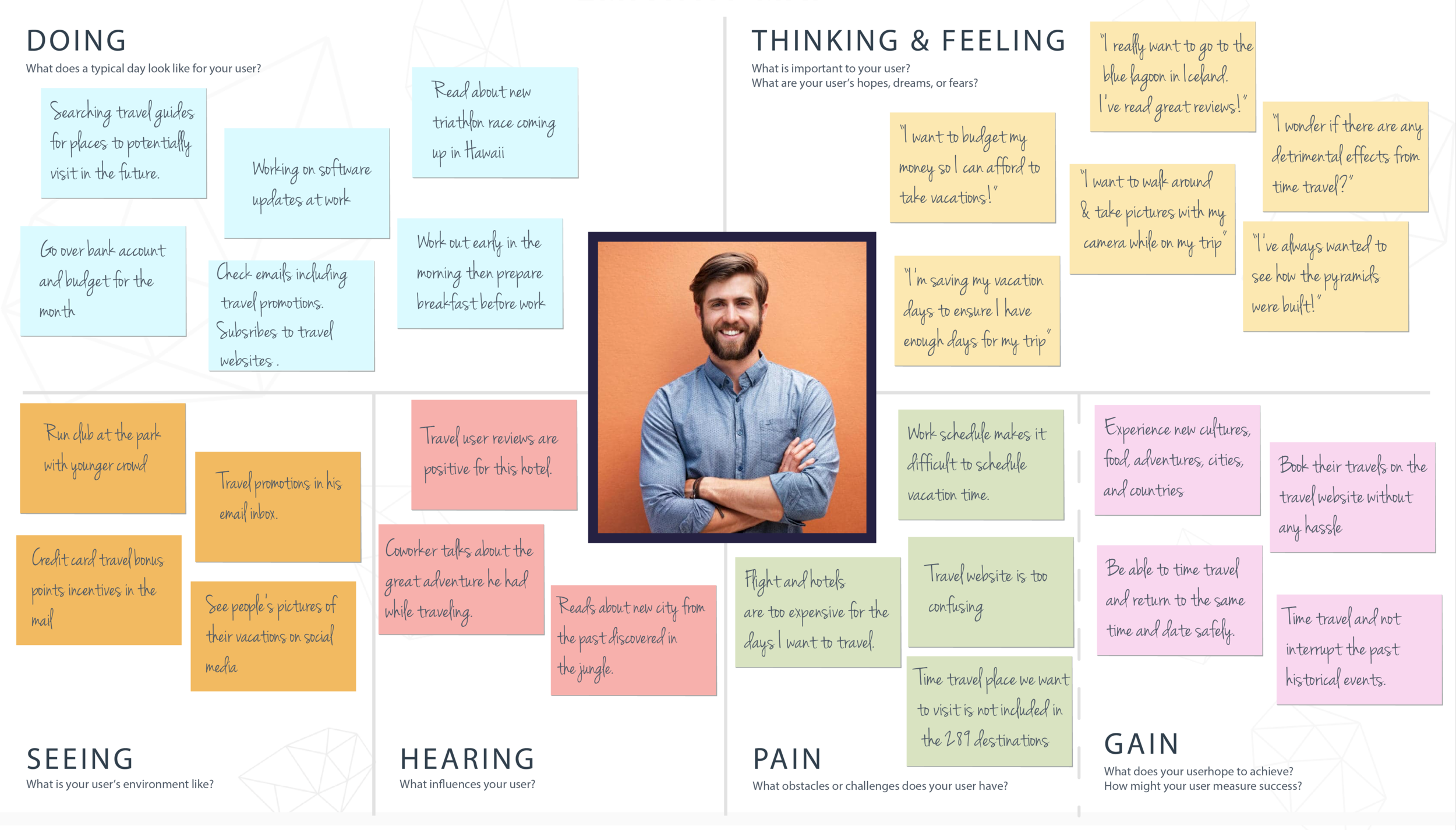
Empathy Mapping: After creating the persona, I created an empathy map to understand the user's needs, wants, perceptions, and motivations and gain empathy with our users. Interview findings helped me identify their pain points and expectations.
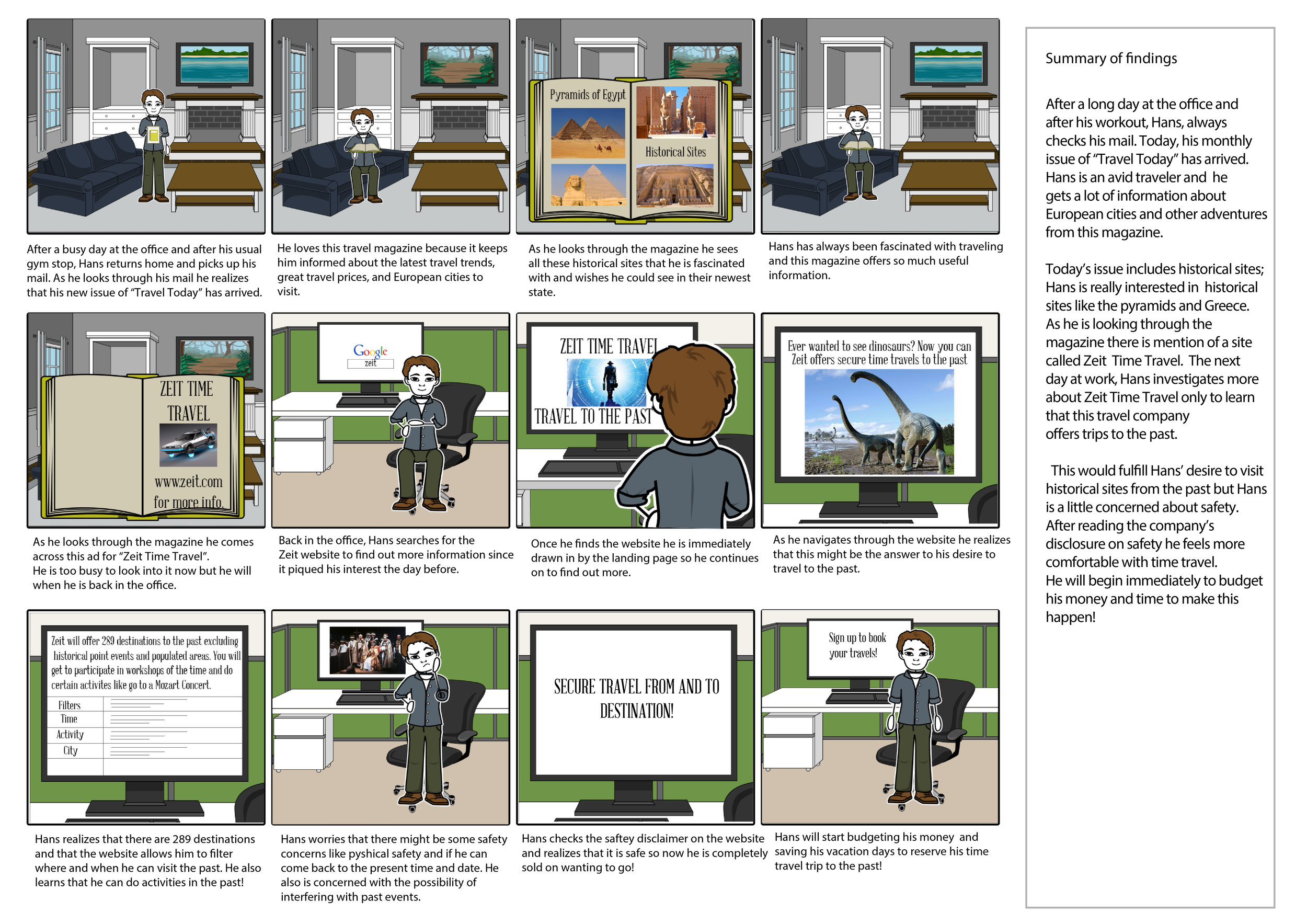
Storyboard: Then I created a created a storyboard. I created a story about Hans that would line up with the persona I made/people I interviewed. This narrative would help me better understand the problem space the user might run into.
Card Sorting: In order to organize and label content on the website in a way that makes the most sense to my users, I conducted a card sorting workshop. For Zeit, I used a closed card sorting workshop where a pool of ten participates were asked to categorize several different categories ranging from historical events to entertainment.
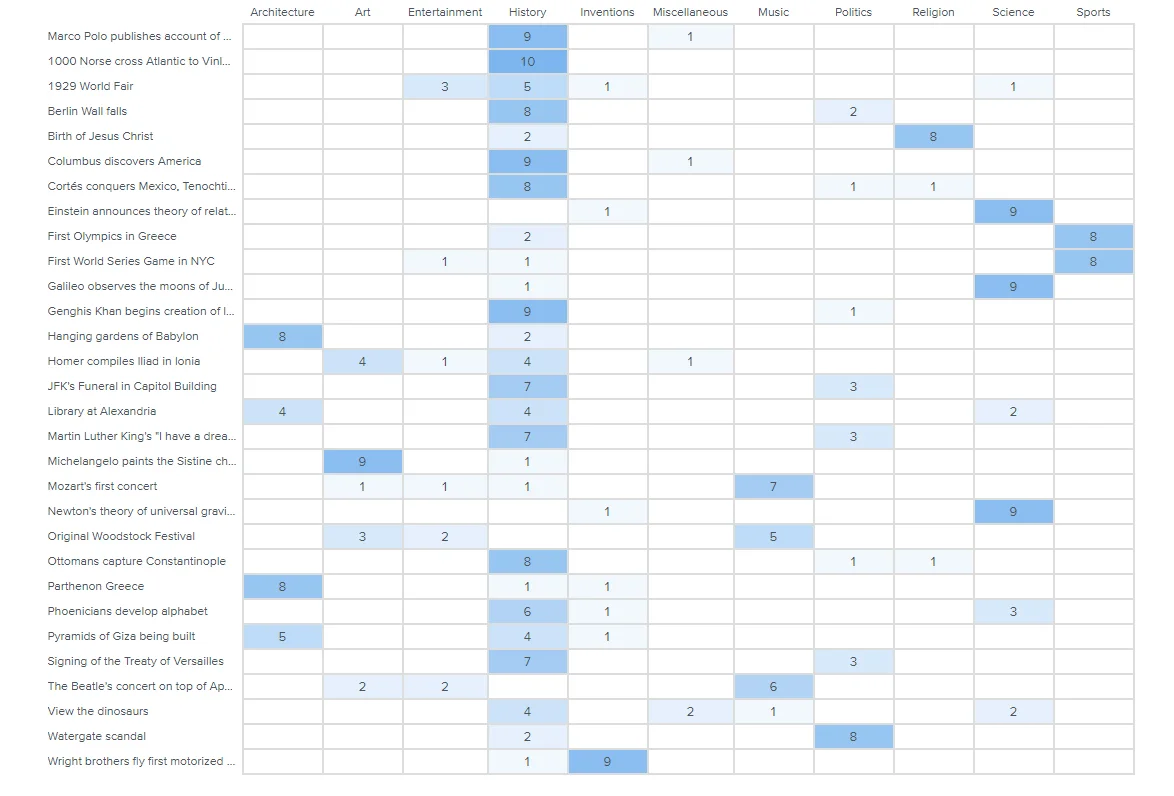
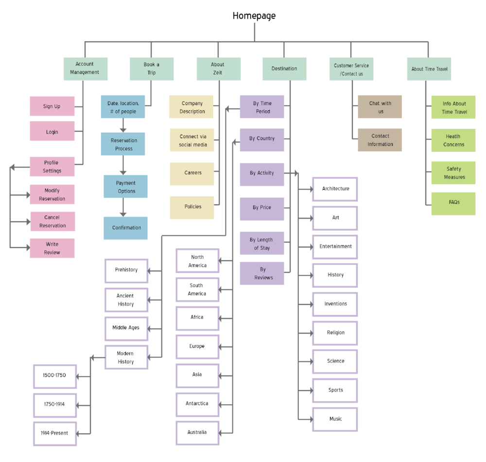
Site Map: With these results I went on to create a site map that would show the relationship between the content within the website and establish navigational categories.
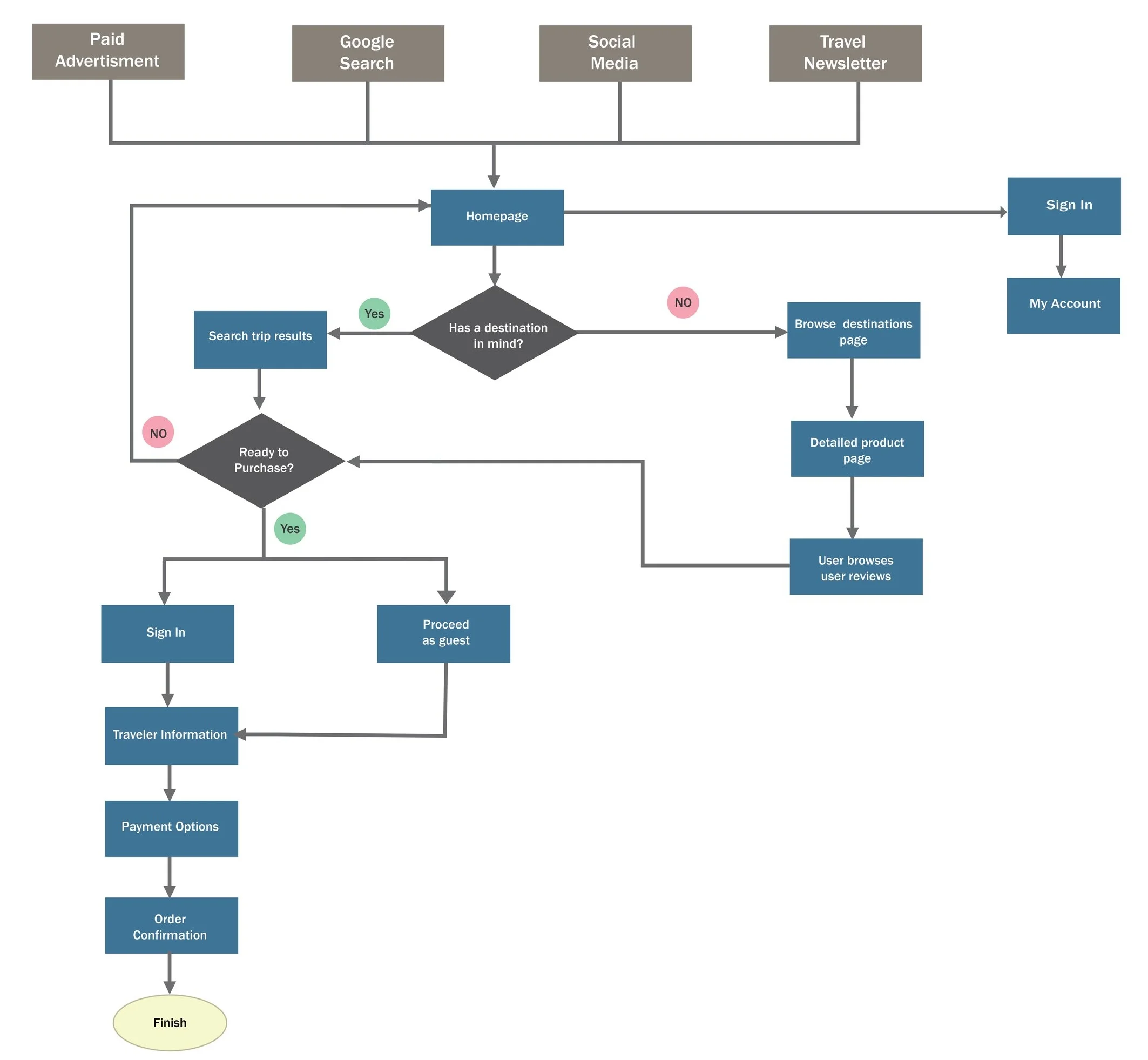
User Flow: With the site map as a guide, I constructed a user flow diagram to identify the different paths that a user would take through the website to complete a task.
INTERACTION DESIGN
Prior to designing the low-fidelity wireframes on the computer, I did some brainstorming. Keeping the project scope in mind, I grab manila paper, my moleskine notebook, and a pencil and I sketched out some ideas of what I visualized the ZEIT homepage might look like. After this, I translated these ideas to low fidelity wireframes. When sketching out ideas, I looked at current travel websites as a reference to see what potential competitors are currently designing keeping in mind my own target audience, my user flows, and my previous user research.
Low-Fidelity Wireframes
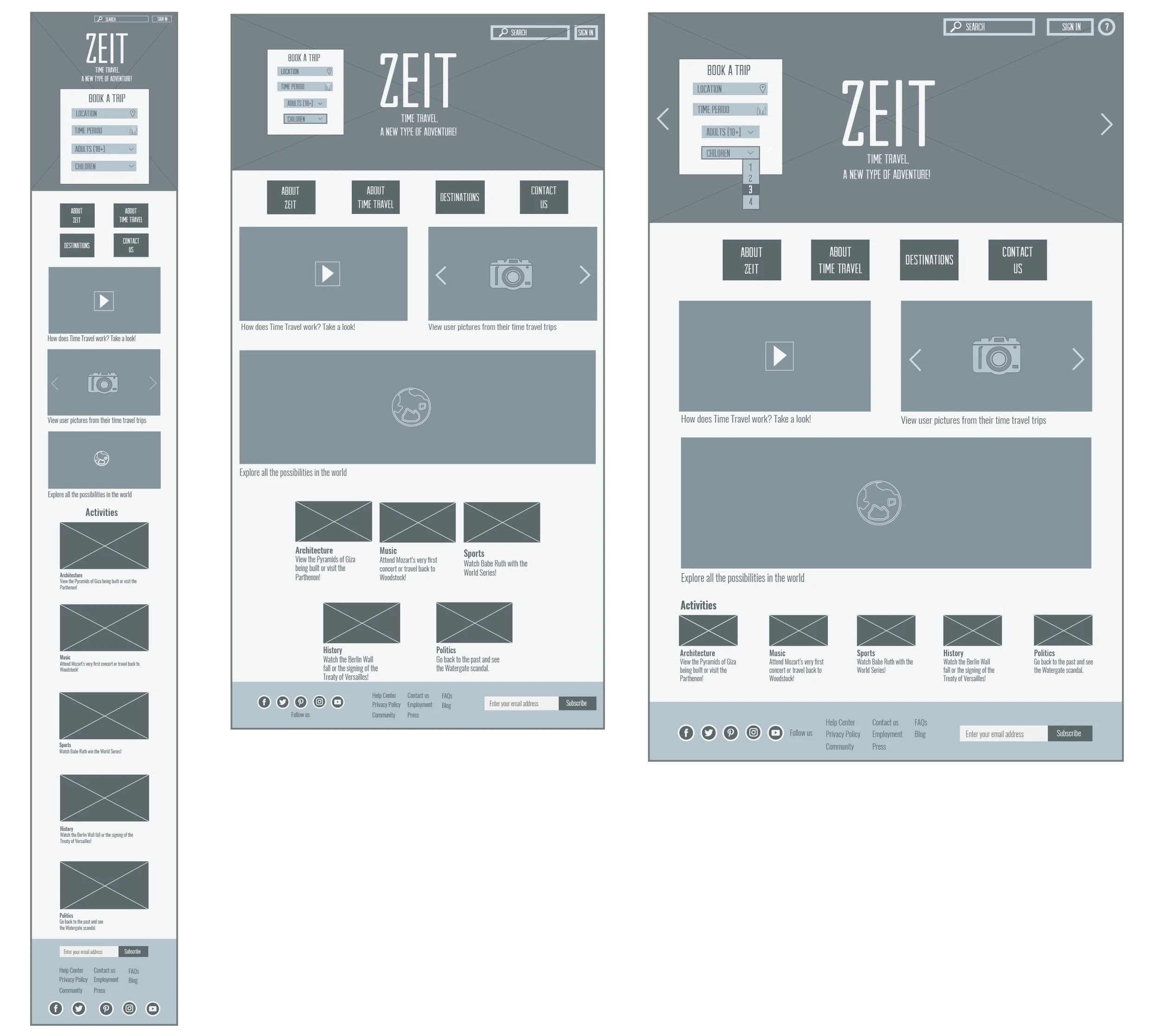
Low-Fidelity Prototype (it's clickable)
UI DESIGN
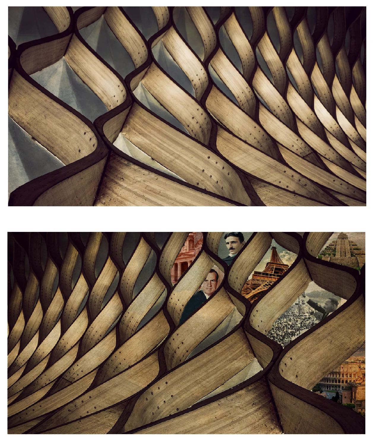
Brand Identity: After designing the low-fidelity wireframes I began brainstorming for ideas of time travel for my logo and branding since this is a time travel website. I looked for textures, imagery, graphics, website that tied back to Einstein’s theory of gravity that unites space and time as “spacetime”, which curves in the presence of mass and represent that in form. It allows for the possibility of wormholes – a kind of tunnel through space time connecting otherwise very distant parts of the universe. Since time travel is not possible in reality but for the purpose of this project it is, I chose to focus on the actual theory behind time travel which goes hand in hand with Einstein’s special theory of relativity and gravity and create imagery that would invoke movement of space through light and imagery. It is said that If the “mouths” of the wormhole are moving relative to one another, then traversing the bridge between different points in space would also take a traveler to a different point in time to that in which he or she started. Therefore this is what I based my inspiration on for creating a brand for Zeit. I think it needs to be bold and invoke movement since when one travels we move from one place to another, same with time travel. The universe as being made up of three spatial dimensions, and a fourth dimension representing time, so I wanted to invoke geometric shapes and forms in my branding since it boils down to mathematical theory. Space and time, is something that be associated universally to everyone on the planet and since we are trying to cater to different types of people for our website, I thought this represent the brand.
For the website I designed a hero image based on the top image (below). The finalized hero image is the bottom one. I added images from the past to the main image. I feel this image invoked the movement and dimension that I previously mentioned.
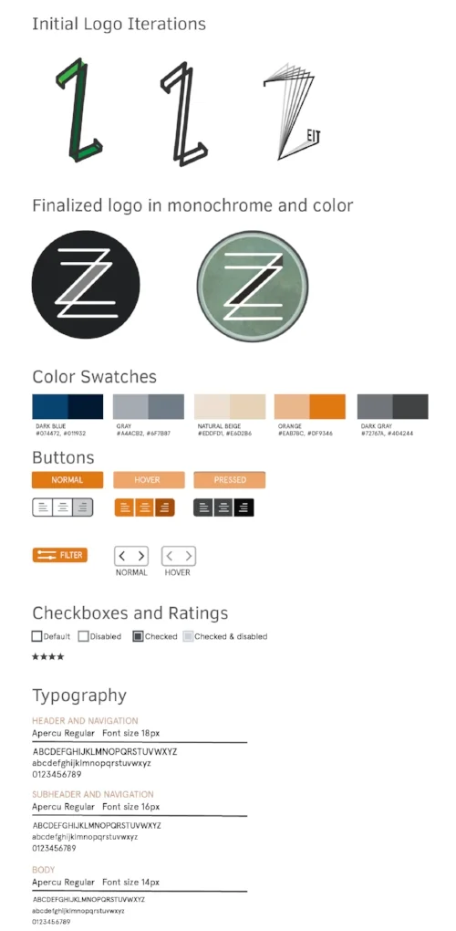
UI KIT and Logo: When it came time to design the logo, I went back to my initial inspiration which was previously mentioned in this case study, for ideas. I wanted to focus on the "Z" in ZEIT as the main focus of the design invoking dimension and movement. I am showing some of my intial iterations of the logo that were the based for the finalized logo.
High fidelity prototypes were designed for desktop, tablet, and mobile. I uploaded them to InVision to create an interactive prototype.
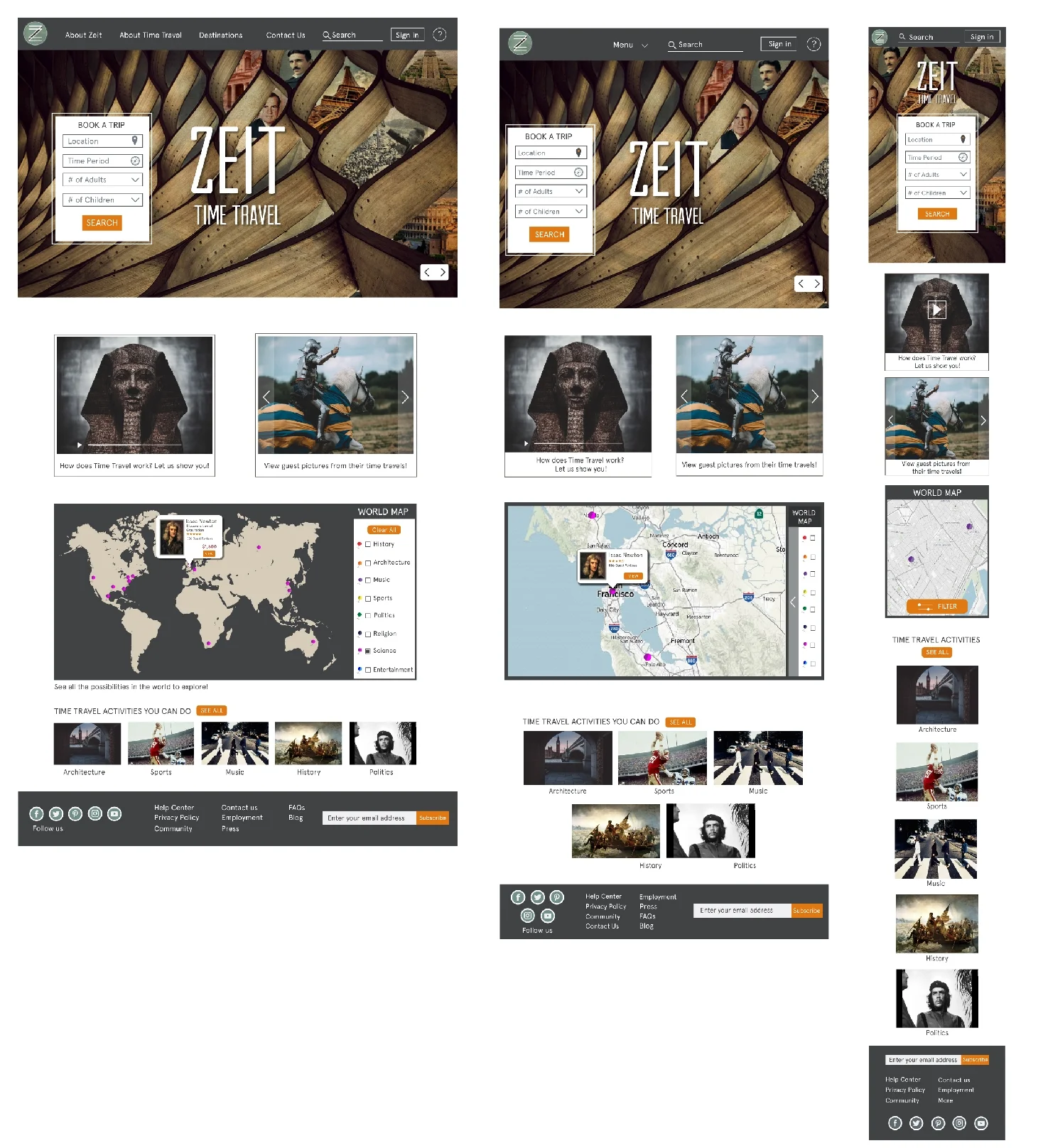
Homepage High Fidelity Prototype
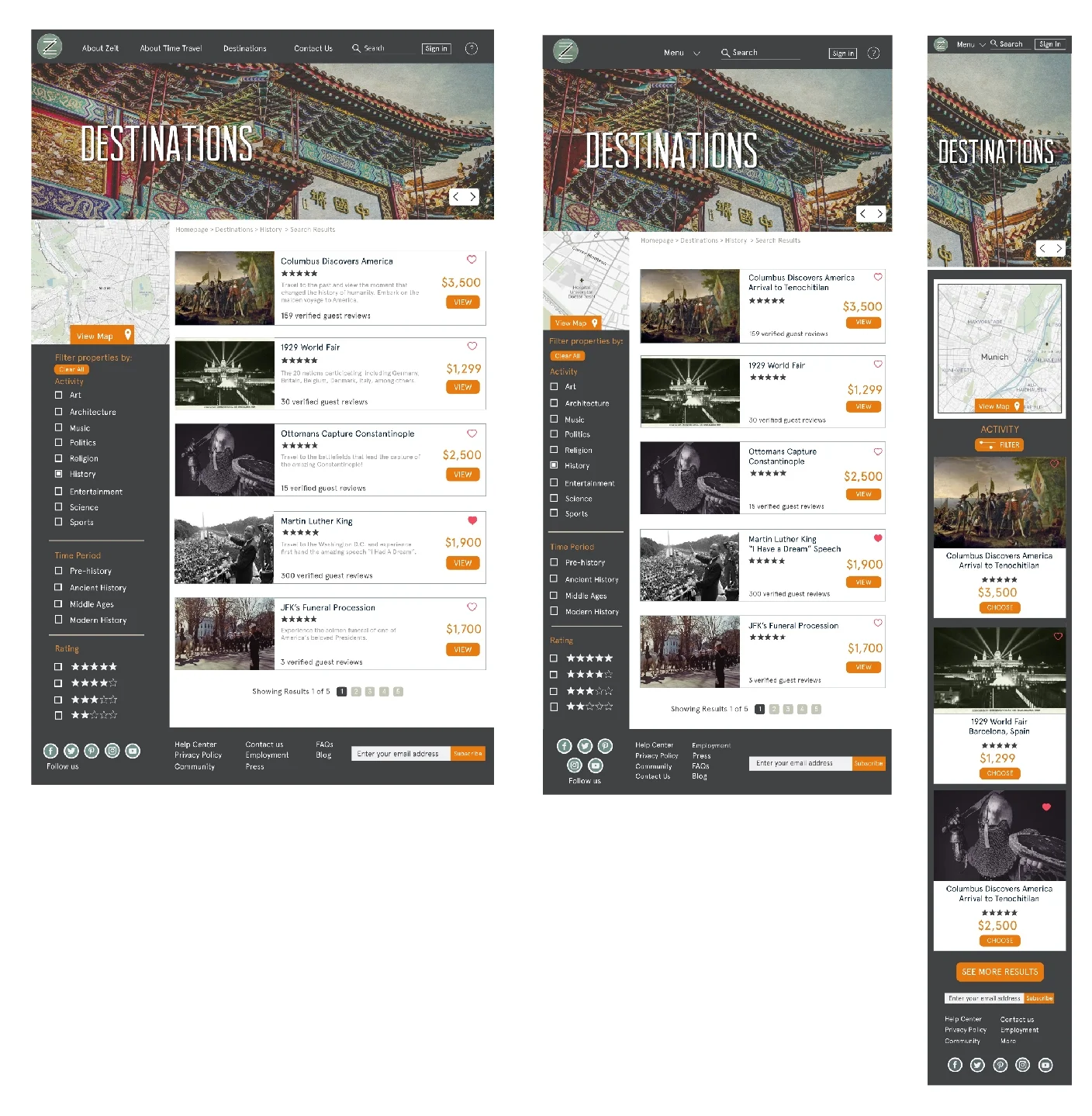
Destination Results High Fidelity Prototype
USER TESTING AND PROTOTYPING
The UI kit, logo, and branding specifications were used to finalize high-fidelity wireframes. I used Invision for my prototypes.
High Fidelity Prototype (It's live and clickable)
Pages that were created: Homepage, Destinations, Product Detail Page, Registration, Check Out
Test Objectives:
• Test how how easy is it for the user to complete a full trip transaction from
start to finish.
• Determine if the site has been designed in a way that it makes the user feel
comfortable and trustworthy of Zeit to book a time travel trip.
• How easy it is for users to accomplish basic tasks on the website.
• How pleasant it was for the user to use the site.
Test Methodology:
• In person and remotely moderated usability testing.
• Participants were men and women between the ages of 18-40.
• Invision hi fidelity prototype used for testing participants
Tasks:
• Users will be asked to shop for a time travel destination package and add it to their cart and go through the motions of completing the transaction.
Test Goals
• Users should be able to easily navigate the homepage and destinations page.
• Users should be able to easily complete the transaction from finding a destination to adding it to their cart.
• Users should be able to view the product page and navigate it easily.
• 100% of the participants should be able to complete the transaction process of a time travel destination.
• Less than 5% or fewer of the participants experience a problem.
Affinity Map
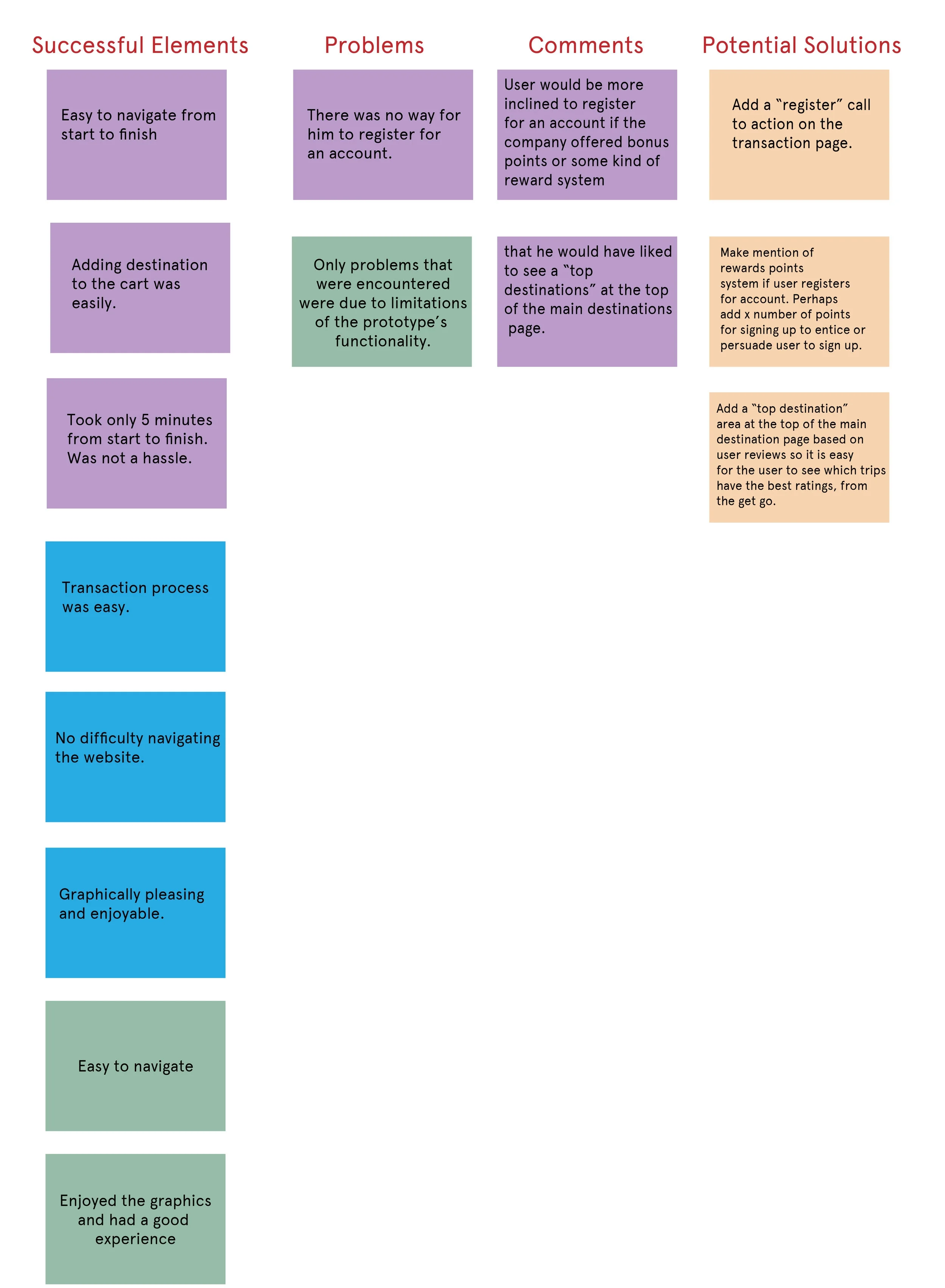
Conducting usability testing gave me an opportunity to observe users and see how they interacted with the website. I analyzed all the usability testing feedback from the 3 users and I organized them into an affinity map. This allowed me to identify elements that needed to be re-iterated. The different sticky notes represent the different users with the yellow representing potential solutions only.
CONCLUSION
By using the design process of research, strategy, design, and testing I was able to successfully achieve my project goal of designing a responsive e-commerce website and branding for ZEIT.
I was successful in creating a website that users found pleasant, easy, and quick to use. The next step would be to work with consultants and developers to launch the website.